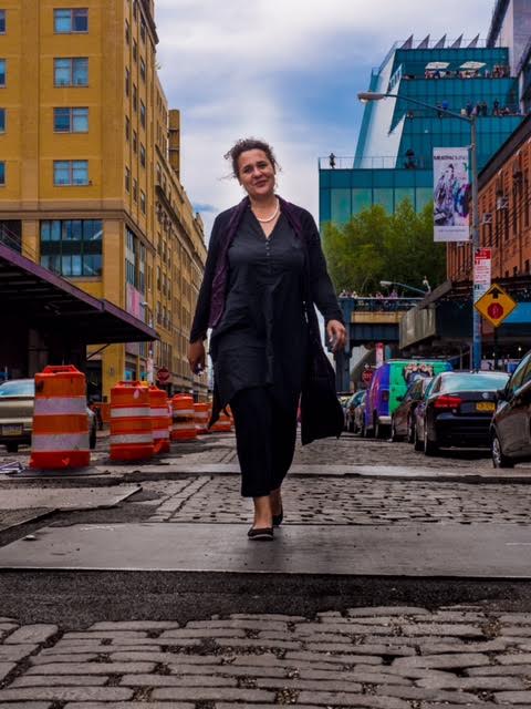
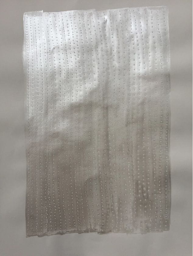
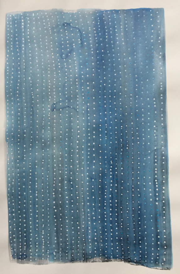
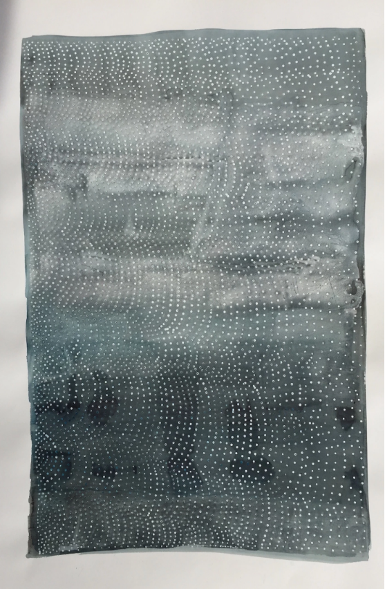
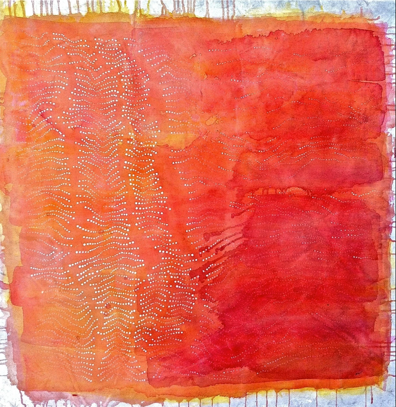
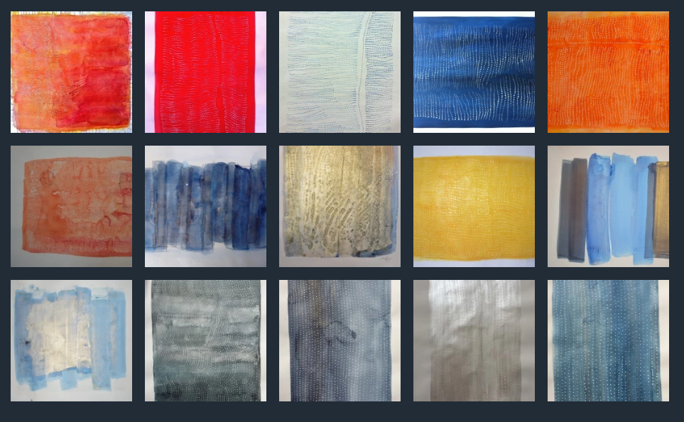
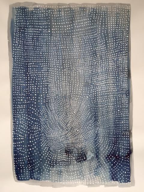
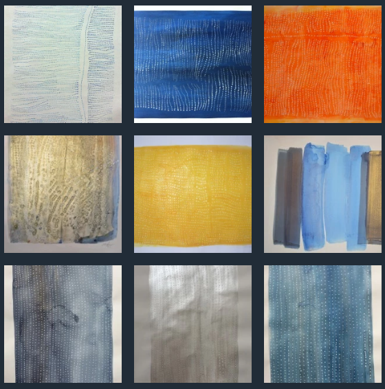
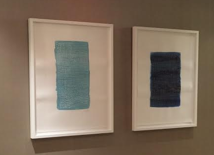
 A series of eighteen of Katie’s paintings are currently on display on the newly renovated fourth floor of Saks Fifth Avenue. This space, featuring new, emerging and legendary brands is the perfect backdrop for her creations.
You can visit Katies her work at Saks, online at Katie.Gallery or in person on Gansevoort St in Manhattan on weekends.
Can you start by introducing yourself?
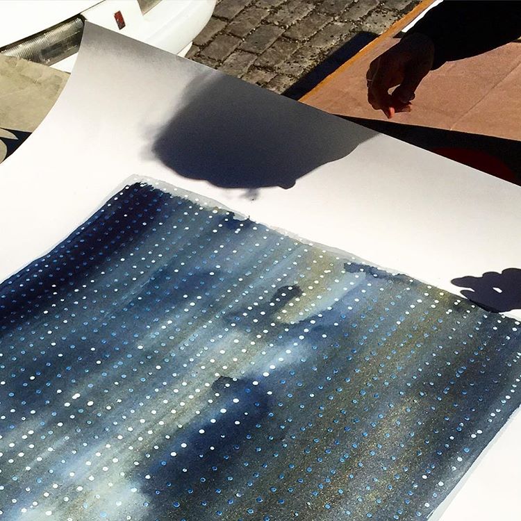
I'm Katie Heffelfinger. I am the lead artist at katie.gallery where I create original watercolor paintings using a unique process of latex resist and handmade paint on Legion's 100% cotton Coventry Rag paper.
What inspired this series?
What inspired me was Otto Piene in the 1960’s and his work with the other German zero artists. I saw a piece of what I thought were impressions in the paper laid out in a grid with a human hand with slight irregularities making it impossible to look away. I’ve never seen them in person, just in catalogs. But they took my breath away.
 The washes are just part of me. My mother was a watercolor artist and I loved her work. I just lay on the color and create compositions. Much of my inspiration is part of the mixing and chemical process of the different paints I develop in the studio. It's often like making crystals develop on the surface as the mica dries with the funori. They develop into beauty, I give it a place to happen and a direction, but I don't always know how it will come about.
Yayoi Kusama and Dorothy Napangardi are always present in my work and my two biggest influences as women artists who master the dot. The Albers are my color teachers and I have to thank them often for their vision.
What materials do you use and why? Are there any favorites?
For me Legion Paper’s Coventry Rag paper is more than half the piece. My studio mate artist Jed Miner introduced me to Coventry Rag five years ago. It was only later I realized the paper's properties were so perfect.
The resist (dots and lines) are done in Marquee Behr house paint. There is something about the formula that works differently than any other. The funori in the paint I make pulls away from the Marquee paint and there's a reaction between the sizing in the paper and the Marquee that creates many of the effects.
My framer Rooq is another key piece to my success. Their show room on 4th street is my favorite space to show clients for the lighting, and at their giant work tables I always feel comfortable there with my clients. Their quality is great and prices reasonable. Regarding materials, Rooq uses Rising Museum Board to support my work.
 Can you tell us a little about your watercolor process? What makes it unique?
The traditional binder of watercolor is gum Arabic. This is a thick kind of jelly medium that binds water and color (pigment) to the paper, thinned to about 2-7% of volume with water and mixed into water and pigment gives us watercolor. When you mix heavy pigments or mica into the paint adding more gum Arabic makes it sticky slow drying goo like the coating on an old photograph.
Funori changed the game of watercolor painting. It's a Japanese seaweed which is used in bookbinding. Jed Miner brought a rigorous daily practice and a skill for invention into the work. He experimented constantly with old binders and coatings. Working with him we created some of the chemical process I use today. It's exciting to make all of the paint myself and be able to tweak the ingredients.
How did you come to work with Legion Paper?
At the Gansevoort street outlet at the base of the highline, I met Josh Levine [Legion CEO]. He was walking with his wife, saw my work and casually asked what paper I used. I said My favorite was Coventry Rag. When he said that Legion created Coventry Rag I was pulled into one of those synchronicities that only seems to occur in NYC!
Art is a business and making that first large (for me, anyway) investment in really high quality materials was the first step on a trajectory to where I am now. Josh mentioned they happened to have some slightly irregular batch of Coventry Rag they rejected and we traded paper for a piece to be named later. Josh also supported me getting access to their “seconds” and off-cuts. This was a huge game changer. I was able to touch samples of almost every kind of paper that Legion has and as a result I could make more informed choices.
 In our conversations prior to this you’re very specific about what you look for in a paper.
Everyone should be! These higher-quality cotton papers are so different from other papers it's like night and day. I get this feedback from people all the time, particularly people from Europe and other artists who can see and feel something is special about my paper.
Michael Ginsburg, co-founder of Legion (as well as the rest of the staff) was patient with me dragging large rolls of paintings to show him that other papers suck the pigment into the center of the sheet, sometimes pulling it to the back of the sheet. Watercolor papers just weren't made to do what my handmade paints needed, which was to keep the mica and pigment on the surface while allowing the water to evaporate without buckling.
And sometimes you have to be resourceful. For example, because of the demand for my work in larger sizes, bigger than Coventry Rag’s 60x44, I was having such a hard time finding a paper to use that for my larger pieces. For this series I had to use a bit of an off label product from the Legion paper family - I actually used the reverse side of the 1 sided Entrada rag, used typically for photographic printing, but the reverse side is very similar to Lenox 100, while feeling to me a bit more sized. The coating keeps the paper held well on the reverse and stable for the many layers of paint I put down.
 How did The Saks Fifth Avenue series come about?
My process is always the same: great designers happen by my outlet spot on Gansevoort. (Meatpacking + Whitney + High Line: it’s a nexus of a lot of cool things and people looking for cool things.)
The buyer for Saks came by and was complimentary and kind, but it was a fairly fast meeting, he liked what he saw and said he'd connect. After that it was very fast: we met again and he selected the pieces. We made a date to meet at the framer (Rooq) to double check particulars about the order. Rooq owner Jawed helped me box and package the paintings (18!!) and I delivered them to the legendary 5th Avenue store in midtown where the work will be part of a new look for the 4th floor.
If you could create something for a dream client (individual or corporate) who would it be?
I’m not sure if this is public knowledge yet but my dream paper is about to become real. It's a 60 inch roll of Coventry rag vellum and smooth!!! Now that my perfect paper is real, I'll be able to make gallery sized dot pieces that on this scale will ungulate and truly absorb and envelop the viewer.
 What I'm seeing now would be three of these giant form pieces let's say 5' x 8' in quicksilver gray and blue colors. I wish these could be completed before my show at the gallery Sensei in the Bowery because I feel like that would be an amazing presentation but I guess I’ll have them for the winter art shows.
But your question didn't ask what but who, as an ideal client!
The truth is I work with my dream clients now. Saks is a dream client. All my buyers and the awesome people who come to me from all over the world and make my pieces part of their lives - I honestly feel that I live the dream. I just want to do more of them, bigger ones and keep working with the really cool people I get to work with.
I am getting the dream I had of being in the Legion Paper offices which is absolutely for a Coventry Rag Superfan like being on Justin Bieber's wall when you're a preteen girl [laugh], you know like that's just awesome.
I also really hope that Behr paint (masco coatings) will understand my love for them and my complete obsession with Marquee paint and get something for their corporate offices in Southern California.
One day at the booth someone walked up and said, "My husband and I have selected your piece to build our lives around." My piece was the first thing they placed after their renovation was finished and they added all the other furniture and decor around the colors in the piece. I could feel them placing their soul into my piece in a beautiful way.
These are my dream clients.
What’s next for Katie?
The Mansion residency program [that Katie created in Allentown, PA.] is being overhauled and I will be unveiling my new course and eBook. Hopefully, readers will get to use the process to hone their art into something very salable. Instead of helping a few dozen artists over years as we have been one at a time in a residency capacity, I want to help thousands realize my goal of removing the term starving artist from the lexicon.
"Doing it like Durher" will debut at an NYU class this fall. This beta version will be what I take to the Internet next year in 2017. It talks about how old a profession we are in and that the rules haven't changed since Durher was making full sheet prints of well rendered watercolor bunnies in 1502. Simple, time tested (like centuries) solutions to teach people to quit their Day-jobs and let their creativity be the fiscal engine fueling their lives, making your existing art practice into a job no one can take away from you and you can do forever anywhere on the planet.
It is my goal to bring people into the understanding this is an amazing profession. People, all human beings, need what we do as artists. In a home we crown the architecture and bind the themes that someone brings into their visual center.
If we understand our profession as a business and take it seriously, how awesome to have our practice as a vehicle to raise humanity, simply by being great artists and fixing and surpassing our limits and preconceived ideas of what can be possible in a life. This is how we can change the world.

