Four Ways to Display Your Art on Legion Artist Panels

Legion’s new Artist Panels offer a versatile canvas for your creativity, providing a sturdy and elegant way to present your pieces. But how do you display them in a way that elevates your space and brings attention to your art? Here are four creative ways to use these panels to make your art stand out.

1. Create a Layered Gallery Wall

Shealeen Louise

A gallery wall is an excellent way to transform a blank wall into a curated collection of your artistic expression. By layering different sizes of Legion Artist Panels, you can add depth and dimension to your display. Try mixing and matching art styles, colors, and shapes to create an eclectic but cohesive presentation. Play with the spacing to avoid rigid uniformity—stagger the panels for a dynamic, layered effect that draws viewers in. Whether you stick to a theme or go for variety, a gallery wall lets you tell a visual story that reflects your artistic voice.

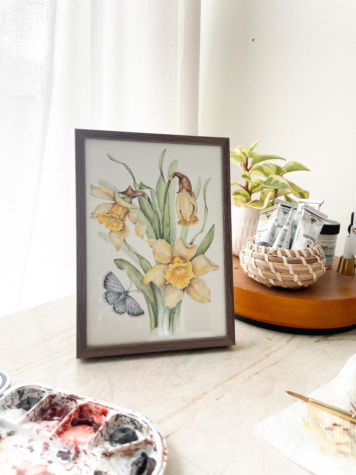
2. Put them in a Frame

Sarah Jane Art Studio

While Legion Artist Panels are stunning on their own, framing them can add an extra layer of sophistication. Our Artist Panel sizes are ideal for standard frame sizes. Opt for frames that complement the color palette of your artwork, or choose minimalist frames to let your art take center stage. Framing not only protects your artwork but also enhances its presence, making it a perfect option for formal presentations or spaces where you want to elevate the aesthetic.

3. Throw them on an Easel

Sarah Jane Art Studio

For an eye-catching and ever-changing display, why not showcase your art on an easel? This approach allows for flexibility, letting you switch out pieces or rotate your collection whenever inspiration strikes. Easels are particularly useful for open spaces like studios or galleries, where your artwork can be a focal point. By placing your Legion Artist Panels on an easel, you create a sense of immediacy and intimacy, as if your work is still in progress—an invitation for viewers to engage more closely with your creative process.

4. Hang them on your wall

Sometimes, simplicity is key. Hanging Legion Artist Panels directly on the wall creates a clean, modern display that puts the focus solely on the art. The panels' sleek design means they can be hung without the need for heavy hardware or framing, giving your space a minimalist and refined look. Whether you choose to feature one standout piece or arrange several in a grid, hanging your art is a timeless and straightforward way to share your work with others. Just make sure to use the right mounting hardware to ensure stability and longevity.

Here is one way we suggest hanging your panel on a wall.

Featured Artist: Mixed Media Artist, Rosi Tonaco

Tell us about yourself and you work.

My name is Rosi Tonaco and I am a mixed media artist. I have always been a creative person, passionate about everything from art to pattern design and fashion. Art gives me a sense of freedom of expression. I try to express things that are personal to me and relatable to other people. 

Five years ago I made the transition from a successful career in science to fully investing in my passion for the arts. I have always been fascinated by the power of colors, shapes and forms, and I have found that abstract art is the perfect way to express the complexity of the human experience.

My background in Artificial Intelligence (I hold both a Master degree and a PhD in that area) brings a unique perspective to my work, and I enjoy exploring the relationship between intellectual depth and artistic expression. I believe that art has the ability to transcend language, culture and time, and I strive to create pieces that evoke emotion, provoke thought and inspire connection.

My work has an experimental way and I’ve been exploring different styles and techniques. In my mixed media art, I use textures and colors to help express a mood or emotion. My creative process is purely organic, the work changes and grows gradually. Papers are adhered; paint is brushed or splashed; more paper is added; lines are drawn and so forth, until the image is satisfying to me.

Which papers did you test?

Stonehenge Aqua Black - CP 600gsm

Mirri Sparkle Silver 10pt

Mirri Sparkle Sunburst 16pt

Yupo Translucent

What was your process in testing these papers? 

I used the Mirri paper to cut some tropical leaves and flowers, the Yupo Translucent I painted with link and then also cut some leaves and the Stonehenge was used as the surface to my collage, I love the texture and the feeling of this paper.

Which paper(s) worked well for your work? What did you like about these papers?

Yupo translucent and Stonehenge Aqua are the ones I use the most, Yupo works great to paint and cutting the transparency adds a nice touch to the artwork. And the Stonehenge is a perfect surface to my mixed media work because it is heavy, has a Beautiful texture and holds nicely any watercolor details I want to add.

What are important characteristics of a paper for your particular kind of work?

I don’t usually use only one kind of paper, I often use at least three, one that can hold well layers of paint, the other one needs to be cut nicely and one with a beautiful texture.

follow rosi on instagram

APPLY TO THE LEGION ARTIST PROGRAM

The Story of Stonehenge

For the last 50 years, we’ve been in the room with some of the world’s greatest artists as they created some of their greatest works.

Many call us their foundation, their rock, yet we are neither mentor or muse, assistant or subject, collector or creator.

We are Stonehenge. One of the finest, most versatile, most universal, and most affordable 100% cotton papers the world has ever seen.

What did artists do before Stonehenge? They either spent a lot or settled for little. They had the choice of emptying their pockets and waiting for their crème-de-la-creme European fine art paper to find its way to them or settling for a surface that wasn’t right, compatible or worthy of their craft.

That’s why 50 years ago, Michael Ginsburg, Co-Founder of Legion, decided to create his own paper here in America. How did he do it? With initiative, technical expertise and by spending countless nights sleeping beside a paper machine.

First, he needed to find a mill that would help him make a very special paper: one that would be affordable while capturing the same qualities as the gold-standard, European fine art paper of the time. It would take an ungodly number of formulas, trials, and long nights; the only time the mill could squeeze in Michael and his dream.  

Of course, this new paper would need to be 100% cotton and feature deckled edges, unmatched sizing, and would never crack when pressed. He went back to that mill in New England 12 times that year to get it perfect.

And he did.

He named it Stonehenge, and the paper world would never be the same.

In the 80s, Michael and his partner, Lenny Levine, started by putting in a lot of work and shoe leather selling to individual artists, one-by-one.  After achieving groundswell, they then sought out two of the most influential sites for NY artists in the ‘80s: Pearl Paint and NY Central Supply. These art stores weren’t staffed with salespeople; they were staffed with artists that could make or break any new paint, pencil or paper. Well, turns out Michael and Len were on to something because those artists bought what they were selling, and they recommended it to ALL the artists.

And that’s when Stonehenge became the it-paper.

Stores loved it as it was easy to get, affordable and the results were unmatched. Artists started trying it out for printmaking. Did it work? Yes. Then they tried it for drawing and again, Stonehenge came through. Graphite? Colored pencils? Pastels? Yes, yes and yes.

And by that time, it wasn’t just a paper, it was THE paper of artists, amateur and professional. Same holds true today. Over the last 50 years, Legion has grown Stonehenge to become so much more. It has birthed new lines of paper in almost every size, color, and format, with every sheet conveying its legacy of value, quality, and excellence. With Stonehenge available to all, artists have thrived with a paper that doesn’t just do everything, it does everything exceptionally well. And it has to.

Because at Legion Paper, we believe that our artists deserve and will accept nothing less.

Block Printing on Stonehenge Kraft by Aftyn Shah

Silkscreen on Stonehenge by Serio Press

Colored Pencil on Stonehenge by Ester Roi

Featured Artist: Designer & Lettpress Printer, Alyssa Ingham

Tell us about yourself and you work.

I’m Alyssa Ingham and I’m a graphic designer, illustrator and hand lettering artist hailing from Houston, TX. My work doesn’t really fit into one particular style, but nature, spirituality, and music are huge sources of inspiration. I enjoy deep-diving into a medium for some time and then move on, holding onto the bits I enjoyed most. Right now, I keep coming back to letterpress printing – it’s such a beautiful process that requires such a high level of attention, and I love being able to offer it to clients as an option for their design needs. 

Instagram: @alyssa_ingham

Which papers did you test?

I tested out most of the papers from the Letterpress and Thick Paper Collections.

What was your process in testing these papers? 

For the letterpress papers, I used my Chandler & Price letterpress to see out how well each paper held a blind (no ink) impression.

With the thick papers, I used a small DIY press, black ink, and woodcut to print out artwork. Then, I compared the results, focusing on quality of texture and how ink interacted with paper.

Which paper(s) worked well for your work? what did you like about these papers?

I really enjoyed the Arches Cover! It has such a lovely and subtle texture to it, sturdy, yet still able hold ink well when printing by hand. And of course, I love the Lettra, which has been a staple for me in past projects. I’ll definitely be adding the Arches into my favorites for future use.

What are important characteristics of a paper for your particular kind of work?

The paper I work with needs to be substantial and sturdy, as my projects tend to be physical items- like posters or wedding invitations. Ideally, they would also have a nice tactile feel to them that adds to the design without distracting.

 Anything else you would like to include!

When there’s time, I have a side project where I design and print really tiny posters. I’ve made ten so far and hope to make even more. If you’d like to take a look, you can follow @project_tiny_type on Instagram.

Featured Artist: Watercolor & Charcoal Artist, Jennifer Annesley

About Jennifer.

I am a full-time Canadian painter working primarily with watercolour and/or charcoal on paper, with the goal of creating expressive, luminous and finely detailed paintings of historic architecture, landscape and still life. My professional art career began in 1989 after graduating with Bachelor of Fine Arts from the University of Alberta. My paintings are exhibited and collected worldwide, have received significant awards, and are included in many curated fine art publications. I am an elected member the Canadian Society of Painters in Watercolour (CSPWC), the American Watercolor Society (AWS), and Signature Member of the Federation of Canadian Artists (FCA). I regularly serve as critic and jurist for many arts organizations, served on the board of the CSPWC as director and was Chairperson for the CSPWC’s 96th Annual International Open Exhibition. My work has been represented by prominent Canadian Galleries since 1989, including Canada House Gallery in Banff, Alberta (since 2009.) One of my proudest accomplishments of 2023 is reaching the 30th anniversary of my annual one-night solo exhibition held in Edmonton Alberta since 1994.

“Europe on Time”

Watercolour, Arches CP 640gsm 28 x 40”

“Winter Encore”

Watercolour, Arches HP 640gsm 24 x 36”

My process begins by searching or waiting for light in urban and wilderness landscapes through travel and backcountry exploration, gathering reference and details with a camera and notebook. Back in the studio, the design and drawing stages are the foundation of each work. My technique includes everything from undiluted paint to thin washes, dry brush to wet-in-wet application, and single strokes to repeated layers. Finished paintings take from several days to several weeks depending on size, detail, and depth of colour and complexity of execution.

“Paradise Valley” Charcoal & Gouache, 42 x 15.5” Stonehenge

Which papers did you test?

Since I already use Arches and Stonehenge, I tried the following papers:

Acquerello Italia CP

Coventry Medium 320 gsm

Coventry Smooth 335 gsm

Bockingford CP 200 lb. white

Lanaquarelle Smooth 1114 lb. white

Lanaquarelle CP 1114 lb. white

Legion Bamboo 530 gsm white

Saunders Waterford CP 300 lb. White

Saunders Waterford CP 200 lb. High White

Saunders Waterford smooth 300 lb. High White

Saunders Waterford smooth 200 lb. White

Stonehenge Aqua 275 lb HP white

All of these papers are considered archival, PH Neutral, and made of 100% cotton (except for the Bockingford which is High alpha Cellulose, and the Legion Bamboo.)

To test the papers, I lined them up and used a single stroke of the primary colours across all, as well as pencil marks and charcoal so I could do a side-by-side comparison of the effects. Then I painted patches of paint on the front side, and painted wet-in-wet with the same colours on the other side. This allowed me to compare how the paint applies to the paper, how colour reacts with and appears on the paper, how much lifting, erasing and scrubbing are tolerated, and after leaving them to dry over night, how flat the papers stay.

Next, I made a shortlist of four papers to make four small paintings in order to more completely test their characteristics. I chose still life as the genre as it works well for small paintings, and completed two watercolours, one charcoal and one combination.

Which paper(s) worked well for your work? what did you like about these papers?

“Night Music” Watercolour, 7.5 x 7.5”

Lanaquarelle Hot Press White 640 gsm

I enjoyed this paper the most for its balance of absorbency and lift, the velvety refined texture and bright but warm white colour. It did not warp, and the surface integrity remained intact with erasing and lifting. Edges were easy to blend, lifting was clean, and the colours appear vibrant.


“Map & Compass” Watercolour, 7.5 x 7.5”

Saunders Hot Press High White 300

Though I liked the surface texture, I found the paint lifted too easily, and so I would not choose this for larger paintings. The creamy colour is useful for the right image, and lends to the warmth of the parchment map in this painting, but would not be my first choice for paintings needing a brighter white. I will try a charcoal on this paper in the future as I think it has the right tooth and texture.


“Silvered Sugar” Watercolour, 7.5 x 7.5”

Stonehenge Aqua Hot Press White 550 gsm

I liked the bright smooth texture for fine crisp detail when using wet brushed charcoal, and the bright white colour which results in clean specular highlights. The hot press doesn’t have quite enough tooth to hold dry charcoal for the deepest blacks, so I will try the cold press next time. The surface tended to pill with scrubbing, erasing and burnishing. (I am rather tough on paper!)


“Operetta” Watercolour, 7.5 x 7.5”

Legion Bamboo 530 gsm

The slightly ivory colour & luxurious feel and weight of this paper is lovely. For me it doesn’t have quite enough absorbency for layering colour, and slightly too much texture for the smooth effects I try to achieve with charcoal. Though it is not an optimum paper for my particular style of painting, I appreciate the use of alternative fibers to produce artist’s quality materials, and I look forward to learning about more innovations in the industry.


What are important characteristics of a paper for your particular kind of work?

  1. Acid-free archival quality paper is a pre-requisite to any paper or surface I use.

  2. Size is always a consideration as I work outside the usual full or half sheets, so I prefer the largest sheets I can get (eg. Arches 40 x 60” 1114 lb, 640 gsm) and always have a roll of Arches on hand.

  3. Sizing: the right balance of absorbency and lift is critical for my technique of repeated washes/ glazing, direct undiluted application and the ability to remove paint for highlights, soften edges or correct mistakes. The paper needs to hold the previous layer enough to allow subsequent layers to be be applied without removing the first layer to achieve luminosity, saturation and a full range of values.

  4. Surface strength: needs to withstand repeated washes, scrubbing, lifting, and erasing without pilling, damage to the surface, or pencil imprints. If using charcoal, the paper also has to withstand the physical application of charcoal with a variety of tools, whether applied directly or with a stomp, fingers, fabric, paper towel, etc…

  5. Texture: I look for certain textures depending on size and subject matter. Generally, I prefer a smoother surface for fine details (still life and refined archicture) and more texture for larger less precise imagery.

  6. Tooth: For charcoal, the paper needs to have the enough tooth for the charcoal to adhere but still be erased.

  7. Stability (dimensional strength) : I prefer a heavy paper that will not cockle with application of water (640 gsm is preferable.) That being said, I soak and stretch all papers regardless of weight to ensure a flat painting.

  8. Colour & brightness: Since watercolour is transparent, the paper colour is part of the paint palette and its brightness is a determinant in creating lumosity and highlights. I gravitate to bright paper with slightly warm undertones.

“Age of Steam” Watercolour, 26 x 39”

Arches CP 640 gsm

What will be your go-to paper moving forward?

I have used Arches hot and cold press papers as well as Stonehenge drawing paper for the past 35 years and will continue to do so. However as a result of this experiment, I look forward to adding the Lanaquarelle hot press 640 gsm for smaller and highly detailed paintings and the Saunders Waterford smooth for charcoal work.

“As a professional working artist, deadlines and demand can be barriers to experimentation. Most often, “tried and true” wins out over experimentation due to time, cost and maybe also fear of the unknown. As any artist does, I know what I like in terms of materials, however I haven’t really thought of why. This partnership with Legion has afforded me the opportunity to experiment with new papers, to think more deeply about what I’m trying to achieve in my work and appreciate how important materials are in process and outcome.”

Learn more about Jennifer Annesley’s work.

Learn more about our Artist Program.