Art is about connections. Between structure and the whole, ideas and the viewer, the medium and the maker. No matter what the piece of art, all of its elements must work together. Everything must be connected.
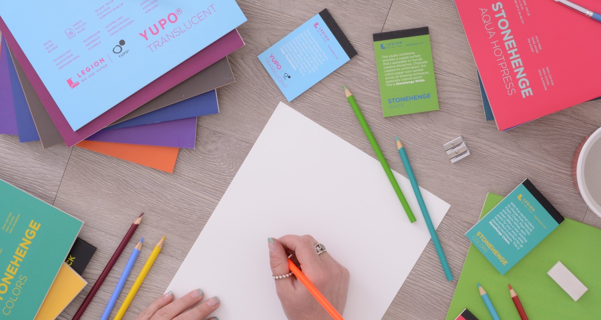
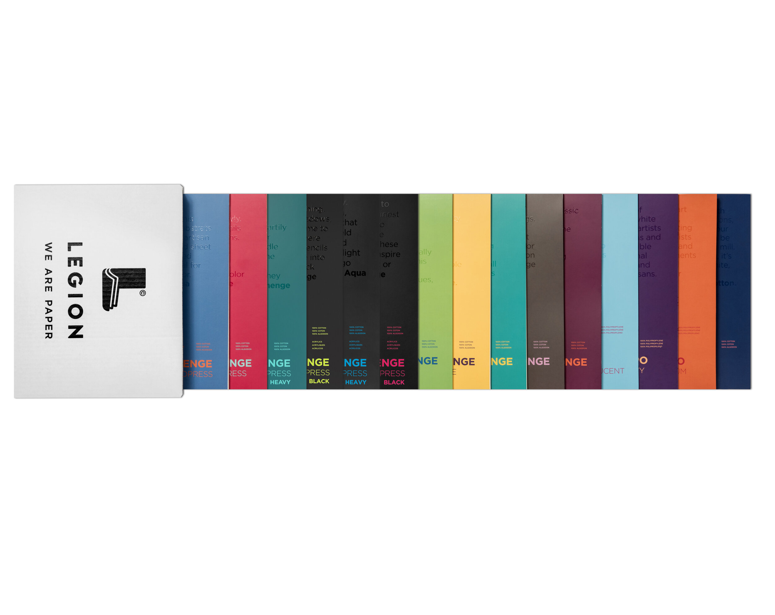
At Legion, our art is paper. And now we are proud to announce our new redesign, a bold disruptive look that takes three of our papers, new and old, and connects them so you know that you are getting the quality, consistency and substance you demand for your art.
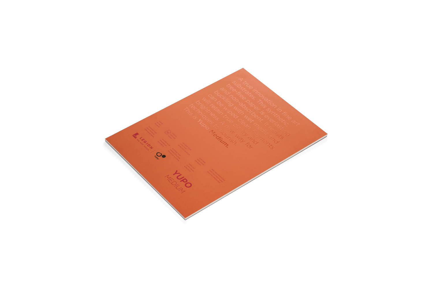
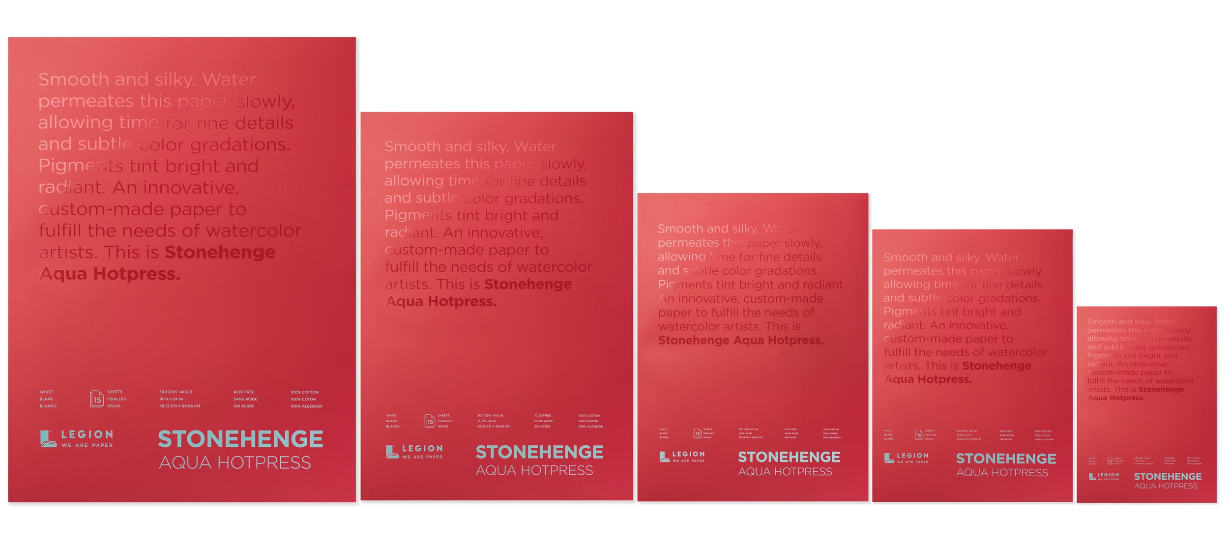
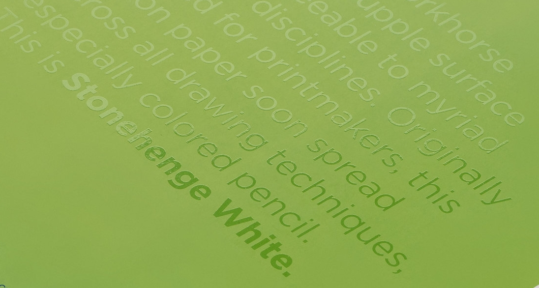
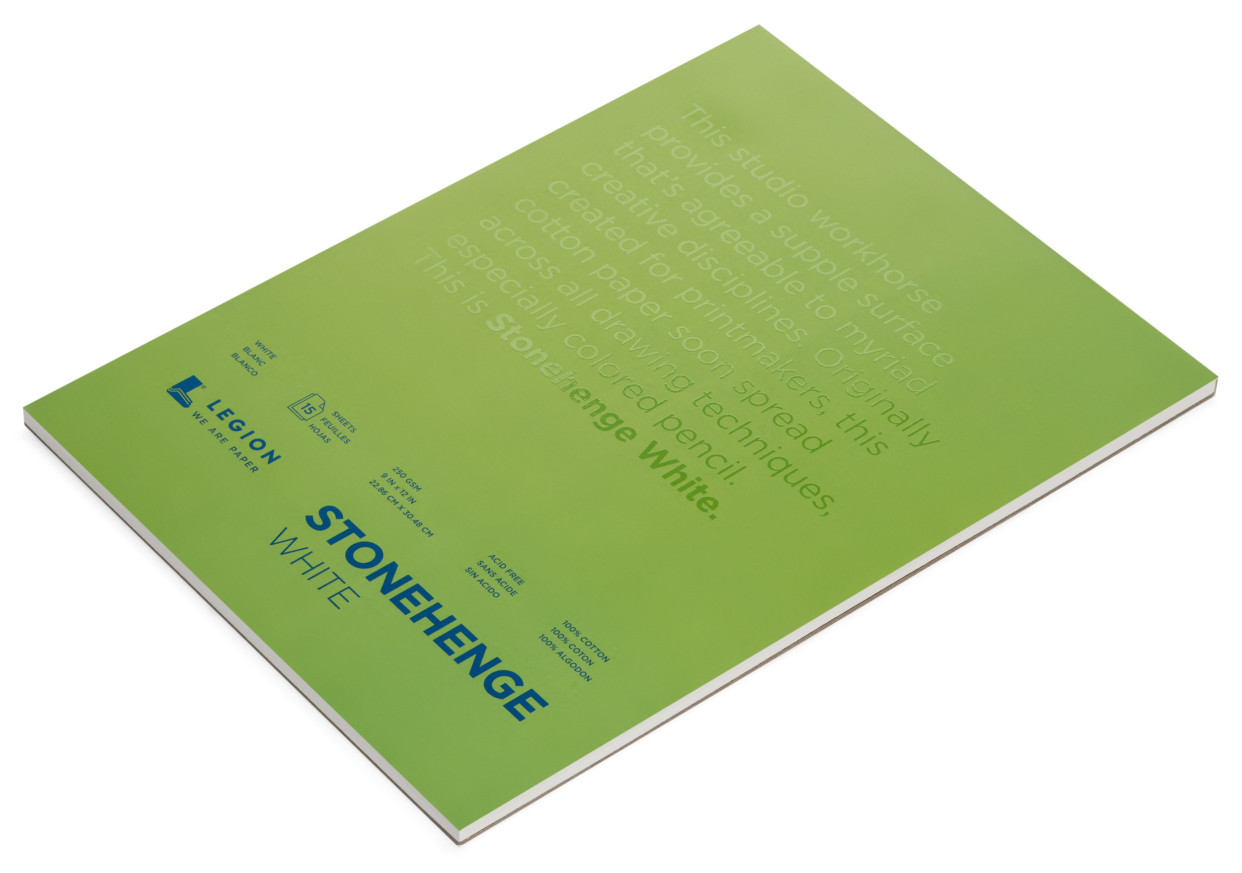
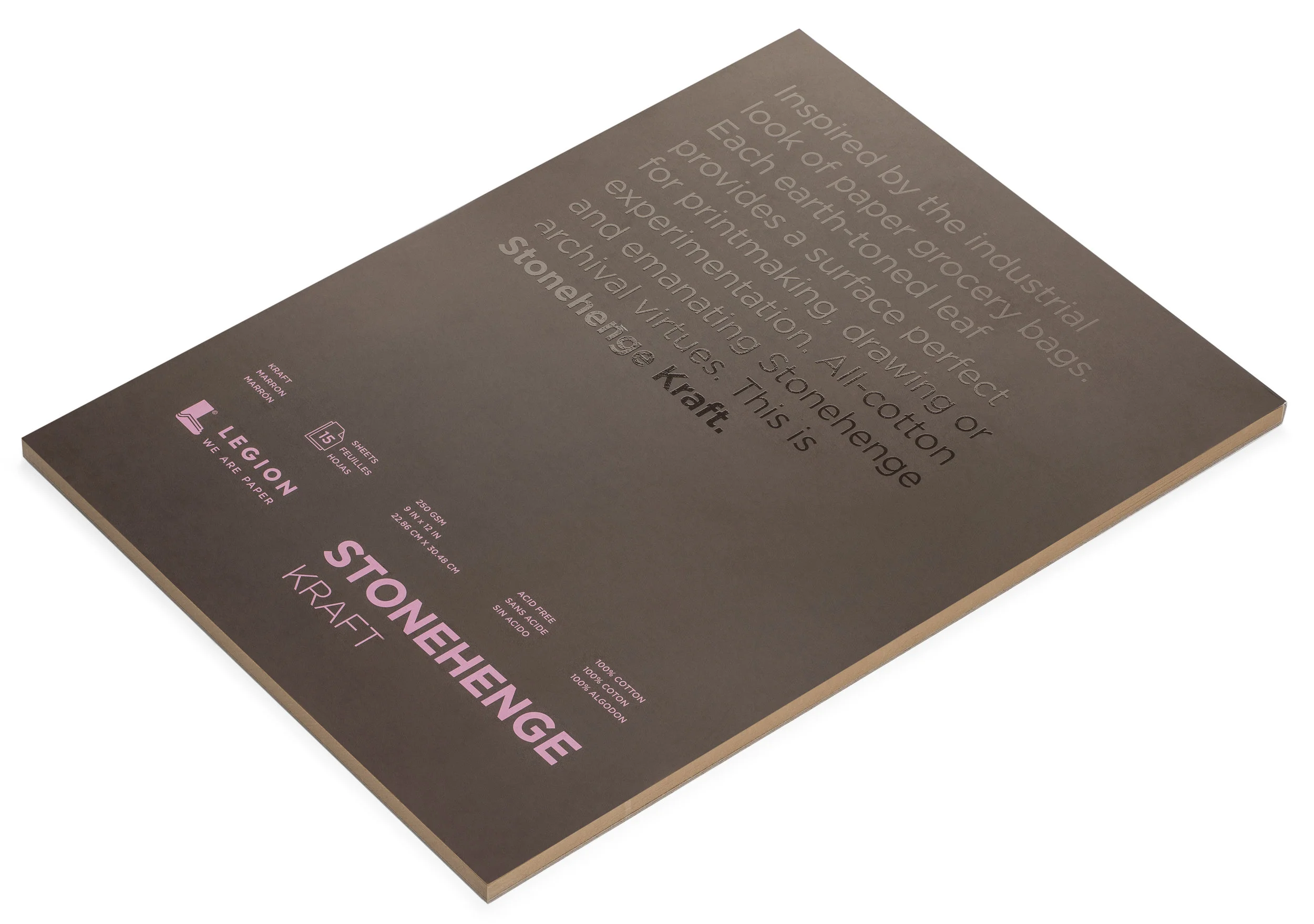
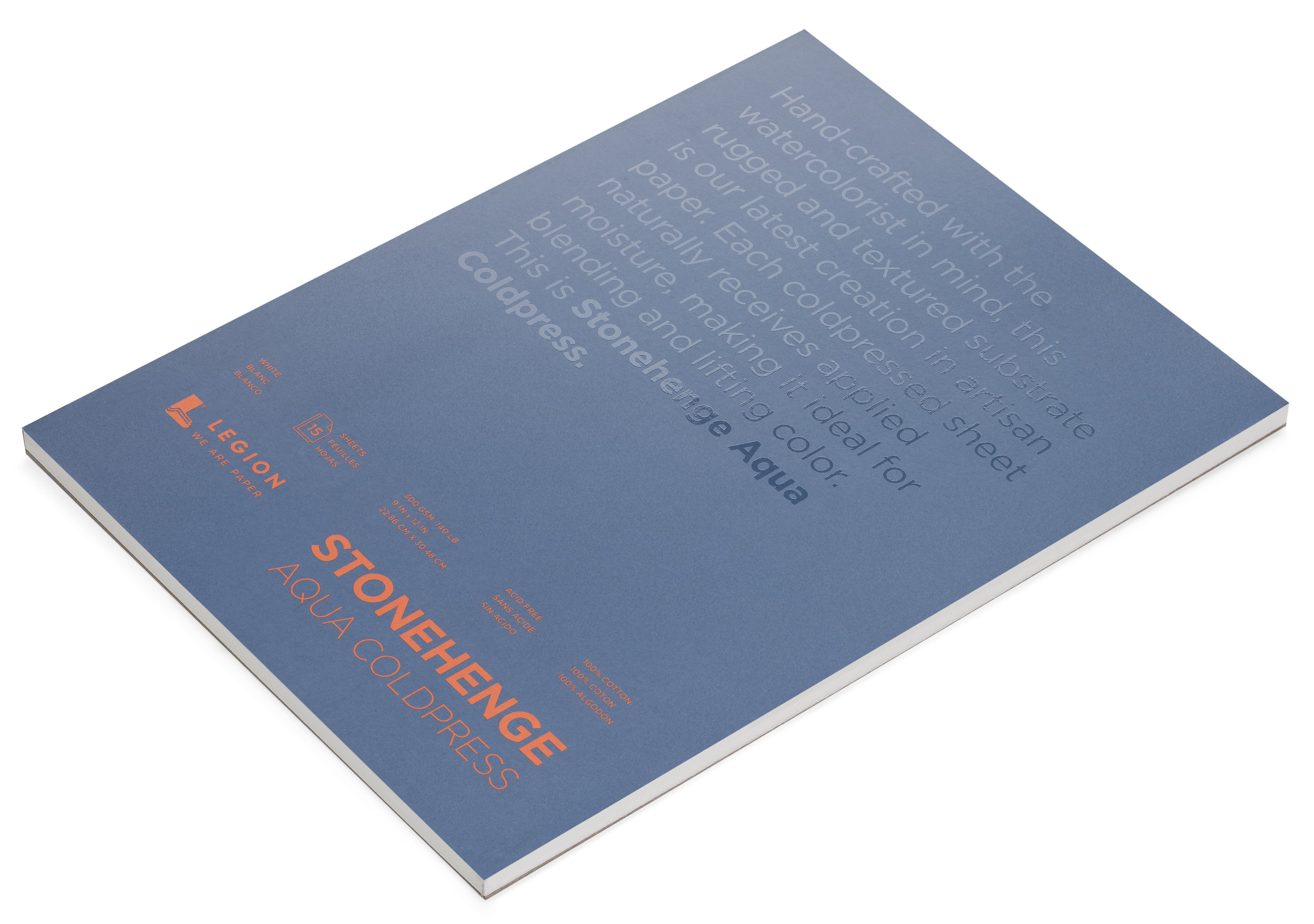
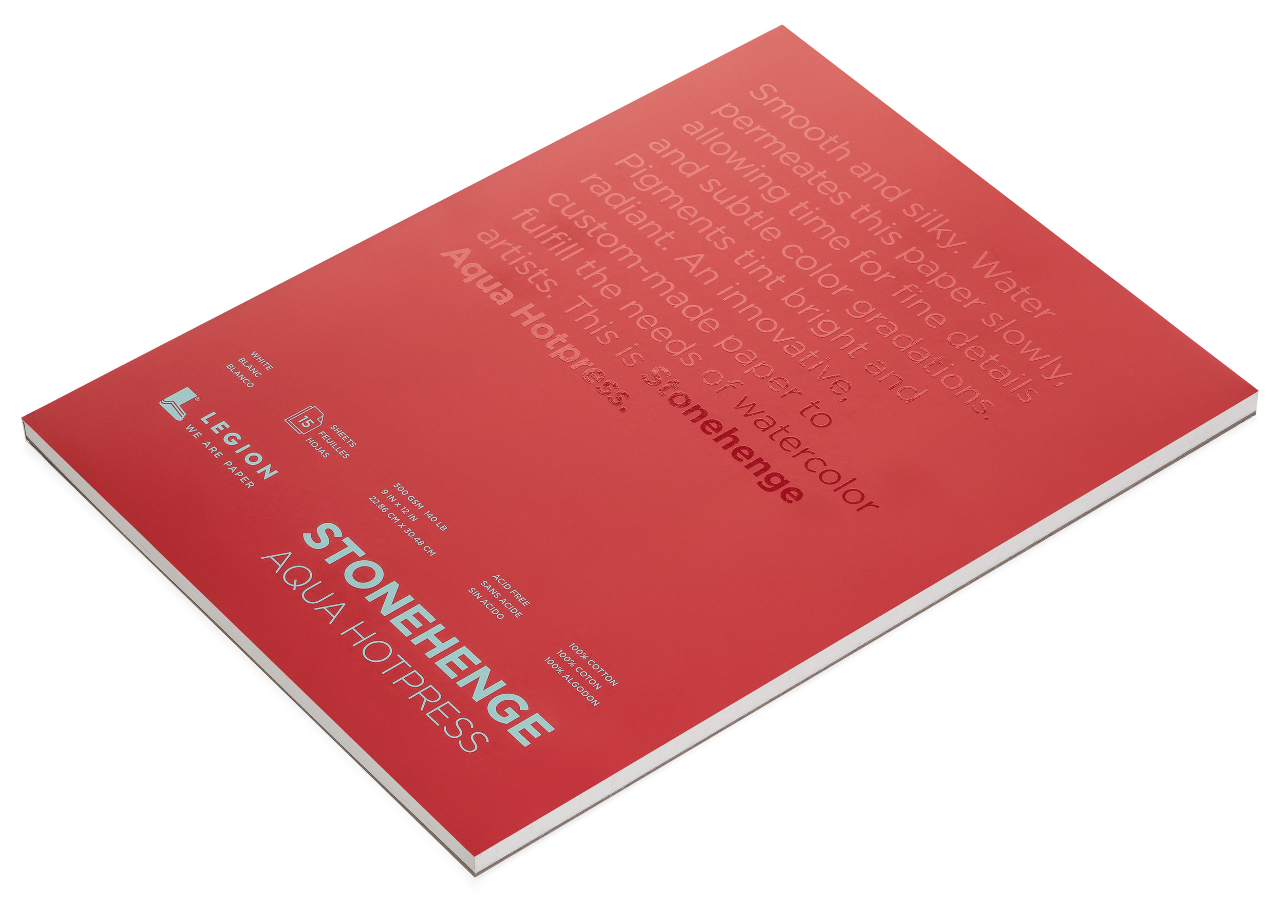
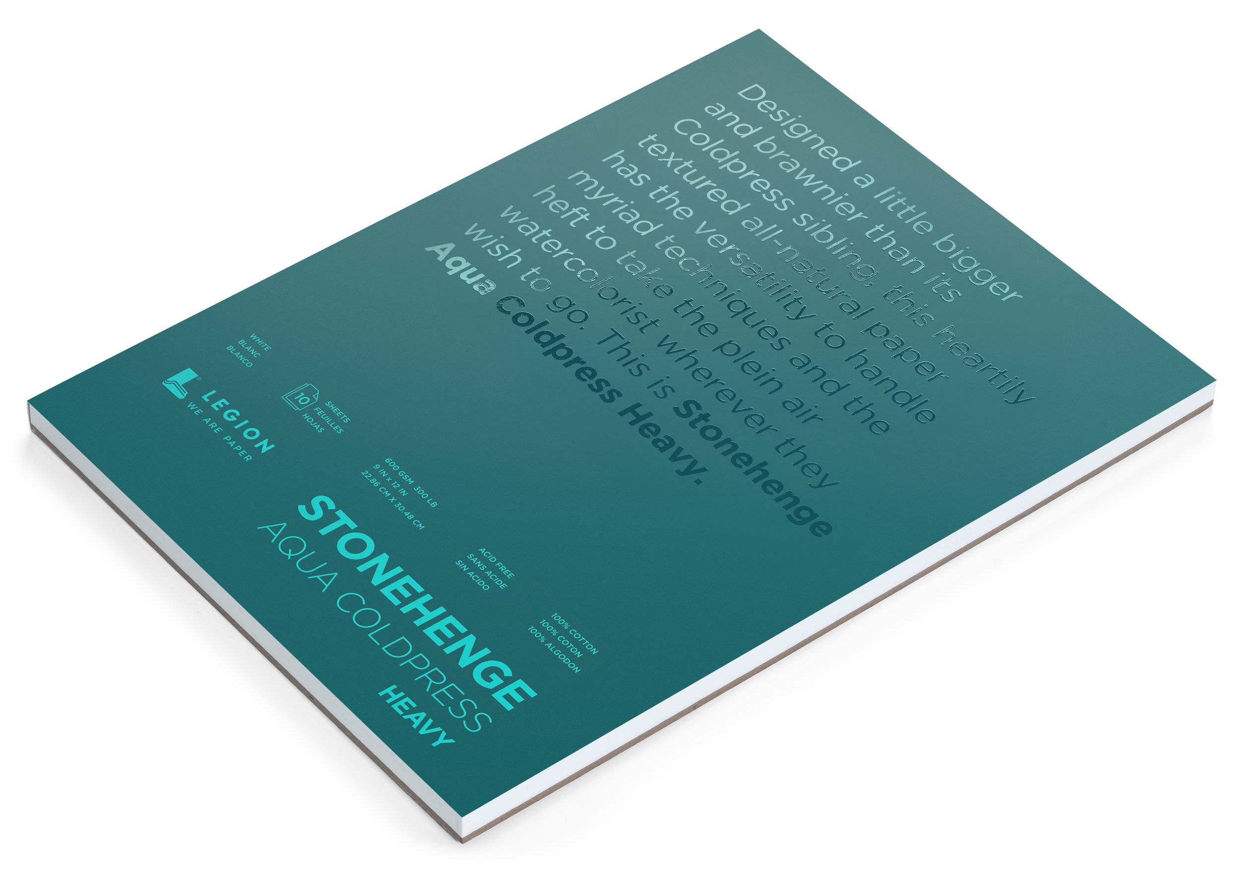
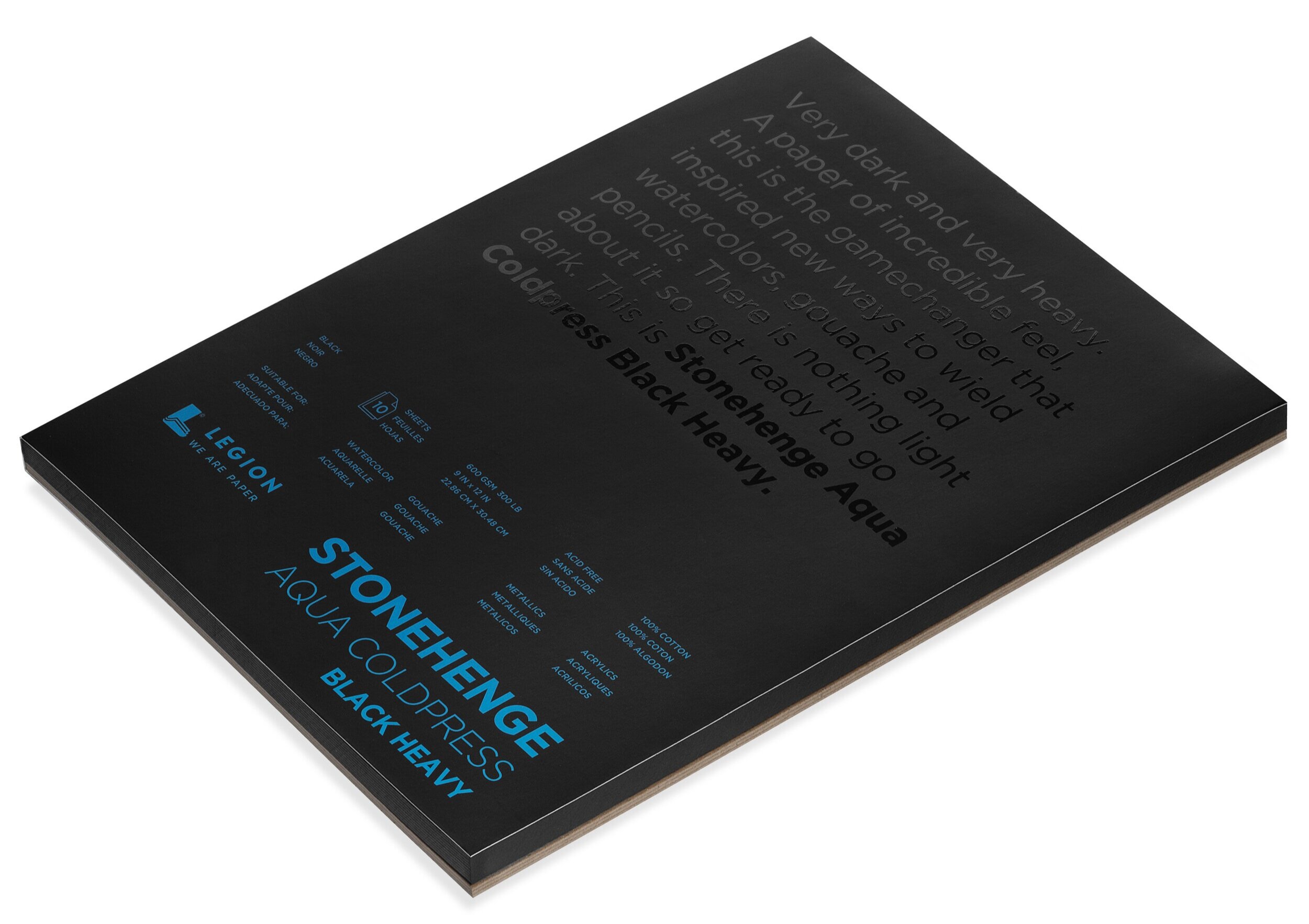
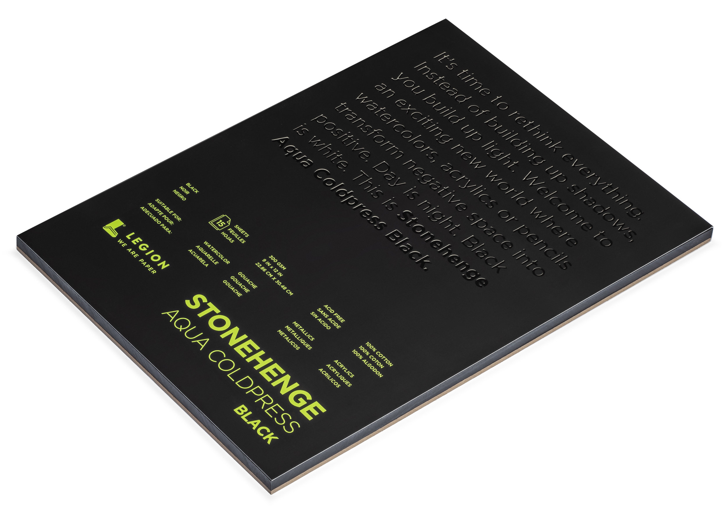
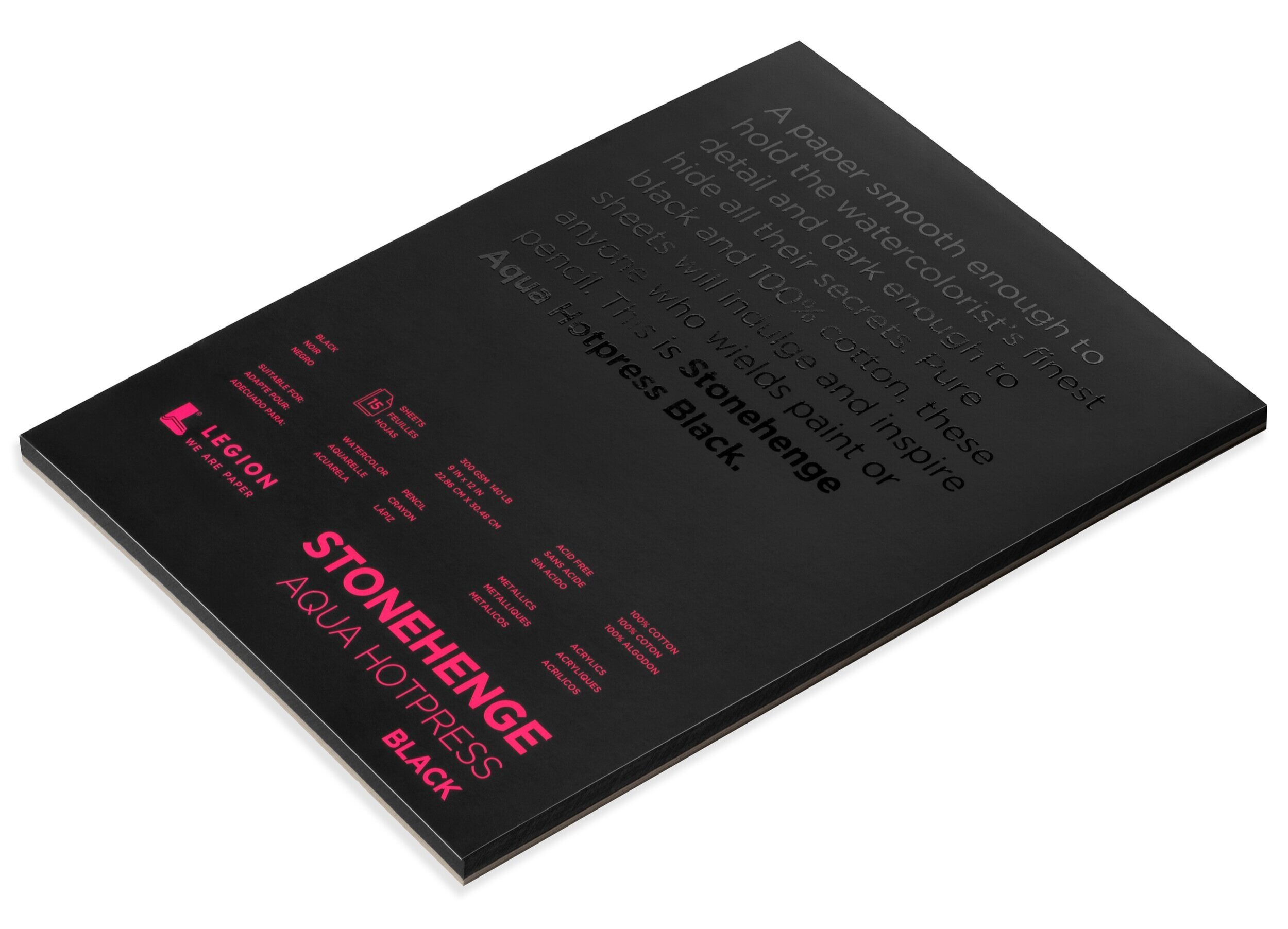
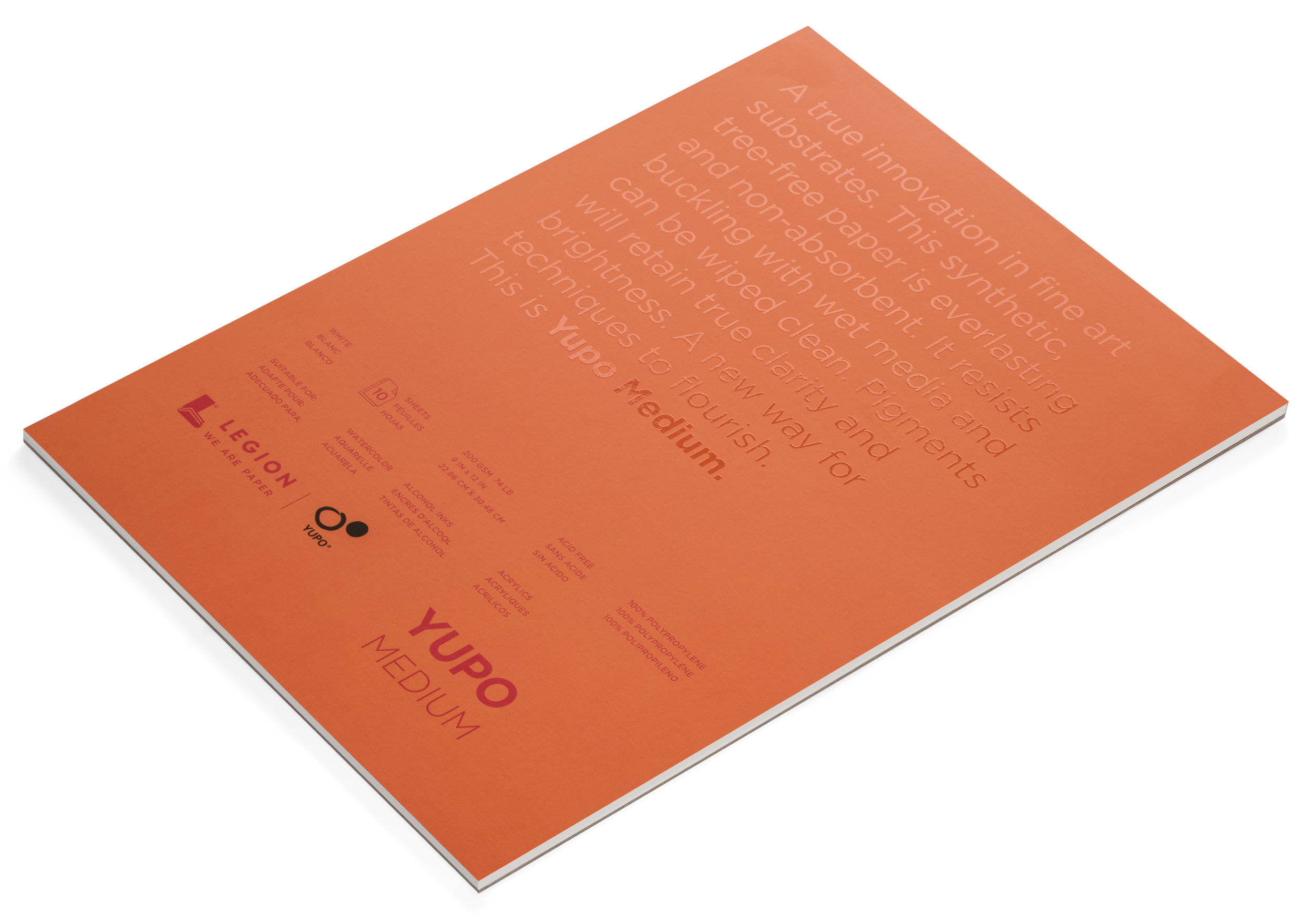
It was time to break tradition. To create something the market had never touched upon. The design-savvy covers strip away the clutter of conventional pad covers, using a varnish text against a solid background color to capture the attention of the artist without being intrusive. Designed for the artist’s eye, the clean, bold type tells you the paper, a beautiful gloss overlay paints an ephemeral verbal picture of exactly what that paper can do.
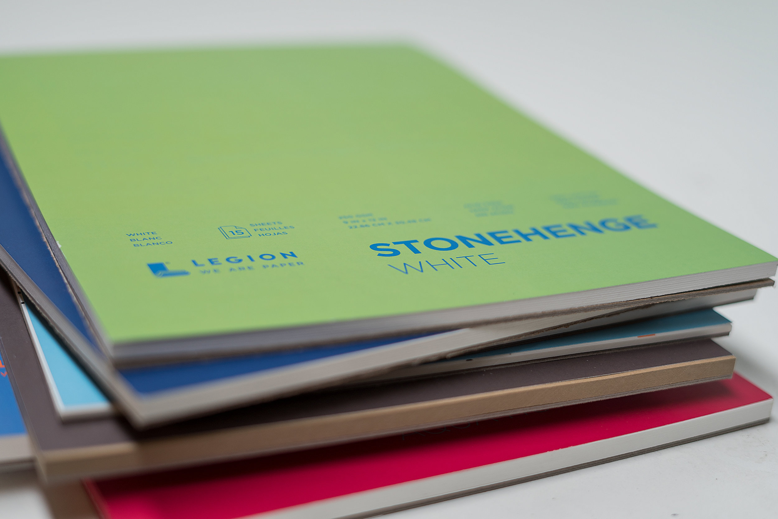
Orange on purple? That’s Stonehenge Light. Red on orange? That’s Yupo Medium. And so on and so forth. The papers haven’t changed, we’ve just made it easier for you to find them on the shelf and given them a look you'd be proud to leave out in your studio or on your coffee table.
Together, all these covers will connect all of our brands under an umbrella that any novice can recognize and any artist can appreciate. And connections are what it’s all about. We are Legion. We are paper.

