Art is about connections. Between structure and the whole, ideas and the viewer, the medium and the maker. No matter what the piece of art, all of its elements must work together. Everything must be connected.
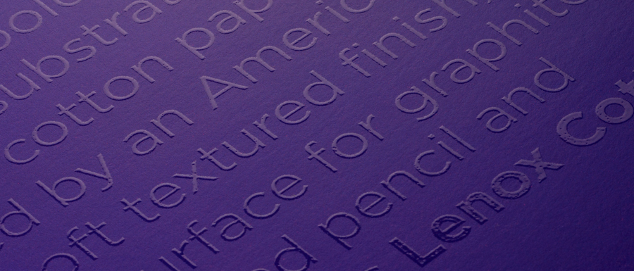
At Legion, our art is paper. And now we are proud to announce our new redesign, a bold disruptive look that takes three of our papers, new and old, and connects them so you know that you are getting the quality, consistency and substance you demand for your art.
It was time to break tradition. To create something the market had never touched upon. The design-savvy covers strip away the clutter of conventional pad covers, using a varnish text against a solid background color to capture the attention of the artist without being intrusive. Designed for the artist’s eye, the clean, bold type tells you the paper, a beautiful gloss overlay paints an ephemeral verbal picture of exactly what that paper can do.
Orange on purple? That’s Stonehenge Light. Red on orange? That’s Yupo Medium. And so on and so forth. The papers haven’t changed, we’ve just made it easier for you to find them on the shelf and given them a look you'd be proud to leave out in your studio or on your coffee table.
Together, all these covers will connect all of our brands under an umbrella that any novice can recognize and any artist can appreciate. And connections are what it’s all about.
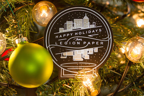
This holiday season, we had the pleasure in working with designer Jennet Liaw and printer Mama's Sauce to create our holiday card. We were determined to send a card that wasn't immediately tossed!
What was the directive from Legion and how did you translate that to your design?
[Jennet Liaw, designer] The brief was very open-ended, which made it great fun for me to design completely from the direction of spotlighting the paper itself, and to play with printing technique choices - this is something clients are often stingy on. With great suggestions from Nick and Hogan, I knew I wanted to apply a foil, as well as make a die cut, so I kept the stroke weight simple and illustrative to balance out those techniques into the clean aesthetic that I personally like.. made extra special for the holidays with sparkle and shine.
Did you revolve your design around the paper or the other way around? If so, how did the paper inspire the design? /The base paper is Sirio Ultrablack – by all accounts the blackest paper we’ve ever seen – how did that affect the design?
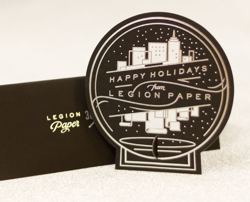
[JL] It seemed counterintuitive at first to use the blackest black to create a card for the holidays, a time usually associated with festive reds and greens, or warmth and earthiness. But it was an opportunity to create a high contrast effect, perfect to show off just how incredibly black Legion's paper was, and how beautifully bright the white/foil that Mama's printing would create. I enjoyed that the final product was a gently alternative take on the holidays - crisp like the wintry air and festive in a clean way.
What print methods did you use and what worked well with the paper? Were there any particular challenges?
[Hogan Birney, printer] We ended up choosing Hot Foil Stamping for the entire piece as it is the best way to letterpress light colors on dark papers. The metallic foils work great as they cover very nicely and provide that shine that foil stamping is known for. A shine that works really well with the holiday theme and we knew would tie in with the Mirri Sparkle Paper. White foil is a bit tricky on dark papers and larger coverage areas, but since this piece was run 1 at a time, we had some flexibility and were able to get the white foil looking great.
We know you were a little hesitant in using the Mirri Sparkle. Having worked with it – what are your feelings now, both in terms of design and in terms of working with it in production? Would you use it/recommend it again?
[JL] It's an incredible paper. I had shoved the folder of samples in my suitcase to review while traveling, and when I casually drew out the Sparkle at the airport, it turned literally heads. After working with it, I know that a dominant paper like that can't be a second thought or late decision - it's definitely the star. I'm a believer in going full force, all the way, with any design decision - if sparkle is the goal, Mirri Sparkle is an awesome choice.
What finishing did you use and what worked well with the paper?
[HB] The cards were trimmed using a custom cutting die, created to mimic the shape of a snow globe. The card size and design direction that Jennet took allowed us to use the exterior portions for a border that would incorporate punch-out directions and a stand for creating a sort of 3 dimensional snow globe. The Sirio Black mounted to the Mirri Sparkle die cut extremely well due to its dense nature and slightly coated surface on the sparkle side. Being that it was a thicker paper, the die cut created a nice bevel on the face side of the card.
Designing for a paper company – where the goal is to highlight the paper as well as the company – does that change your process at all?
[JL] Definitely - there's a place in everyone's heart for NYC, where Legion is based, so a subtle snow globe format was the perfect setting. Having that in mind also offered an opportunity for me to play with the forms of the iconic skyline - As I looked through images of the NY skyline over the water, I was inspired to put a twist on it by reflecting the buildings as scrolls of Legion paper - the star of the whole project. Also, if you look closely, the background pattern of the card has Legion's logo woven into each corner (one of which punches out to become the "foot" of the standing globe)
Anything else you think is important to include that the design community might want to know?
[HB] I think that it is important to note what can really be done with a simple piece. This is only a 2/0 (2 color on one side only print) that has a very dynamic and interesting look. By using different paper colors mounted together and making great use of the space from a design standpoint, it opens up room for the materials and process to really shine. Its very easy to get caught up in trying to get 4 colors on one side and 2 on the other that are printed, but by keeping things simple, not only does it help with production consistency with processes like ours, but it also helps with your production costs without sacrificing a unique look.
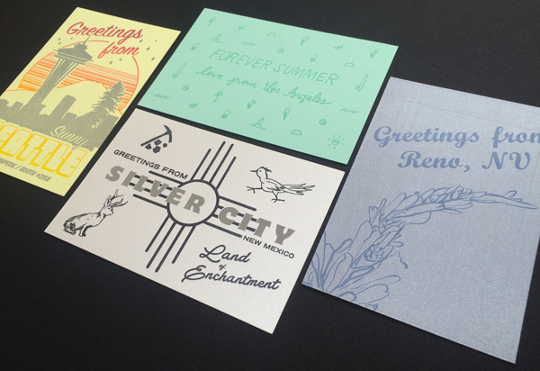
It's that time again for the 5th annual National Stationery Show project.
Organized by Flywheel Press and sponsored by Legion, we are estatic to announce this year will be post cards from around the world. As 23 of our diverse range of fine art papers went out, 23 designers will return them in the style of the location chosen.
As done in the past, attendees of the National Stationery Show will paticiapte in a scavenger hunt to collect the post cards from the booths of the designers. After collecting the set of cards, come by Legions Booth (2774) to store your cards away in the packaging done by Flywheel Press.
The National Stationery Show is right around the corner. Stay tuned on the Legion Blog, Facebook and Twitter for more information as the post cards fly in from around the world.