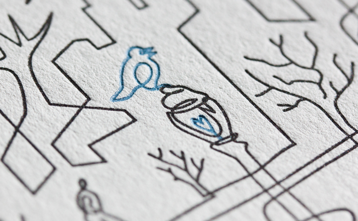
James Cropper, one of the UK's oldest paper companies, introduces Wallpaper* blue, the new colour developed by creative director Sarah Douglas.
The new hue – an unusual dark petrol blue – first made its appearance in a slightly different form when Sarah specified a palette of 12 new colours as part of Wallpaper*’s 2013 redesign. ‘I wanted to develop it further,’ she explains, ‘and the opportunity to work with James Cropper came at just the right time.’
The family-owned company, founded in 1845 and based in the Lake District village of Burneside, is one of the world’s leading producers of coloured and specialist papers, and works with many of the biggest brands in fashion and design – but this is the first time they’ve developed a bespoke paper for a magazine. ‘It’s been a really fruitful collaboration,’ Sarah says, ‘and I’ve loved meeting people who are so passionate about what they do.’
Working closely with current chairman Mark Cropper and his colour specialists, Sarah explored the possibilities of the existing blue, and ended up taking it in a subtly new direction. As she says, ‘The new Wallpaper* paper colour may look at first glance like a dark, almost navy blue, but it also contains a surprising amount of yellow, which gives it added richness and warmth. It feels modern and has a certain austerity, but it’s also a strong colour that to me feels very Wallpaper* and really reflects the strength of the brand.’
The new paper colour is already being used for all Wallpaper* stationery, but there are also plans afoot to launch a range of Wallpaper* notebooks in the same hue: watch this space.