Blog | Legion Paper

mirri

Arsenal Handicraft Uses Mirri Sparkle for Space Walk Silkscreen

arsenal-handicraft-about-us-page_1000x.jpg

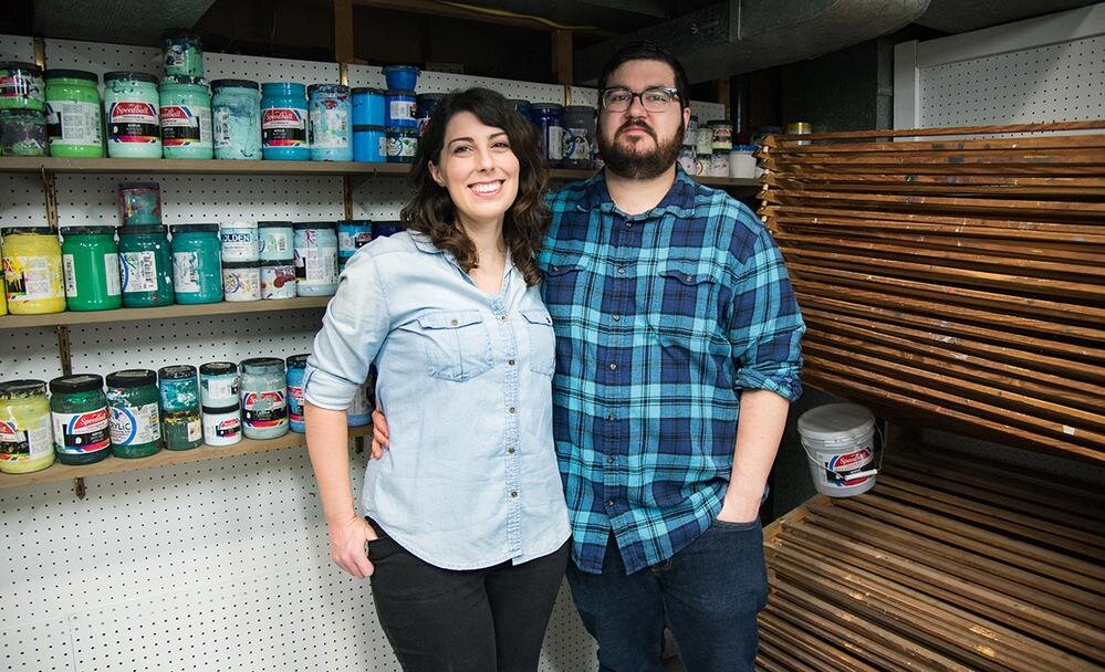
Who is Arsenal Handicraft? Tell us about yourself.

Arsenal Handicraft is husband and wife illustration / screen printing duo Dennis and Christina Jacobs. We work out of our home studio in Madison Heights, just outside of Detroit, MI. We've been printmakers for about 12 years and the first thing we screen printed was our wedding invitations. In addition to art prints we have previously worked on concert posters, album artwork, book covers, and most recently beer labels.

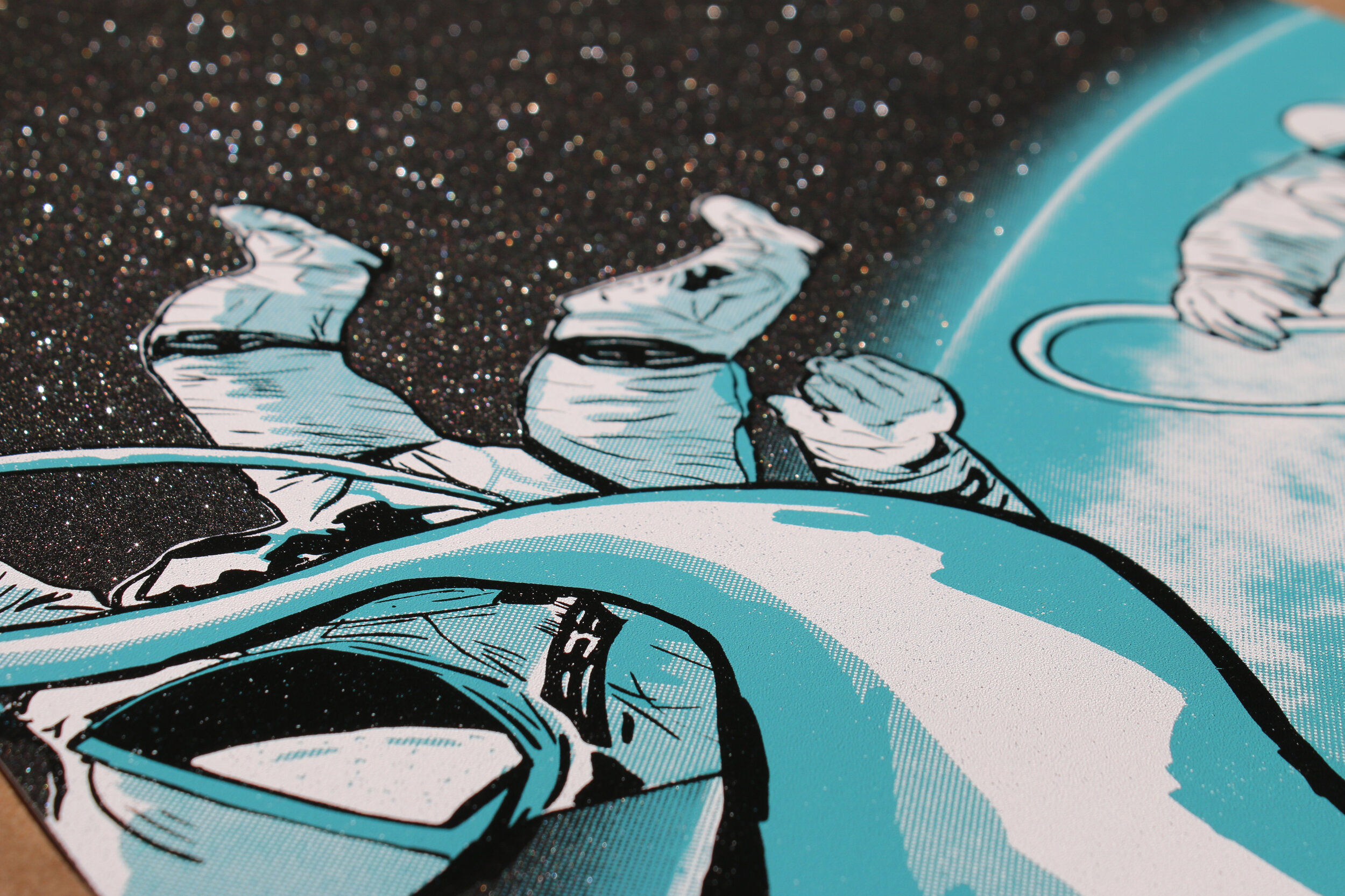
What materials did you use for the recent screen print, ‘Tethered’?

We used Mirri Black Diamond Sparkle Paper and Speedball acrylic screen printing ink.  We design and print everything in house, which allows us to experiment with different pigments and materials, such as this Mirri paper.

silver variant.jpg

Why did you choose Mirri Sparkle for this project?

We've recently been experimenting by printing on different surfaces and mediums.  When we came across the Mirri Sparkle paper, we knew it'd be perfect for a space themed print, which is often the subject matter of our prints.  It looks like outer space littered with stars and adds so much depth to the image.

silver close up 1.JPG
close up 2.jpg

What was your process for creating ‘Tethered’?

Since we knew we wanted to make the most of the glittery finish of Mirri Sparkle paper, we wanted to leave much of the paper exposed.  With this in mind we started by thumbnailing different concepts, landing on this image of two astronauts on a space walk.  It was ultimately Christina's thumbnail that we developed into the final composition.  Once the thumbnail was finalized Christina chose the ink colors, and Dennis began illustrating the full rendering for the print.  During the illustration process we have a bit of a back and forth to make sure we both like the direction it is heading.  Once finished the artwork was separated into three ink layers, white, blue, and black.  These are then outputted to film for use in burning our screens.  Once the screens are made, Christina got to work on mixing the ink colors.  These were printed by us with Dennis pulling the squeegee and Christina racking the paper.

Were there any challenges using Mirri Sparkle for a screen print?

This was our first time experimenting with a paper such as this and we were super happy with the results!  We did notice that the ink sits on top of the paper more than being absorbed, which resulted in slightly longer drying times.  We also noticed that the paper grew a bit when we were printing a large flood of ink.  This is normal, we just approached it by printing one color per day, which allowed for the paper to dry and relax.

What projects are coming up next?

We are currently entering our Fall show season.  Over the next few months we will be set up at various art fairs around the Midwest selling our screen prints.  Additionally, we are working on a poster for Artcrank, a bicycle themed art show held in Minneapolis this September.  We are also working on another print using Mirri Sparkle paper, this time with Mirri Twilight Sparkle.  

4 New Papers You'll Love for Packaging

The purpose of packaging is not just to protect the product inside, but also to create demand, hint at the quality of its contents and reflect the brand it represents. The design – not just visual but tactile as well - that can be achieved with paper can make the entire experience from first look, opening and to disposal or storage a wonderful experience.

  1. Mohawk Renewal

    Renewal was born out of a desire to redefine the contours of how we source fiber and expand the existing definition of sustainable papermaking. By rediscovering old fiber sources like hemp, straw and cotton rag, we uncovered a new path forward. You might say we looked to the past to discover the future.

    Choose from 3 renewable fibers in 7 colors and 2 gorgeous finishes. Each shade tells its own origin story and breaks new ground in the responsible creation of world-class, fine papers.

    HEMP- Unlike trees, Hemp grows rapidly, maturing in as few as 90 days. Turning hemp into pulp requires less chemicals, water, and energy than wood.

    RECYCLED COTTON- Made from t-shirt and denim scraps diverted from the 10.5 million tons of clothing waste Americans send to landfills every year.

    STRAW- Making paper with straw eliminates the need for the annual "fall burns" set by farmers to clear straw from their fields, creating acrid smoke and carbon emissions.

2. Mirri Lava

Mirri Lava is a wash with color in a random wave-like pattern similar to that of lava. This highly decorative paper is available in a variety of colors in a matte finish.

Manufactured using an exceptionally high quality film, the brightness of the metalized surface provides a mirror finish which is further enhanced by the smoothness of the cast-coated board to which it is laminated. With the metalized surface protected by a polyester film, this construction has a high surface energy that offers an excellent key for inks and adhesives. 

3. Timberluxe

Whether you choose Cherry or Birch, it’s a paper that constantly reminds you that it’s not just a wood in name. It has everything: The grain, the knots, the perfect “imperfections”, the texture, and perhaps most important, the feel. You’ll appreciate it as wood but relish it as paper.

Pliable and welcoming, Timberluxe will add an organic spirit to whatever you create. It’s a unique and unexpected medium perfect for foil stamping, offset printing, silkscreen, letterpress and packaging.

4. Colorplan’s four new colors

Simply stated, Colorplan is the broadest range of premium colored papers we know. The four new crowd sourced ‘favorite colors’ were chosen from GF Smith’s ‘World’s Favorite Color Report’.

Chartreuse is a hue almost halfway between green and yellow and was voted the world’s most popular shade of yellow. Due to the high attention it commands since 1972 following a survey by the International Tennis Federation, it has been the regulated color of tennis balls due to its high contrast on the television screen.

Bright Pink was added to the Colorplan range as ‘bright’ was mentioned over 1000 times when describing color in The World’s Favorite Color survey.

As a paper, both black and white are highly prized and form some of the best selling ranges. Slate is the world’s most popular shade of black from the World’s Favorite Color survey. A shade at the darkest edge of grey, adding even greater depth to our existing night time shades.

Rust was added to embody the natural warmth and tactility that people associate with hope and joy.