Featured Artist: Lizzy Gass

Artist Program: Lizzy Gass, an artist painting real and fantastical worlds.

Join our experienced artist as she embarks on an insightful journey testing various watercolor papers. Find in-depth reviews, performance assessments, and expert recommendations to select the perfect paper for your watercolor paintings.

Tell us about yourself and your work!
I’m a painter who uses watercolor and gouache to create fantastical worlds and capture treasured memories. With a background in chemistry and nursing, I blend my love of science, fairytales, and the outdoors to create whimsical and detailed paintings that encourage the viewer to step into a new world or glimpse snippets of magic in the everyday. My work is inspired by a childhood spent reading fanciful stories and sci-fi books, building forts, and playing in the woods. I hope to evoke a sense of enchantment through my art, eliciting thoughts of raindrops and wildflowers, cups of tea, and reading books by a cozy fire. My artistic practice includes a range of projects, from detailed watercolor and ink illustrations to gouache landscapes and miniature, layered-paper dioramas.

Which papers did you test in the samplers sent?
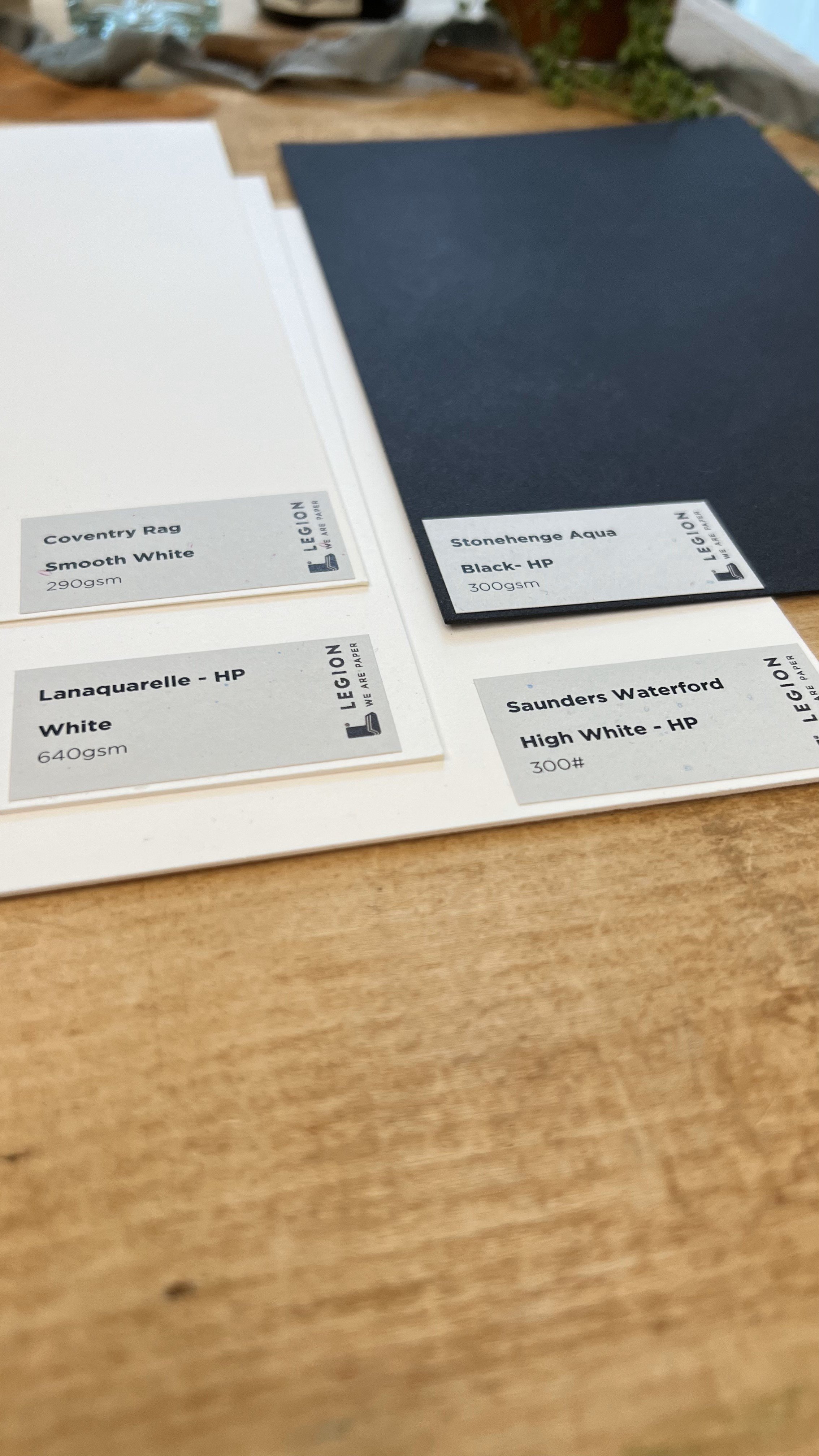
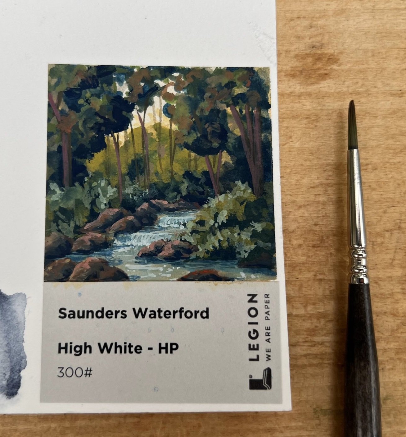
In the watercolor collection, I tested four papers: Stonehenge Aqua Black HP (300gsm), Coventry Rag Smooth White (290 gsm), Lanaquarelle HP White (640 gsm), and Saunders Waterford High White HP (300#).
I've used (and loved) the Stonehenge Aqua (300#) for years, it's been a favorite for larger pieces where I need a sturdy paper that takes paint well. It has just the right amount of texture to add depth to the painting without requiring too much editing when I go to scan a painting and make prints. I didn't re-test the sample, since I already know I love it. 


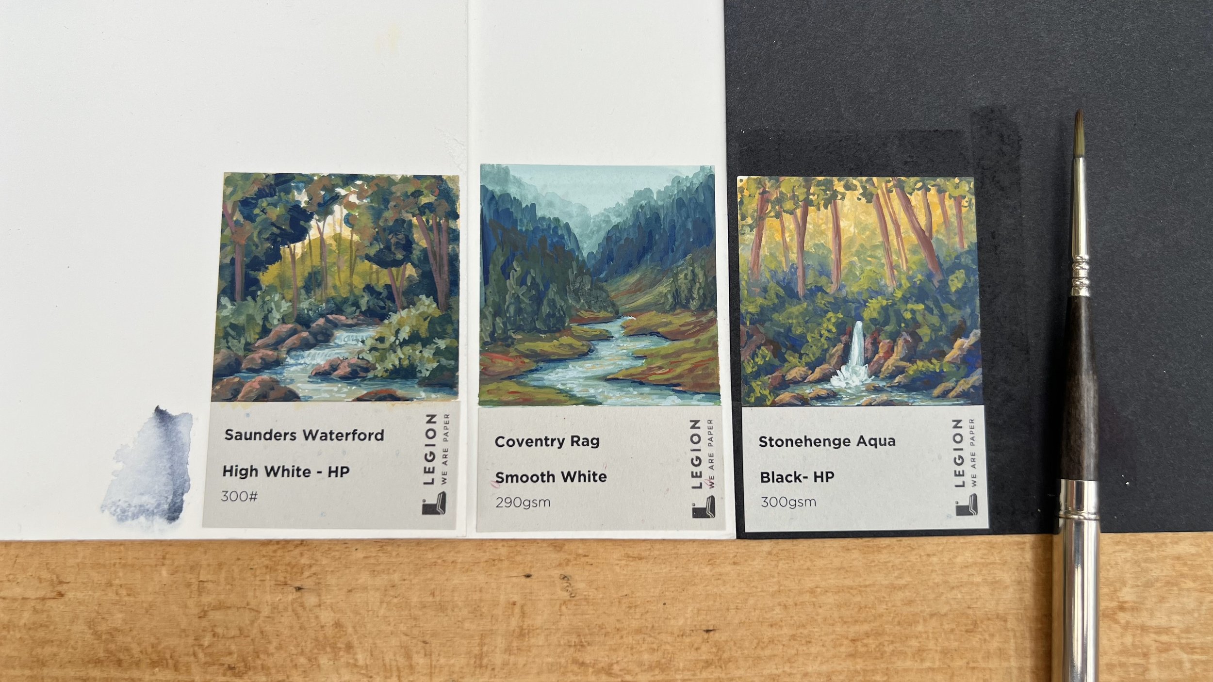
Initially, I tested all four papers by getting an area wet and adding watercolor. The Coventry Rag, Lanaquarelle, and Stonehenge Aqua (black) all worked well with this, but the layers of the Saunders Waterford separated, making bubbles in the paper. I then made a small painting with gouache on each paper, and the Saunders Waterford and Coventry Rag were my favorites.


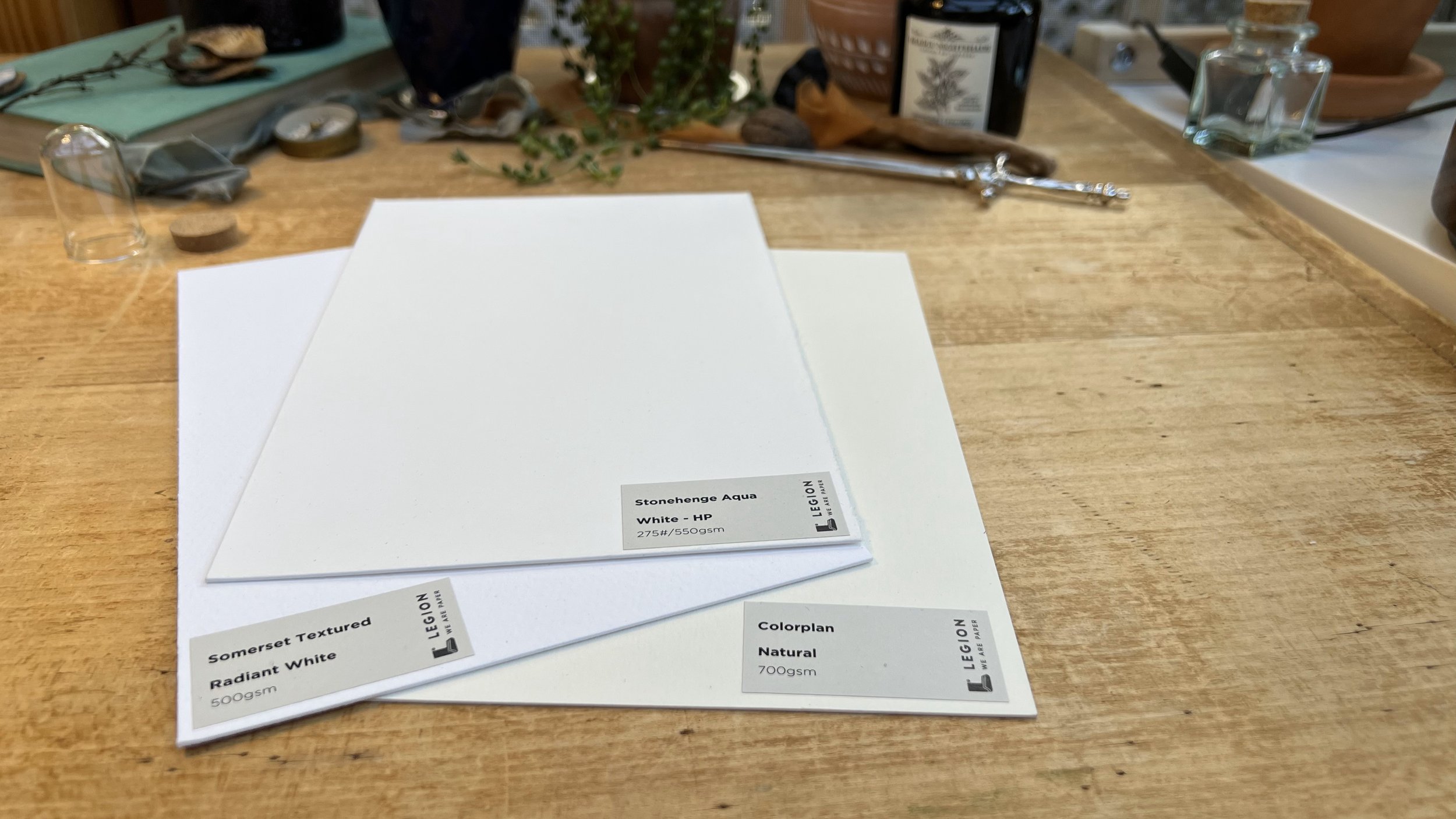
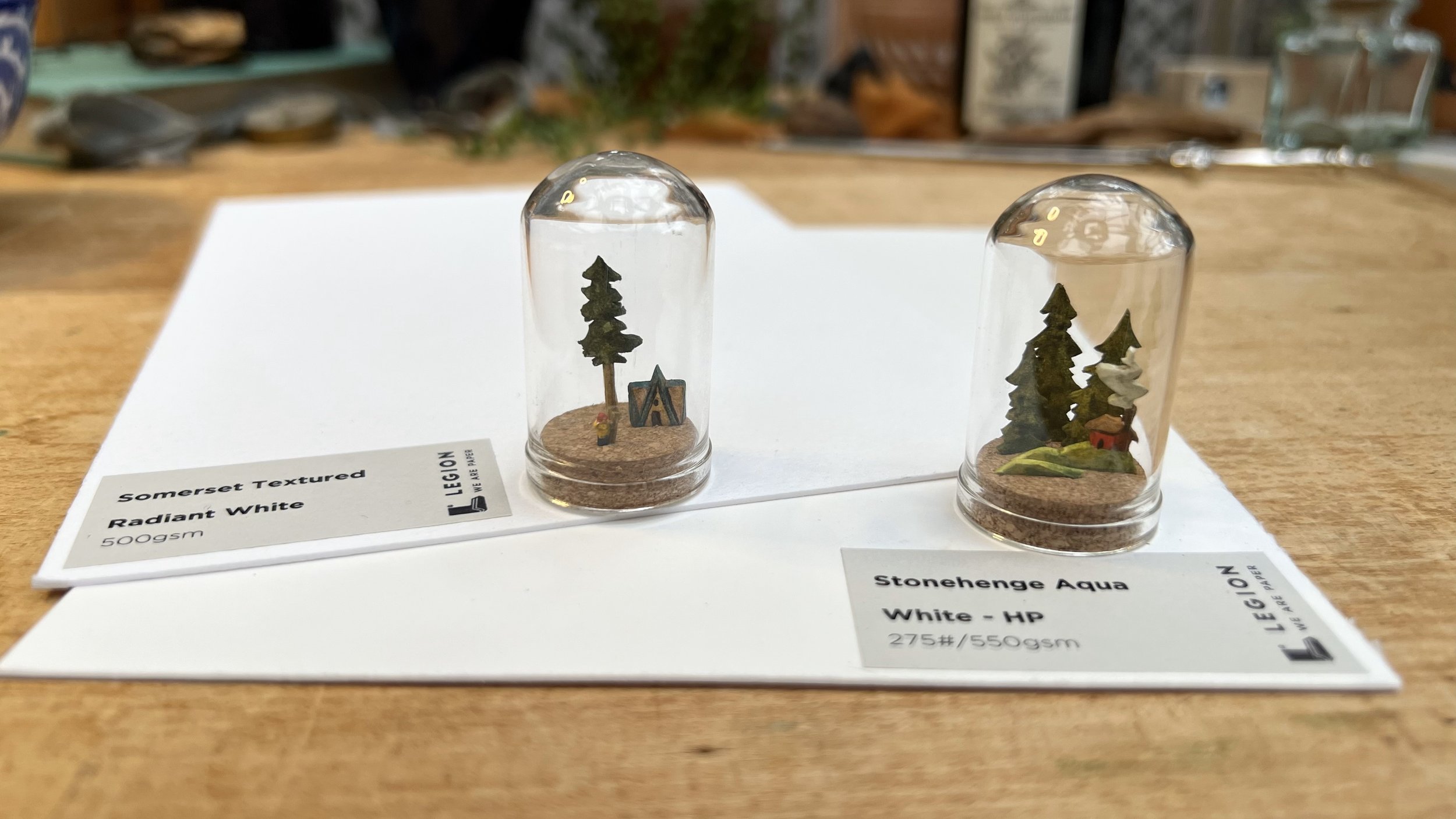
For the thick papers, I tested the Somerset Textured Radiant White (500 gsm), Stonehenge Aqua White - HP (550 gsm), and the Colorplan Natural (700 gsm). Since I use thicker papers for dioramas, which I assemble in wooden boxes and small glass domes, I tested these papers by using them to make small dioramas.

Which papers worked well for your work?
In the watercolor collection, the Stonehenge Aqua, Coventry Rag, and Saunders Waterford worked best for me. They accepted multiple layers of paint without buckling or pilling, and the paint moved beautifully on the papers.

For the thick papers, the Somerset Textured and Stonehenge Aqua both worked very well. The thickness of the papers allowed me to cut at an angle (rather than straight through the paper), which adds dimension to the finished pieces. Both papers also held up well when I cut very narrow pieces - small areas of paper were able to support much larger sections, such as the smoke coming out of the chimney in the diorama I made with the Stonehenge Aqua or the top of the tree being supported by the relatively narrow trunk in the diorama made with the Somerset Textured. 

What are important characteristics of a paper for your particular kind of work?
For my work, it's really important that the paper is sturdy - I work both wet on wet and wet on dry, and I paint in many layers for both watercolor and gouache. I look for paper that can get wet and dry out without changing shape and can withstand repeated brush strokes without pilling or disturbing the fibers that form the paper. It's important to me that an area of the paper that gets wet can dry and look the same as it did before - the Coventry Rag was a great example of this, since I was able to apply a large amount of water to the surface, and when the water dried, the surface of the paper was unchanged. Depending on the project, it can be important for me to remove tape without tearing the paper surface. Some papers that are wonderful to paint on don't hold up well to tape, so it's always something I check before starting a large piece. The surface of the Stonehenge Aqua black tore when the tape was removed, although I didn't test it with Holbein's soft tape, which usually is the least likely to tear paper.
For the dioramas, I also need sturdy paper, and it's important for me to be able to cut tiny pieces of the paper and have it still hold together.

What will be your go-to paper moving forward?
I'm looking forward to working more with both the Saunders Waterford HP and the Coventry Rag; they both held up well with multiple layers of paint and the color and texture of the papers are lovely. I've used (and loved) Legion's Incisioni paper for years, and it's been my go-to for both watercolor and gouache, but I'm looking forward to testing out these new papers further! 


The Stonehenge Aqua White - HP (550gsm) was my favorite of the thick papers, and I'll definitely be using it for more dioramas and paintings in the future. It's the perfect thickness (not too hard to cut, but the individual diorama components can stand up on their own even if they're narrow) and the smooth texture makes it easy to see the tiny details of the painting. 

Anything else you found interesting and want to include.
I'm always amazed by how important it is to choose the right paper for a project, and how small changes, such as watercolor vs gouache, can change which paper is "best" for a given piece. It was hard to guess ahead of time which papers would or wouldn't be ideal for the way I enjoy painting, and I'm looking forward to testing all the different papers over time.


These paper samplers are such a great idea, and it's definitely worth the time to test out different papers to find the best one for a particular project. It's hard to find the perfect paper when you have to invest in a whole block or sheet of each kind in order to try them, but these sets make it easy to pick a few papers to test more in-depth without ending up with large quantities of paper that isn't a good fit.

Featured Artist: Jamie Blicher, Uses IVF Needles to Create Art on YUPO

Artist Program: Jamie Kushner Blicher

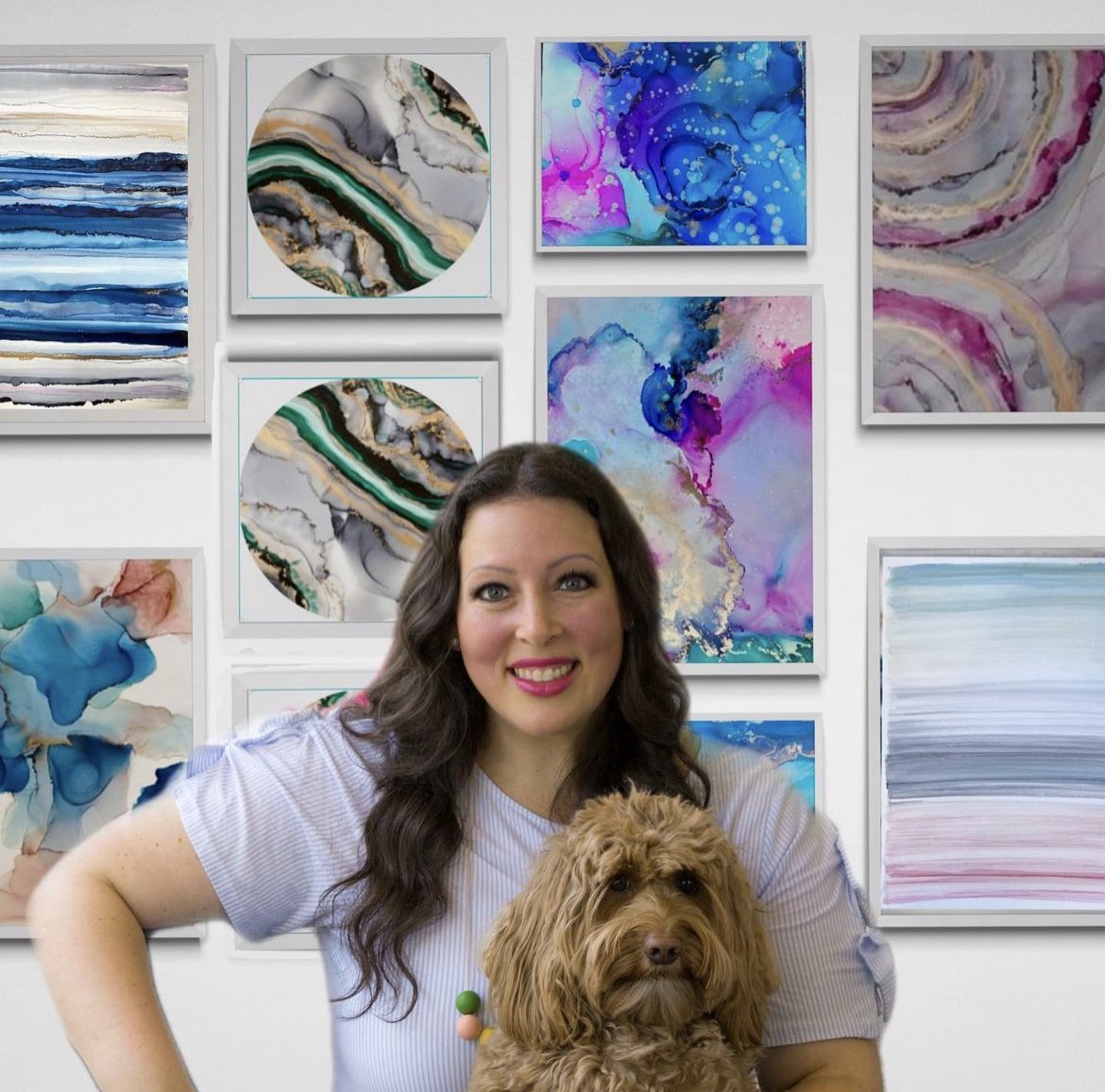
My name is Jamie Kushner Blicher and I am a self taught alcohol ink/mixed media artist. I’ve been creating almost exclusively on YUPO for the past 8 years. I’ve always been artistic and when I started my fertility Journey, which ended up being a long one, I used art to cope. Creating using sterile, IVF needles as a paintbrush on YUPO has been a lifeline in so many ways. I now paint for individuals and fertility centers all over the US to create joy, make beauty and move forward from pain.

What is your inspiration for creating?

My inspiration for creating, and has always been to cultivate community.  

What is your go-to paper?

YUPO 20x26” and 26x40” 144lb. 

What role does YUPO play in your artistic vision and how does it complement your style of work?

I love YUPO because it is forgiving and so much fun to play on. I am constantly drawn to creating abstract pieces that tells a story. YUPO allows me to experiment without worry of mistake, and makes the process just so much more fun and meaningful. I feel like other canvases on paper are more final and doesn’t allow space for fun. 

What is your process like?

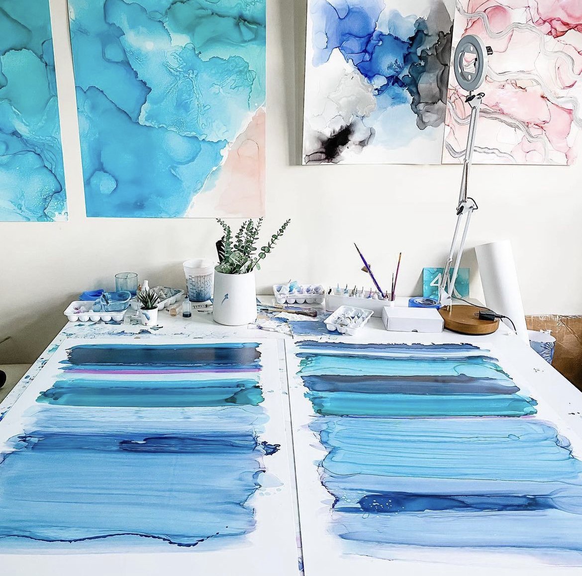
I typically put down alcohol, then alcohol inks, then alcohol in an IVF needle I then spread the ink using various heat tools, as well as the use of my own breath, working to control an uncontrollable medium like alcohol ink on YUPO. This is an obvious metaphor for Fertility journey, where you have a basic plan and then when things go right you get creative and then beauty comes out. 

Can you share some tips or advice for artists looking to explore the potentials of YUPO?

Use all kinds of paint, mediums, different brushes, and different heat tools To explore the magical wonders of synthetic paper before deciding if you love it. YUPO has opened so many possibilities for me, and the best way to get my feelings out on a forgiving paper. 

Can you talk about any challenges you’ve faced with YUPO and how you’ve overcome them?

I've experienced times when my hands or brush on the table have gotten onto the YUPO and other colors have rubbed off that have “ruined” my work. Thankfully YUPO is pretty stain-free and a bit of alcohol can fix the issue quickly. 

Can you tell us about any upcoming pieces you’re excited about?

I am about to create several pieces of work for CRM fertility center in Miami. There will be 6 to 8 pieces up in the clinic and patients will be reminded how strong they are and how they are not alone going through infertility when they see the art. 

Featured Artist: Screenprinter, Arsenal Handicraft

Through the Legion Artist Program, Dennis & Christina Jacobs tested a variety of papers for their screenprints. Read more about Arsenal Handicraft’s findings as they dive into this paper exploration.

Arsenal Handicraft is a husband and wife illustration / screen printing due based in Michigan.  They work in their home studio illustrating and designing hand pulled screen prints with a focus on using unique pigments, such as those that are metallic or glow in the dark.  We have been printmakers for about 15 years and our first printmaking project was our wedding invitations.  We sell our prints in galleries and shops throughout Michigan as well at Midwestern art fairs throughout the Summer and Fall.

What are some important factors you consider when choosing a paper for your screenprints? 

We use water based inks which require study paper to prevent warping when printed with large floods of ink.  Also sturdy papers distort less, making registration of multi color prints easier.  We also like to incorporate the color, texture, and finish of certain papers into the designs of our prints.  For example we've used Mirri paper to simulate outer space and the night sky.  We've also used Colorplan New Blue as the basis for a dusky evening scene.

Which papers did you test? 

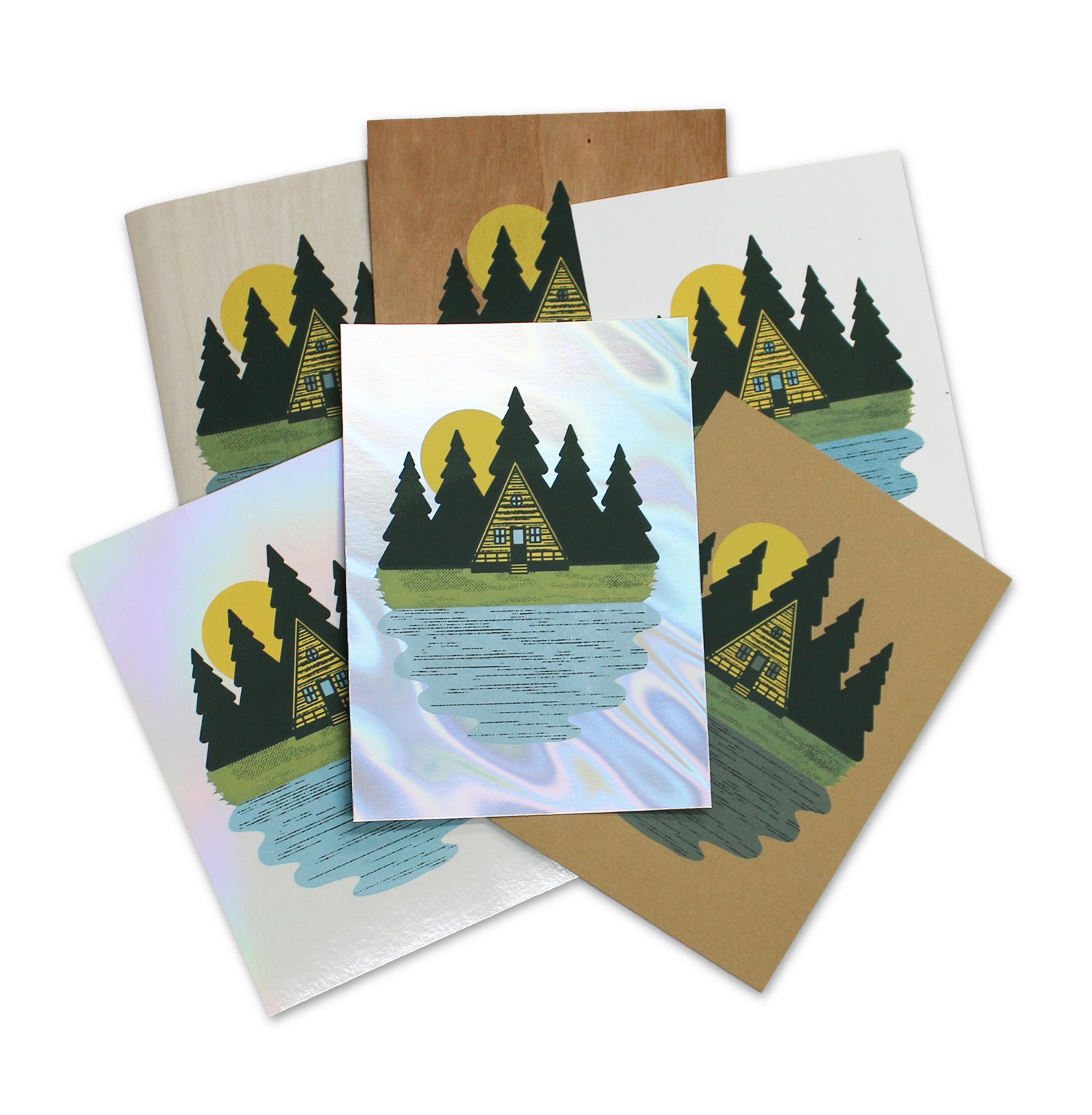
We tested: MirrI Holo Blanco Pearl, Timberluxe Cherry, Timberlux Birch, Mirri Sparkle Glitter (Twilight and Black), Coventry Rag White Vellum, Stonehenge Kraft, Mirri Matte Lava, Stardream, and Colorplan.

Other tools used testing: Acrylic screen printing ink, screen printing screen, squeegee.

Coventry Rag

Timberluxe

Stonehenge Kraft

Mirri Lava

What was your process in testing these papers? 

We wanted to test how our acrylic screen printing ink would work on different papers.  This includes the smoothness of the printing, how well the ink adhered to the surface, and how opaque and transparent inks performed on the papers.  We designed a three color screen print of an A-frame cabin in the woods.  The inks used were an opaque yellow, an opaque dark brown, and a transparent blue.

Which papers were your favorites? Why? 

Mirri, Stardream, and Timberluxe were our favorites to use because of the way that their unique appearance can enhance our designs.  Also, the Coventry Rag and Stonehenge were wonderful to print on and produced fantastic results when we needed a standard heavyweight paper.

Did you find any papers didn’t work well for your process? 

The foil paper gave us great results aesthetically, but there were some issue with the ink being somewhat easy to scratch off of the foil sheets.  I believe that this can be fixed with a more robust type of screen printing ink, or additive.  Many print shops print successfully on foils, so the issue we experienced was most likely caused by our ink. 

Possibilities of Paper - Colorplan, Edition 2

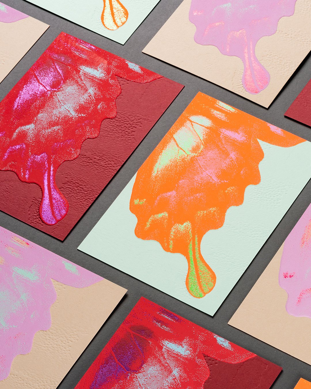
Introducing: Possibilities of Paper - Colorplan, Edition 2, produced in collaboration with Imprimerie Du Marais (Paris, France).

View Edition 1 here.

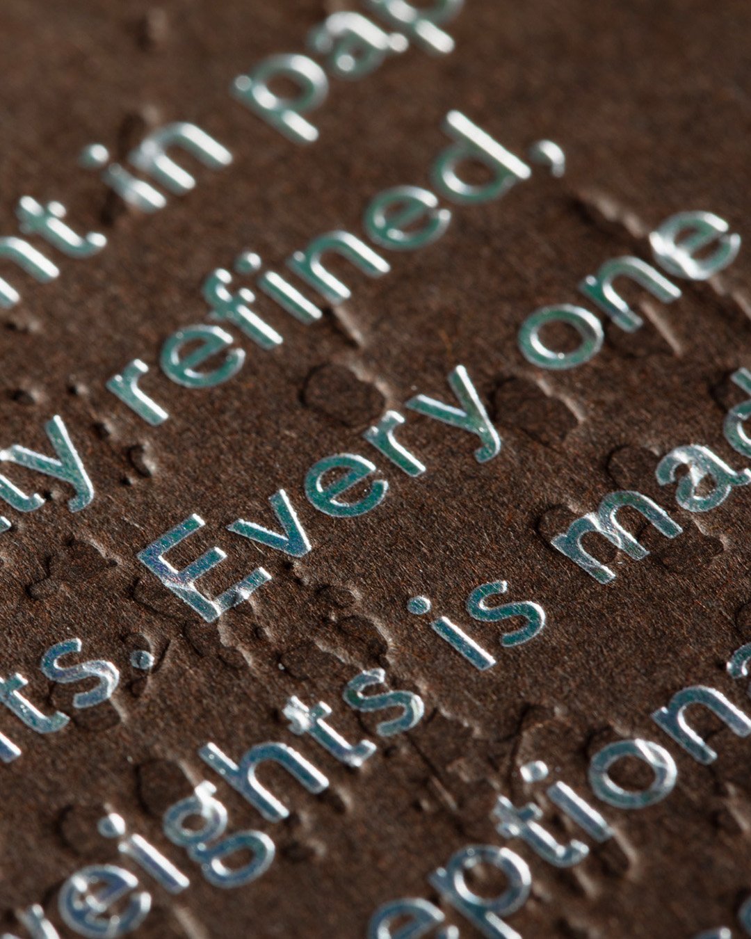
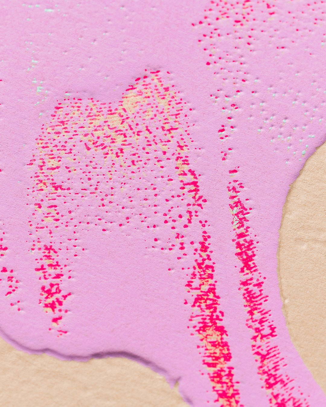
The second edition in a series of three is in collaboration with French print and production house Imprimerie du Marais to showcase the vast potential of Colorplan through unique and unusual color combinations, paired with production techniques such as silk screen printing, hot foiling, and sculpted embossing. 

A natural evolution from Edition 1, Edition 2 steps back from the micro view of the butterfly to reveal more of the concept image. Edition 2 also showcases a selection of different print techniques and finishes to Edition 1.

Each card has a common design but is produced in different colors. The foil, silkscreen and emboss techniques are precisely registered together. The sculpted emboss is produced using a brass die under heavy pressure on the machine; a 3D preview was created before the die was produced to visualise the detail on screen before production.

Etching Process with Kathryn Anderson

Professional printmaker and printmaking tutor Kathryn Anderson takes us through the print process she uses when printing her etchings.  Kathryn is an ambassador for Somerset paper and is known for her highly detailed prints capturing the beauty and mystery of the natural world.

ABOUT ETCHING (Intaglio)

Intaglio is the opposite of relief printing. I always think of it this way: Etchings print what’s BENEATH the surface and relief prints print what is ON the surface.

Creating etchings is a very old technique. They were first produced around 1500. Some of the great etchers include Durer, Rembrandt, Goya, Degas, Picasso, Matisse and so many more!

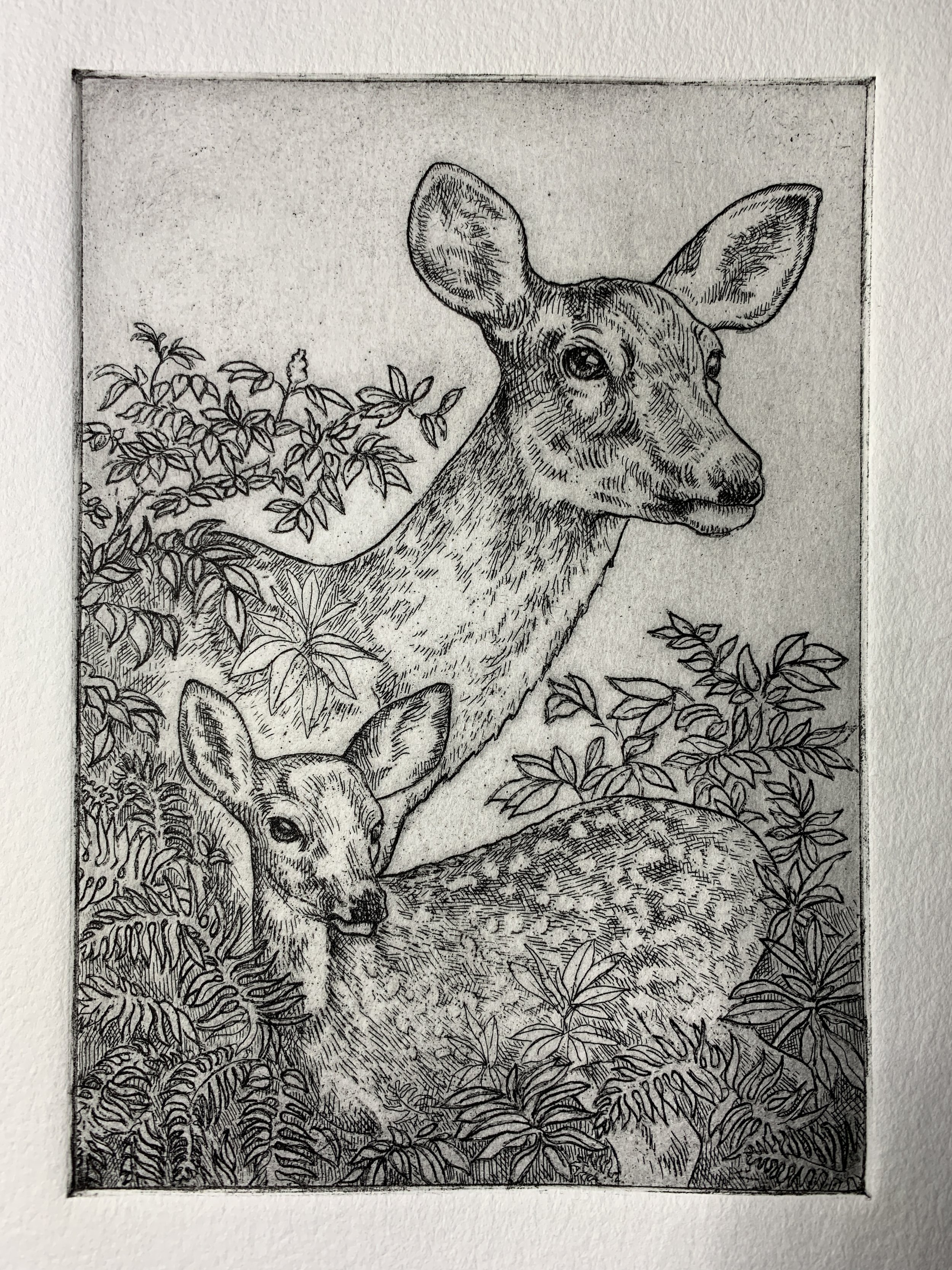
An etching is created by incising lines on a metal plate with a corrosive solution and then applying ink to the plate. The ink is pushed into the lines and the surface is wiped clean. Dampened paper is then laid on top of the plate and passed through an etching press under great pressure which pushes the paper into the incised lines and transfers the ink to the paper.

Let’s look a bit deeper into the process!

DRAWING UP YOUR DESIGN

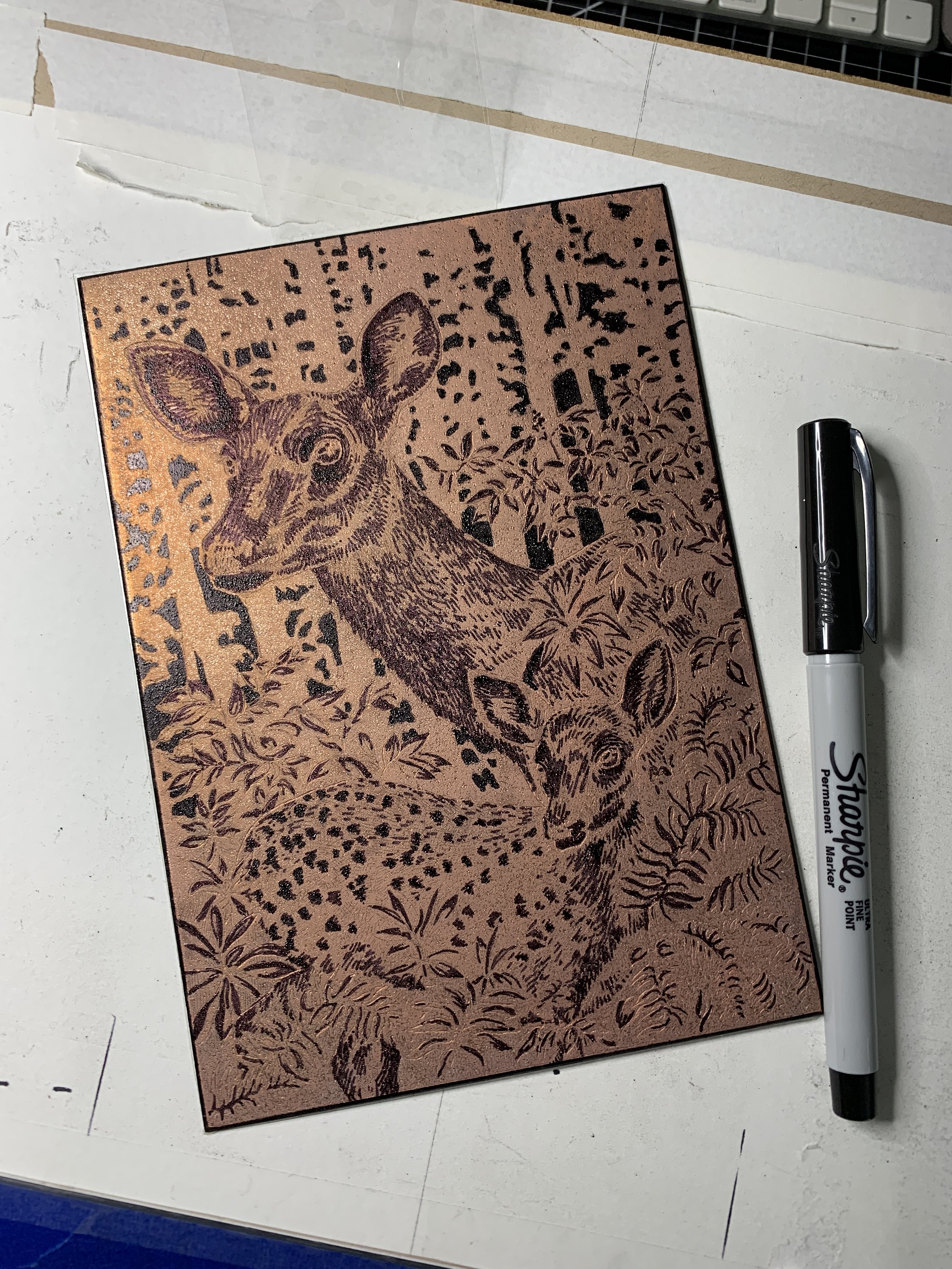
Create your imagery to fit your copper plate. Once you’ve established your design, it can be drawn directly or transferred to the prepared copper plate.

PREPARING THE PLATE

I use copper plates for my etchings. Here are the steps to get it ready to image:

  1. Use standard sized plates or cut the copper plate to the size you want. (I use a coping saw)

  2. File the edges to a nice 45 degree (ish) bevel on top and sand smooth. (So you don’t trap ink there or cut your paper, or press blankets, or yourself!)

  3. Lightly sand the surface to erase small scratches and make the surface very smooth.

  4. Polish the surface of the plate (using metal polish) and de-grease with whiting and vinegar.

Now your plate is ready to be imaged!

CREATING LINEWORK

In this step we will create linework and etch the copper plate with Ferric Chloride.

There are different ways to do this, but this is what I do.

  1. Make sure your plate is clean and free from oil.

  2. Apply a ‘ground” which resists the Ferric Chloride. I prefer hard ground for fine lines.

  3. Draw your lines with an etching needle through the hard ground to expose the copper.

  4. Cover the back with an acid resist that doesn’t scratch off, either varnish or adhesive backed shelf liner.

  5. Submerge your plate in Ferric Chloride to etch the plate. The length of time in the Ferric will determines the depth of the line. Deeper lines hold more ink and print darker.

  6. Remove the plate and clean the ground off with mineral spirits.

You’re ready to pull your first print!

PRINTING THE ETCHED PLATE

The first step is to print a proof of your etched linework plate.

  1. Apply etching ink to the etched plate surface and work it into the lines. A matboard tab can be used to spread the ink and remove the excess.

  2. With a combination of wiping with stiff cheesecloth (Tarlatan or other wiping fabrics) and newsprint paper the surface ink is removed leaving the incised lines with ink. You can also choose to leave a thin layer of ink to create tone.

  3. Don’t forget to clean those beveled edges!

  4. Place the copper plate ink side up on the etching press.

  5. Blot your dampened paper and lay it on the plate.

  6. Put a sheet of newsprint on top and roll down the felt etching blankets. There are three blankets on an etching press: the sizing catcher, the cushion, and the pusher on top.

  7. Engage the press to apply pressure to the paper covered plate. This pressure will push the dampened paper into the plate and transfer the ink to the paper. The pressure will also create a “Plate-mark” which is the hallmark sign of an etching.

  8. Gently lift the blankets and newsprint and carefully lift the paper off the plate.

VOILA!! You have your first proof!

At this point I decide what comes next. Do I like the line proof as is, or do I want to add tonal values?

CREATING TONAL VALUES

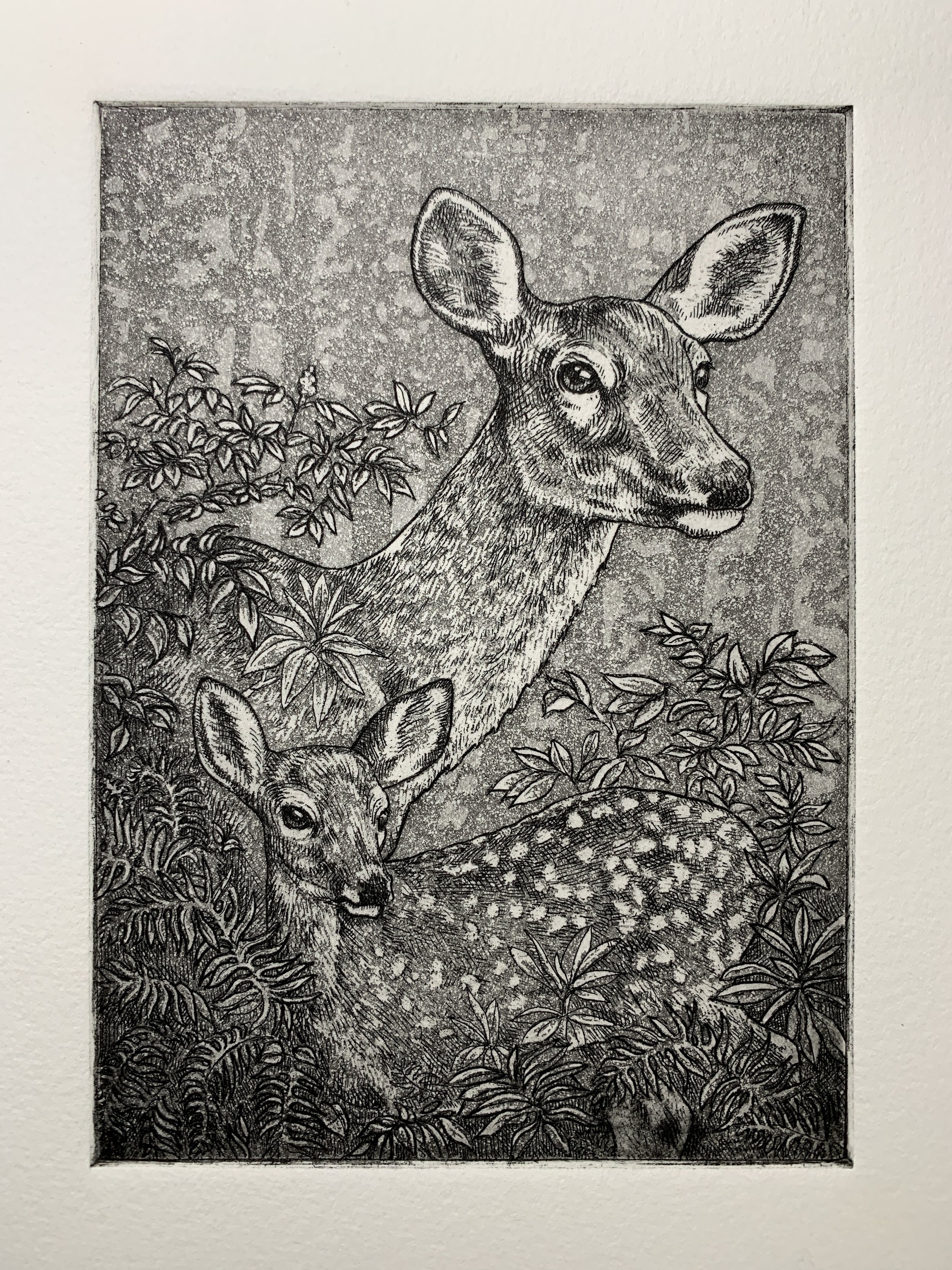
There are lots of ways to create tonal values on your plate, my favorite is Aquatint.

Aquatint is an etching process that creates a texture that is etched into the plate to hold ink. It can be done with traditional powdered rosin or with the more recent method of spray paint. I use rosin

(Note Rosin can be hazardous if inhaled, so always wear gloves, mask, and eye protection when using)

  1. Clean and degrease the line-etched plate

  2. Apply powdered rosin to the surface and heat until it begins to melt and adhere to the plate.

  3. The tiny dots are resistant to the Ferric and create a texture that holds ink. The longer you submerge the plate the deeper the etch and thus the amount of ink it holds.

  4. A series of tonal values can be achieved by blocking of the lightest value on the plate (I like permanent Markers of varnish) and dipping in the Ferric for a short time. After the plate is removed from the Ferric you can block out the next area of lighter tone and etch it again. You can do this for multiple times to create a full range of values. (Note: It is VERY important to run a test plate to better understand the timing of the etch and the resulting tonal value.)

  5. After you have finished creating your tonal values you need to remove the aquatint (Soaking in denatured alcohol works well) and you are ready to print!

THE BIG REVEAL!!

Ink up your plate and print as you do with the line etching. VOILA! Your beautiful etching!

There are other methods of creating intaglio work including drypoint, mezzotint, photogravure, heliogravure, and engraving.

AN IMPORTANT NOTE ABOUT PAPER

It’s very important to use the right paper. Etching paper needs to be soaked in water for at least 30 minutes (depending on paper type) and gently blotted just before printing.

Etching paper must be soft but strong under pressure.

My favorite Somerset Paper for etching is Somerset Textured. It comes in cream, white, and softwhite and prints BEAUTIFULLY! It has just the right amount of sizing and prints wonderfully on even the most delicate images. Somerset Velvet is another excellent choice for very fine work with its smoother texture.

IN CLOSING

Etching is a challenging and extremely rewarding printmaking method. I have to admit, it’s my favorite medium for creating prints. (I love a challenge!)

There are lots of variables in this process, but using the best papers takes some of the guesswork out of the equation and makes printing a joy!