Try this! @vanessa_paints_ galaxy painting using Stonehenge Aqua Hotpress Black. (not drawn to scale)
Materials used:
‘The Sprout Creative handmade watercolors
Princeton Brushes
Arteza chalk pastels
Uniball Signo white gel pen
Try this! @vanessa_paints_ galaxy painting using Stonehenge Aqua Hotpress Black. (not drawn to scale)
‘The Sprout Creative handmade watercolors
Princeton Brushes
Arteza chalk pastels
Uniball Signo white gel pen

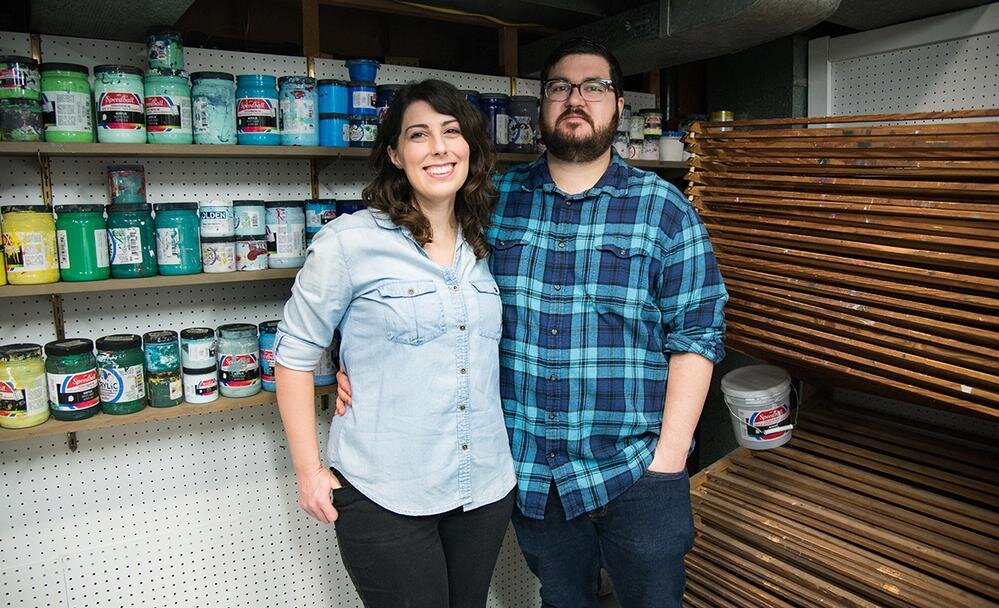
Who is Arsenal Handicraft? Tell us about yourself.
Arsenal Handicraft is husband and wife illustration / screen printing duo Dennis and Christina Jacobs. We work out of our home studio in Madison Heights, just outside of Detroit, MI. We've been printmakers for about 12 years and the first thing we screen printed was our wedding invitations. In addition to art prints we have previously worked on concert posters, album artwork, book covers, and most recently beer labels.
What materials did you use for the recent screen print, ‘Tethered’?
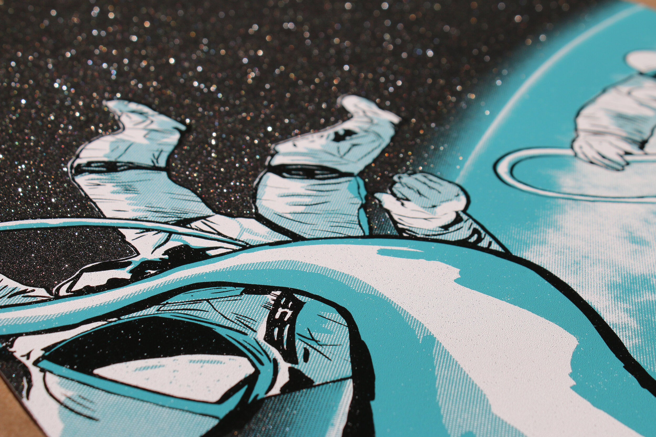
We used Mirri Black Diamond Sparkle Paper and Speedball acrylic screen printing ink. We design and print everything in house, which allows us to experiment with different pigments and materials, such as this Mirri paper.

Why did you choose Mirri Sparkle for this project?
We've recently been experimenting by printing on different surfaces and mediums. When we came across the Mirri Sparkle paper, we knew it'd be perfect for a space themed print, which is often the subject matter of our prints. It looks like outer space littered with stars and adds so much depth to the image.


What was your process for creating ‘Tethered’?
Since we knew we wanted to make the most of the glittery finish of Mirri Sparkle paper, we wanted to leave much of the paper exposed. With this in mind we started by thumbnailing different concepts, landing on this image of two astronauts on a space walk. It was ultimately Christina's thumbnail that we developed into the final composition. Once the thumbnail was finalized Christina chose the ink colors, and Dennis began illustrating the full rendering for the print. During the illustration process we have a bit of a back and forth to make sure we both like the direction it is heading. Once finished the artwork was separated into three ink layers, white, blue, and black. These are then outputted to film for use in burning our screens. Once the screens are made, Christina got to work on mixing the ink colors. These were printed by us with Dennis pulling the squeegee and Christina racking the paper.
Were there any challenges using Mirri Sparkle for a screen print?
This was our first time experimenting with a paper such as this and we were super happy with the results! We did notice that the ink sits on top of the paper more than being absorbed, which resulted in slightly longer drying times. We also noticed that the paper grew a bit when we were printing a large flood of ink. This is normal, we just approached it by printing one color per day, which allowed for the paper to dry and relax.
What projects are coming up next?
We are currently entering our Fall show season. Over the next few months we will be set up at various art fairs around the Midwest selling our screen prints. Additionally, we are working on a poster for Artcrank, a bicycle themed art show held in Minneapolis this September. We are also working on another print using Mirri Sparkle paper, this time with Mirri Twilight Sparkle.

Introduce yourself! How did you get started as an artist?
{JH} Hi! My name is Julie Hilboldt and I’m a painter/drawer from St. Louis. Growing up, I always had a strong interest in art. My mom would have me making all sorts of projects to challenge me creatively. It was primarily a hobby until I got to college and I started to realize how much I really enjoyed it. After my undergrad I worked for approximately six months in the “real world” before I decided I needed to find a way to make art my career. At that time, I started graduate school for my MFA and I’ve been navigating my way through the art world ever since!
What type of art do you create? What mediums do you work with?
{JH} The majority of my work is representational with moments or marks of abstraction. Typically the subjects are people; the main reason for this is because I went to Fontbonne University for graduate school where there is a strong focus on anatomy and figurative studies. I primarily use traditional mediums like charcoal and oil paint but I’m enjoying experimenting with new materials that can enhance the old ones.
How do you choose a paper for your piece?
{JH} It may sound strange but I have to feel the paper or any surface I’m about to work with. This is why I love a good art supply store. When going through the options there could be a different size, shade, texture, etc that jumps out to me and makes sense for my project. It’s difficult to have that experience online.

Charcoal on YUPO

Charcoal & Ink on Stonehenge Aqua Hotpress
How does using YUPO differ from using Stonehenge Aqua?
{JH} There are so many differences between these two surfaces but I think the biggest is that there’s a permanence of Stonehenge Aqua that YUPO doesn’t have. I typically use the same materials on both-- charcoal and water. On Stonehenge Aqua, I can build up the charcoal and erase/blend it in a predictable fashion. On YUPO, when I erase something it may wipe away completely. I think that lack of control adds an interesting element to a piece. I don’t think any of my drawings on YUPO ended up looking the way I originally intended but instead it evolved into exactly what it needed to be.
What’s your process like from the sketch to the final piece?
{JH} Chaotic, incredibly chaotic. I’m terrible at planning pieces out and since I use multiple references this can lead to many challenges. I’ve found that if I sketch and prepare too much, I will lose my energy and the artwork won’t become anything special. Instead I think about the piece I want to make for a few days and then I start sketching it out on the paper or canvas. Occasionally I’ll mark out the composition prior to adding the subject but overall I like to see my idea on the actual surface and size it’s intended to be on so I can adjust from there.
What’s the largest piece you’ve created?
{JH} I’m fairly certain that the largest artwork I made was a painting for a lifesize figure painting class. Typically these paintings would be 6 ft tall but since I did mine independently it was 61”x81”. I absolutely love working large and I’m hoping that one day I’ll get the chance to make a painting that is at least double that size.
You do an incredible job filming while creating! Is this an important part of your process?
{JH} Thank you! It started simply as a way of showing people my work, then it became something I enjoyed doing creatively, and now it’s evolved into part of my artistic process. I’ve recently found myself thinking of the video while also thinking of the piece I want to create. Whether I hear a song or just feeling some emotion deeply, I’ll think of how I can translate that into both my work and my filming. I believe finding this balance between the two ends up making for a stronger, more impactful piece. On the other hand, there’s days that I can’t have an interruption and I won’t allow myself to film so I can focus solely on the art. If you ever see a huge jump in the process that wasn’t included in the video, that’s probably what happened!
What’s next for you?
{JH} This year I will be teaching art to both elementary and college students while also working on my own personal practice. It’ll be a busy year but I’m looking forward to it!
Visit Julie Hilboldt’s Website.
One of the most common questions we get from artists using YUPO is how to mount the finished painting to another surface, such as wood, metal, or even to YUPO itself. Since YUPO is a non-porous, synthetic material, traditional water-based glues just won’t cut it.
We teamed up with YUPO where their R&D lab spent several months testing a variety of glues, adhesives, films and mounts to see what worked, and what didn’t. We’re excited to announce the results that we formatted into a cheat-sheet and can be downloaded here.

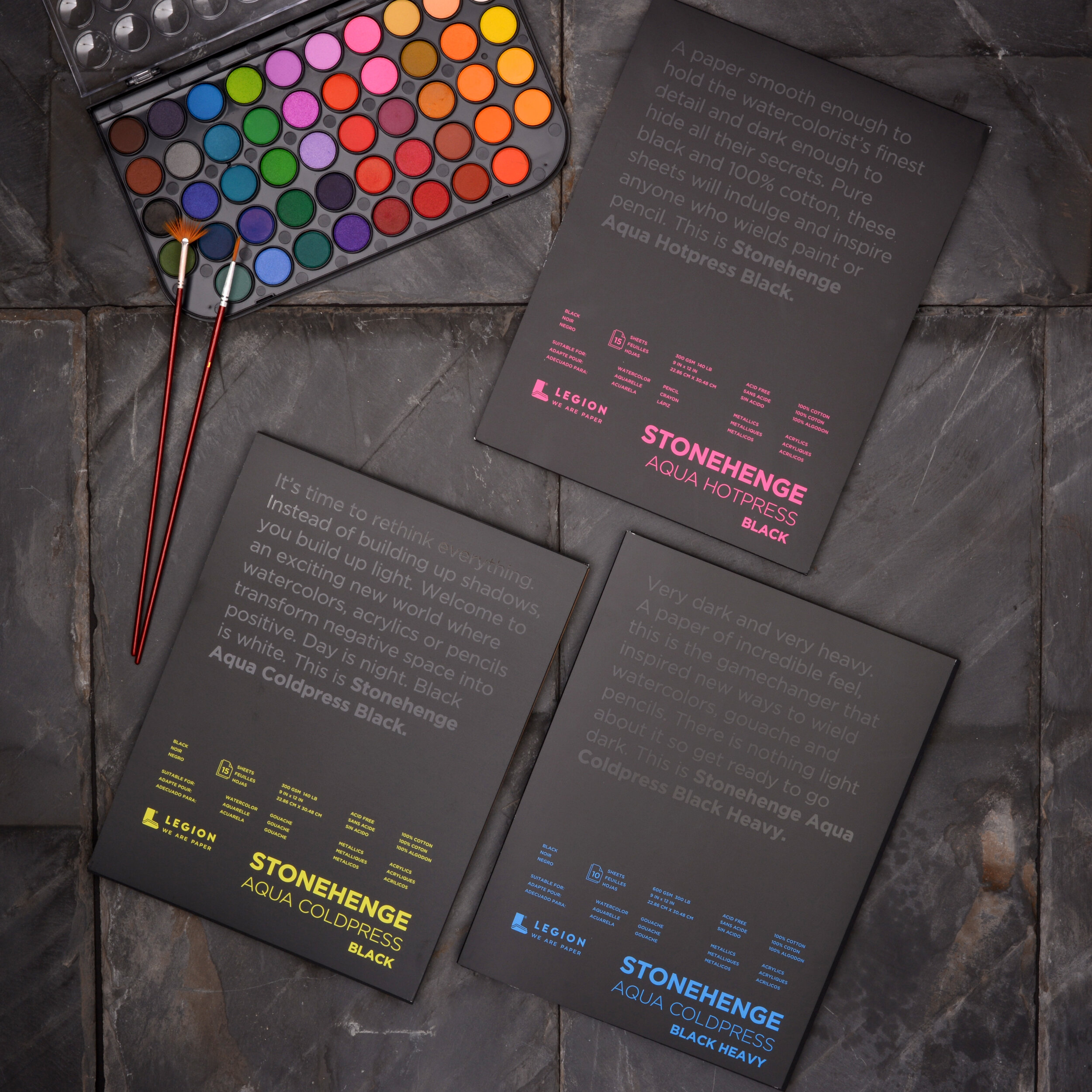
Black paper is not a new thing, but black 100% cotton paper sized for watercolor is. We introduced Stonehenge Aqua Coldpress Black 140lb / 300gsm about 2 years ago, and we’re excited to announce we’re expanding the range to include Stonehenge Aqua Coldpress Black HEAVY (300lb/600gsm) and Stonehenge Aqua Hotpress Black 140lb/300gsm.
Stonehenge Aqua Black is a gamechanger that’s inspiring new ways to use watercolor, acrylics, gouache, pencils, pastels and more! We interviewed artists using Stonehenge Aqua Black with different mediums. Here are some of their techniques, materials they use and inspiration for using black paper,
In college I studied architecture at Wentworth Institute of Technology in Boston. I took many different kinds of art classes, one of them being a watercolor painting class, but I did not have time to pursue it further due to my heavy architecture class load. Later, I started my own architecture firm, Pratt Design. I loved doing architecture and being able to be a mother at the same time. As the kids got a little older, I started watercolor painting as a hobby and fell in love with it all over again. In 2012, with the support of my amazing husband, I switched gears, closed my practice, and turned all of my time to painting and perfecting my craft. I am now working as a full-time professional artist and I’m a signature member in the American Watercolor Society, Vermont Watercolor Society and North East Watercolor Society. I love painting just as much as I love teaching and I started an online school through Patreon in 2019 which I absolutely love. In 2020 I started the Annual Women in Watercolor International Competition and it was a huge success.
Process.
Materials.
Legion Stonehenge Aqua Black Hotpress 140lb watercolor paper, Holbein Gouache (watercolor) Paint, Holbein Gold Round brushesI have tried many brands but find I just can't beat the quality and performance of these.
What you like about the paper? What works well and what challenges do you face?
I have really enjoyed working with Stonehenge Aqua black paper. As a traditional watercolor artist who usually prefers transparent watercolor, I really enjoy switching it up and using the more opaque pigments and gouache. I love the challenge to do the process backwards and paint on the dark paper. With black paper I build up my lighter colors and let the black of the paper come through for my darks instead of building up my darks and letting the white of the paper shine through. You get a completely different feeling from a painting done on black paper versus white and I love the emotional charge it brings to the image.
Where can someone find more of your work?
Website: http://lynndpratt.com/
Instagram: https://www.instagram.com/lynndprattpaint/
Facebook: https://www.facebook.com/lynndprattpaint/
YouTube: https://www.youtube.com/lynndpratt
Patreon Online School: https://www.patreon.com/lynndpratt
I’m a self taught artist who loves working with a wide range of mediums and experimenting with different methods. I find that each medium allows me to explore and learn new skills which is why I always introduce new mediums especially when I feel like I’m stuck or have an art block.
Process.
For this lighthouse artwork I started with the background. I placed all the colors for the sky on the paper before going in and smudging the colors together to give it a soft blended effect. To blend the colors I used my fingers however you can also use a paper towel. Because I didn’t want to go over the area where the lighthouse is with the sky colors I used a q-tip to gently smooth out the edges where the sky meets the lighthouse. The light house was a little more difficult, I was very cautious when adding the colors and I used a q-tip to blend the colors and a blending stump to straighten and remove some of the colors to show the dark paper underneath which allowed me to get the tiny details like the railing in the lighthouse balcony.
The paper worked really well with the pastels, I was able to apply and blend the colors perfectly and remove them easily where necessary. The only difficulty I faced was with masking tape. I initially intended on using masking tape to get a clean boarder for the artwork however upon doing a trial I noticed that it removed quiet a bit of the paper so I opted out of using it.
Materials.
I used only a few products to create the artwork. The legion aqua black watercolor paper ,Paul rubens oil pastels, q-tips, and a blending stump.
Where can we find more of your work?
For more of my artwork you can check out my Instagram @rosies.sketchbook.
David Becker is a commercial Illustrator/Artist turned to full-time artist about 6 years ago, now working as a fine artist and instructor and traveling around the country teaching watercolor and acrylic painting.
Process.
My big thing about using watercolor and acrylics is to Float-Your-Pigment. This statement has worked so well when it comes to teaching my students how to use a water medium on any surface that they can acquire.
Materials.
I use all Holbein high-quality art supplies and I use all legion high-quality surfaces to paint on. I always tell my students to use professional-grade art supplies, student grade is not a grade I think they should even consider. If they want to paint like the pros then use the materials a professional uses.
What worked well with the paper & challenges faced.
I like a surface that is textured in an organic way but I also like that the paper doesn't absorb so much of the paint that it takes away the vibrancy of the colors... Stonehenge Aqua is perfect and has all the qualities I like in a paper. The nice thing is it also now comes black and it gives me a whole other way of thinking when I apply my watercolors or acrylics or pencils to that paper. I always like to try a new approach to painting and the Stonehenge line of Aqua papers helps me change things up.
Learn more about David R. Becker.
https://www.davidrbecker.com or https://www.BeckerArt.net
https://www.pinterest.com/beckerart/watercolorist-david-r-beckers-beckerart-float-your/
https://www.instagram.com/davidrbecker/
My name is Philip Boelter and I’m an artist and designer. I'm inspired by nature, flora, and landscapes. I have always been drawn to painting flowers and landscapes because I love to relax and enjoy a great view. I love to see the beauty in nature and learn about the different types of flowers and botanicals that surround us. I am a native Southern Californian and grew up going to the beach and mountains. From the pines of Big Bear to the cacti of San Diego – My work is heavily inspired by the Californian landscape.
Process.
Before I begin a painting, I like to brainstorm and sketch out ideas. Lately, I’ve been using the iPad to sketch out ideas using Adobe Fresco. This has been incredibly helpful with selecting a color palette for the piece. Once I sketch an idea that I like, I then begin to lightly sketch my idea on 140lb hotpressed watercolor paper. I also like to give myself a border that is easily matted and frameable. Depending on how much time I have and how detailed I expect the piece to be, I’ll usually set up my camera and video the complete painting process. Once I’m finished with the piece, I like to take pictures of the final piece, scan the artwork, save it onto a hard drive, upload the print to my website, edit my video, and share it on social media. It's a process, but I love to watch the videos as much as I love to see my artwork.
Materials.
I use a pencil, Legion Stonehenge Aqua Watercolor Blocks, Holbein Gouache, Winsor and Newton Series 7 Brushes, a large painter's pan for mixing the gouache, water, and a paper towel.
What worked well with the paper & challenges faced.
I really like the black Stonehenge paper because it’s unlike anything available. It makes for thinking outside the box and trying new styles of art. The black paper acts as a background and works so well with the opaqueness of gouache.
You can find my work including limited originals, signed art prints, and digital downloads on my website boelterdesignco.com. I’m also social on Instagram, YouTube, Pinterest, TikTok, and Facebook. Find me @boelterdesignco.