Crystal Wagner Creates Exotic Paper Sculptures Viewed Around The World

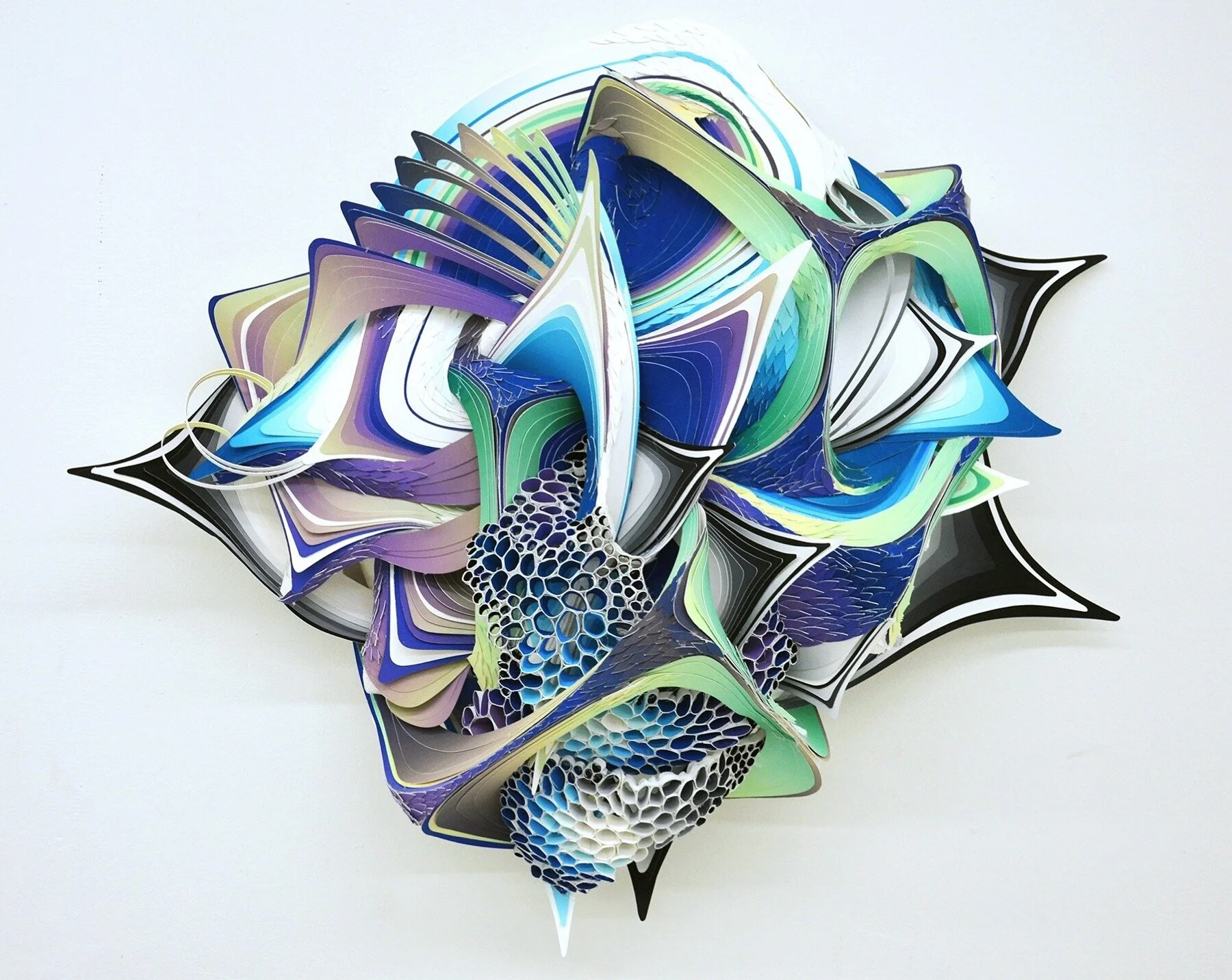
Crystal Wagner’s paper sculture using Stonehenge Paper.

Crystal Wagner is an interdisciplinary artist creating incredible works of art from paper sculptures to installations surrounding castles. She combines 2-dimensional and 3-dimensional works of art using a variety of materials, including Stonehenge Paper, and techniques.

Tell us about yourself and your work. Where did it all begin?

I am an interdisciplinary artist. My practice spans a broad spectrum of medium and processes. I'm interested in what people are capable of with their hands and their imaginations. I grew up in a small suburb of Baltimore, Maryland and then around age 12 moved to rural Pennsylvania. After five years of being a college professor, I left academia to dedicate my time fully to my studio practice. This has given me some of the most incredible opportunities. 

What is your style? What are the different types of work you do? How do the installations, domes, screenprints and drawings relate?

The way I understand style is that it is an individual's vocabulary- their own personal visual language. It's developed through their life experiences, their sensibilities, and their preferences. In my experience, I have always been interested in the relationship between the artificial world and the organic one and a deep love and fascination with ecology. When I am not in the studio, I am usually hiking. I try to drink deeply the world around me. This interest and curiosity, manifests itself differently in each of my bodies of work, and while the difference is usually in scale and material, the stylistic emphasis is always the same.... make something exotic, otherworldly, yet something familiar. 

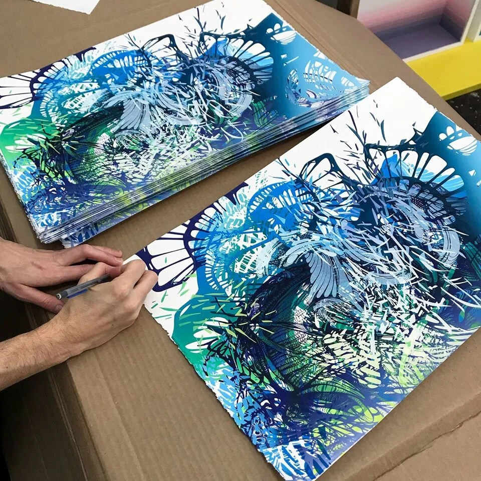
Silkscreen on Stonehenge Paper
Stonehenge Silkscreen Prints

What are the different materials you use for your work?

When I was a college professor, I used to tell my students that being an artist is a way of seeing and thinking as well as making. It's a tool to communicate your distinct experience with the world to others. I personally don't want to be relegated to one mode of making when it comes to my voice. The interior installations are recycled birthday party table cloth, the exterior installations are hot air balloon fabric and the small sculptural works are paper. Each material’s suited for the distinct conditions of their environments.

Stonehenge is the perfect paper for my paper sculptures. I need something that is archival, stiff and flexible. It's thick and durable and can handle all the ink I use and holds it's form beautifully when it is manipulated sculpturally. 

What’s the process like creating the hemispheres?

I work intuitively with all of my work. Each piece is a conversation I am having with the work. Similar to the large-scale installations and the drawings... I make a gesture and respond. The gesture in the case of the paper sculptures is made with wire. Then I cover the armature in paper. The biomorphic paper sculptures require a lot of tedious work. I hand cut every petal with an exacto knife and hand print all of the paper to get create the colors. Ultimately it's about trust. Trusting that every time I put a shape on the piece, that it will provoke me to put another and then another, until finally, it doesn't and the piece is done. 

What’s your favorite piece?
Yikes! I don't have one yet. I probably never will. The thing about being a generator is that creating is a continuum. I'm never working towards an end, just a different moment in the work, a different spot in the evolution to breathe and then it keeps going, keeps growing. With each moment, I learn something new about my language and my particular emphasis in the time in my life. 

What’s next to look forward to?
I'm currently my studio in Los Angeles, CA working on new paper sculptures for the Urban Art Fair this spring in Paris and my solo exhibition with Galerie Openspace also in Paris. 

Crystal Wagner Installation

Pantone Color of the Year 2020: Classic Blue

pantone-color-of-the-year-2020-classic-blue-banner-mobile.jpg

“We are living in a time that requires trust and faith. It is this kind of constancy and confidence that is expressed by PANTONE 19-4052 Classic Blue, a solid and dependable blue hue we can always rely on. Imbued with a deep resonance, Classic Blue provides an anchoring foundation. A boundless blue evocative of the vast and infinite evening sky, Classic Blue encourages us to look beyond the obvious to expand our thinking; challenging us to think more deeply, increase our perspective and open the flow of communication.”

- Leatrice Eiseman (Executive Director of the Pantone Color Institute.

Pantone 19-4052 Classic Blue was announced as the Pantone Color of the Year 2020. We found 10 papers that match (or come close) to the Pantone Classic Blue. While demonstrating the peace and tranquility of the Classic Blue color, each paper contains extremely different features. Click on the thumbnails below to learn more about each paper.

Artists Explore YUPO®'s Possibilities

FROM THE ARTISTS.

YUPO®’s unbelievable quality can transform any work of art into a masterpiece. The ultra-smooth, non-porous, and non-absorbent canvas gives artists the flexibility to work in several different mediums to achieve unique and creative results. Yet every artist exploits these advantages differently, exposing the many possibilities of YUPO® paper.

Read about different artists’ experiences and techniques using YUPO®.


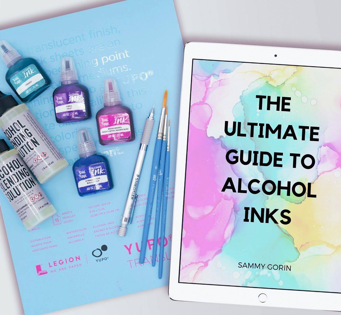
Samantha Gorin, @sammygorinart

Which YUPO® is your go-to?

{Samatha Gorin} My go-to YUPO is the 9x12in "heavy" weight pads. When painting on YUPO, I usually put my finished piece in a pre-cut mat frame so that my collectors can have an easier time framing their work; the 9x12in paper makes it easy to meet standard frame sizes! The pads are also super easy to store in my apartment's makeshift studio.

61841064_436991000448938_6351552402176344064_o.jpg

Which paints do you prefer when using YUPO®?

{SG} I primarily paint with alcohol inks on YUPO. Inks are tricky; you can only use them on non-absorbent, slick surfaces, which makes YUPO an ideal substrate. I especially love using my inks on the "translucent" YUPO. Since alcohol inks are transparent, once you add a mat backing to your piece, it gives your painting the element of depth. 

How did you discover YUPO®?

{SG} When I decided I wanted to learn how to paint with alcohol inks, I did a ton of research. I had never heard of them before, and they are drastically different from my primary medium, acrylic paint. While doing my research, "YUPO" was mentioned in nearly every blog and Instagram post. I did a little research and found an incredibly helpful article on Legion Paper's website. Aside from the inks, a pad of Legion's YUPO was amongst my very first ink purchase, and it's been my go-to ever since.

How do you display your finished masterpieces?

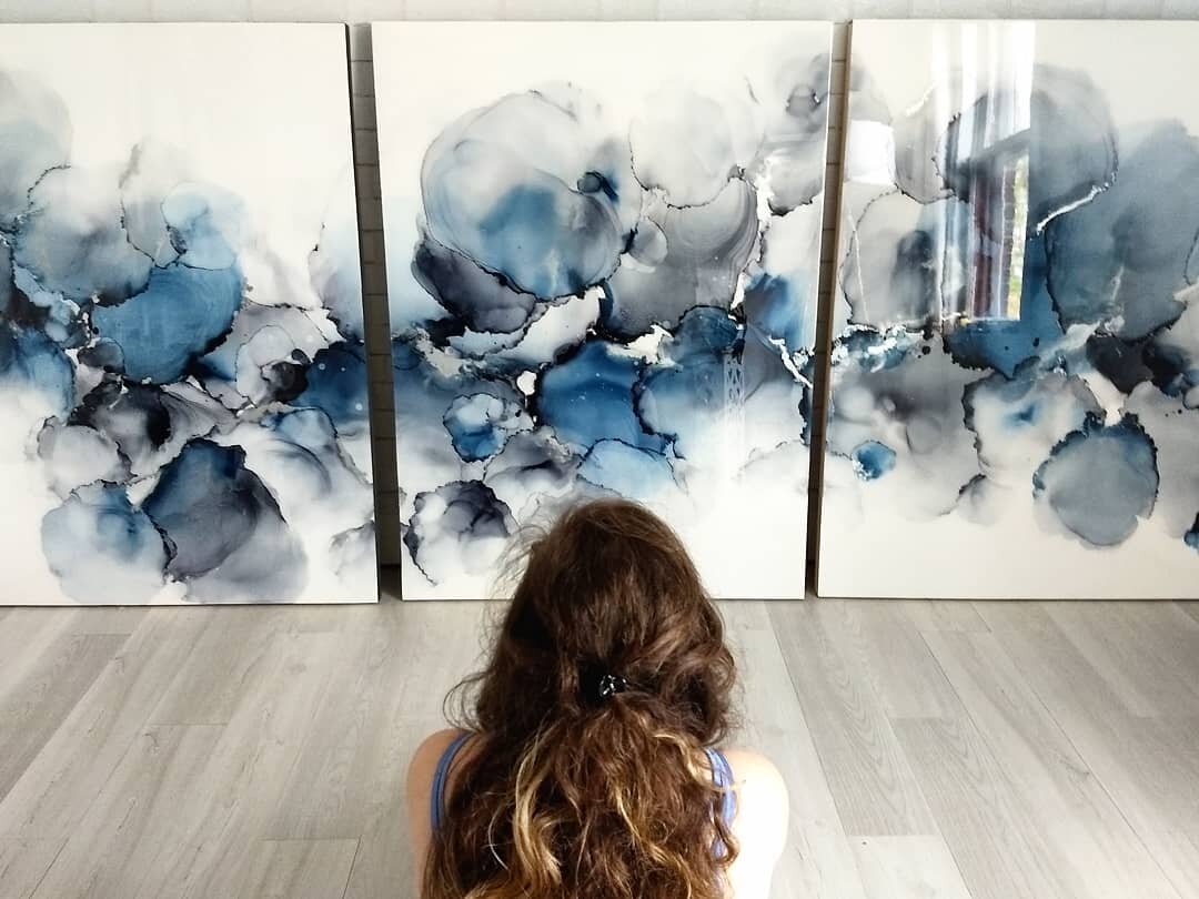
{SG} I usually put my finished work in a pre-cut mat frame, but sometimes I will mount the painting to a cradled wood panel. Once attached, I trim the edges and cover the piece in a glass-like coat of resin.

Any advice for first-time YUPO® users?

{SG} Don't be afraid to try each weight and size! At first, I was hesitant to work with the translucent YUPO, but once I gave it a shot, I fell in love. Also, different weights work best with different projects, so finding the correct weight through experimentation is key.

37343269_239493856865321_7146176550856032256_o.jpg

Ashley Mahlberg, Ink Reel Studio, @Inkreel

Which YUPO® is your go-to?

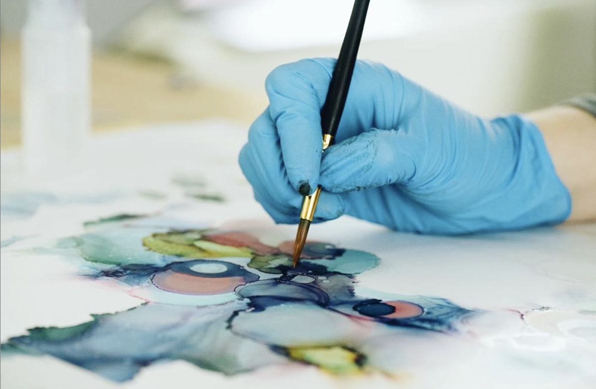
{Ashley Mahlberg} I typically use the medium weight Yupo paper on a roll. The price point fits with my material budget and I find it easier to cut/manipulate the medium paper weight. If I'm not going to cut the paper I tend to use the pre-cut heavy weight paper. As an artist where the majority of my work comes in the form of commissions I like having a roll of Yupo on hand so I can easily create custom size paintings for my clients.

Which paints do you prefer when using YUPO®?

{AM} Alcohol ink is my preferred medium to work with on Yupo. To achieve the amazing effects that are possible with alcohol ink I need a surface that won't absorb the ink and will allow the medium to move fluidly across the surface - Yupo accomplishes this goal beautifully with its super smooth nonabsorbent surface. It extends the time I have to work on a painting and not have to worry about the ink losing its fluidity due to absorption.

Screen Shot 2019-08-07 at 3.07.52 PM.png

What’s your style of work? Why do you choose YUPO® to help accomplish your style?

{AM} I'm an abstract fluid artist, therefore working quickly to direct the flow of the alcohol ink and add effects in a short period of time is something I'm always working against. Yupo not only extends the time I have to work on a painting as it doesn't absorb the ink but sits on top of the paper this also allows me to reactivate the ink and rework a project or add effects at a later time.

How did you discover YUPO®?

{AM} I discovered Yupo a couple years ago while perusing watercolor videos on Youtube, I came across a video of an artist demonstrating how he achieved exciting effects with alcohol ink on Yupo. The next day after watching his demo I ordered Yupo, ink, and was hooked. I hadn't painted on a synthetic surface before Yupo and I was (and still am) absolutely mesmerized by the beautiful effects that I can create with Yupo and alcohol ink.

What do you do with your finished pieces?

{AM} My finished Yupo paintings are either mounted on cradled board or left loose and placed in a frame.

Any advice for first time YUPO® users?

{AM} Using a heat tool to push alcohol ink around a surface is a popular method to create the beautiful alcohol ink effects and since Yupo is synthetic you want to be careful to not apply direct heat in one area for too long as it can melt your paper. I recommend experimenting on a scrap piece of Yupo to figure out the tolerance the Yupo has when applying heat.


Marissa Recker, @astuaryart

Which YUPO® is your go-to?

{Marissa Recker} I use various Yupo products depending on the piece I am creating. I use large heavyweight sheets the most. I like how resistant they are to warping from my heat gun. I use the large medium weight rolls when I create on a larger scale. I love both products and use each often!

What paints do you use with YUPO®?

{MR} I use a few different media on Yupo. I use alcohol inks the most, but I also love using acrylic inks, spray paint, and resin on Yupo. I love how easily alcohol and acrylic inks move across the smooth surface Yupo has to offer. But, I also love that spray paint and resin both adhere to it beautifully!  

What’s your style of work? Why do you choose YUPO® to help accomplish your style?

{MR} My artist style embraces the movement that comes with fluid art. Yupo is the ultimate surface to achieve this because it is so smooth and non porous. Inks move across Yupo so beautifully. I also love that it is easy to pick up a corner of the paper to move inks across the surface. 

astuary.jpg

How did you discover YUPO®? what was your first experience with it like?

{MR} I discovered Yupo through Legion being an early supporter of my work on Instagram. I remember seeing them like one of my earlier posts almost two years ago and immediately thought they must be a good company with great paper! 

What do you do with your finished pieces?

{MR} I mount most of my pieces to wood panels and then seal them in resin. It creates a great display piece with a beautiful finish!

Any advice for first time YUPO® users?

{MR} My advice to a first time Yupo user is if you are using heat (like a heat gun) I recommend starting with the heavy weight Yupo. I found that it was much more forgiving as I learned how to use my heat gun. Once I was more experienced I was able to move onto the medium weight. Also, don't forget if you want to start your piece over, just flip the Yupo over and work on the back! You get a free redo with Yupo. And of course, have fun! 


Zaria Forman: Illuminating Climate Change Through Art

From the Artists.

Zaria working on Lenox Paper

Tell us about yourself and your art. Where did it all begin? What inspires you to create?

{Zaria Forman} The inspiration for my drawings began in my early childhood, when I traveled with my family throughout several of the world’s most remote landscapes, which became the subject of my mother's fine art photography. I developed an appreciation for the beauty and vastness of the ever-changing sky and sea. I loved watching a far-off storm on the western desert plains, the monsoon rains of southern India, and the cold arctic light illuminating Greenland's waters.

I have very fond memories of our family trips and consider them a vital part of my upbringing and education. I feel very fortunate that I had the opportunity to see so much of the world, and to learn first-hand about cultures so vastly different from my own. This myriad of experiences instilled in me a love of exploring and a need to continue exploring and learning for the rest of my life.

How do you use your art to make a difference in the world?

{ZF} Artists play a critical role in communicating climate change, which is arguably the most important challenge we face as a global community. I have dedicated my career to translating and illuminating scientists’ warnings and statistics through an accessible medium, one that moves us in a way that statistics may not.  Psychology tells us that humans take action and make decisions based on emotion above all else. Studies have shown that art can impact our emotions more effectively than a scary news report. My drawings explore moments of transition, turbulence, and tranquility in the landscape, allowing viewers to emotionally connect with a place they may never have the chance to visit. I choose to convey the beauty as opposed to the devastation of threatened places. If people can experience the sublimity of these landscapes, perhaps they will be inspired to protect and preserve them.

zaria2.jpg

What materials do you use for your art?

{ZF} Lenox 100 paper is not what most pastel artists would want, because it doesn’t have much tooth, and therefore it cannot absorb as much pigment as a toothier paper could. But this is the precise reason why I love it! The smooth texture of the surface allows me to render very fine details. A toothier paper would get in the way of that. Although the amount of pigment I can layer is limited, I actually prefer this challenge as well because it requires me to be a better artist. There is not much room for error or re-working, so every mark must be intentional and precise.

What’s the process like from your travel to beginning a new piece? How is the image chosen you’re going to draw?

{ZF} When I travel, I take thousands of photographs. I often make a few small sketches on-site to get a feel for the landscape. Once I return to the studio, I draw from my memory of the experience, as well as from the photographs, to create large-scale compositions. Occasionally I will re-invent the water or sky, alter the shape of the ice, or mix and match a few different images to create the composition I envision. I begin with a very simple pencil sketch so I have a few major lines to follow, and then I add layers of pigment onto the paper, smudging everything with my palms and fingers and breaking the pastel into sharp shards to render finer details.

The process of choosing which images to draw is long and difficult! But there are always a few moments that stand out on each trip, where the landscape and light line up in magical ways, and I know immediately that I’ll make a drawing of it. I tend to jump right to those moments when I begin a new body of work, so I can start drawing before I go through the rest of my photos and memories.

Pastel on Lenox Paper

Disco Bay, Greenland

What’s your favorite piece and why?
{ZF} Whichever drawing I'm working on. The works are like my babies, they mean more to me than anything else I possess! That said, there are a few drawings that have personal significance, like my drawings of Jakobshavn Glacier or of the icebergs that calved from it into Disco Bay, Greenland. Jakobshavn glacier was the first glacier I ever saw, in 2007 with my family. I returned five years later to spread my mother’s ashes in Disco Bay.

How do you display your finished art? Do you use any fixatives? What about framing?

{ZF} I sometimes use SpectraFix pastel fixative, but mostly on the larger pieces, to minimize pastel dust collecting on the inside of the plexiglass once it’s framed.  I have the paper mounted onto dibond in order to have a rigid and supportive structure transportation and drawing, which also makes it easier to frame when the work is finished. My works are float-framed with museum non-reflective glass.

What do you hope to accomplish with your work in the next few years?

{ZF} I would like  as many people as possible to see my work, and to have a moment in which they feel transported to these remote places at the forefront of climate change. If they can experience these landscapes that otherwise might seem disconnected from our everyday life, but are in fact critical to our global climate system, perhaps they will be inspired to take action to protect and preserve this planet that sustains us, so future human generations may thrive. I hope my drawings can facilitate a deeper understanding of the climate crisis, helping us find meaning and optimism in shifting landscapes.

The Midway Gallery & Artist Studios

The Midway Gallery & Artist Studios

Everyday Watercolor Flowers by Jenna Rainey Sneak Peek!

EverydayWatercolorFlowers_3DBook_small.jpg

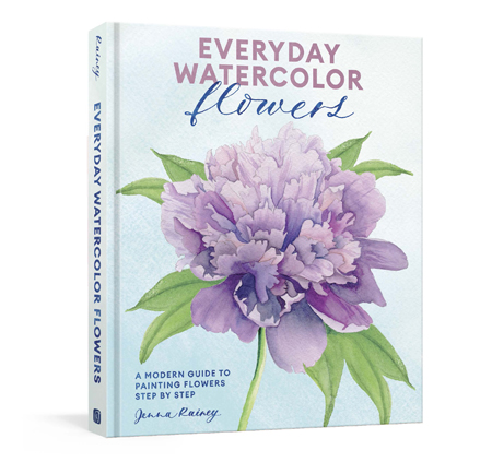
Everyday watercolor flowers is A Modern Guide to Painting Blooms, Leaves, and Stems Step by Step by Jenna Rainey.

Artist, Jenna Rainey, shares easy-to-follow ways to paint a wide range of botanicals, all in her fresh, modern style that appeals to the next generation of watercolor artists and creatives, from beginners to hobbyists. With gorgeously illustrated instructions for both loose and realistic watercolor depictions of more than 25 flowers, leaves, and plants, organized by form and shape, Everyday Watercolor Flowers is every nature-lover’s answer to capturing that beauty on paper.

Jenna uses Stonehenge Aqua Coldpress 140lb for all of her watercolor paintings.

Here’s a sneak peek of drawing Cherry Blossoms in Everyday Watercolor Flowers.