Photorealistic Charcoal Drawings by Emily Copeland

From the Artists.

emily_copeland2.jpg

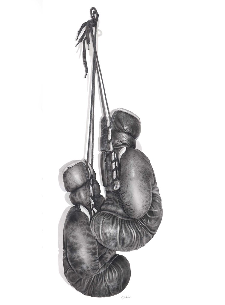
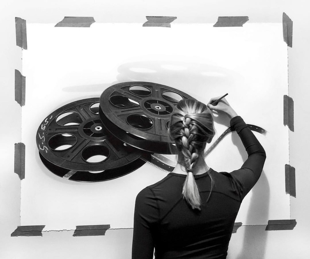
Emily Copeland is a Canadian charcoal artist specializing in realism. Mainly working with charcoal, she focuses on recreating objects on a larger scale.

The detail in Emily’s work is incredible, and we’re proud her work is on Stonehenge. Learn more about Emily Copeland’s work and why she chooses Stonehenge for her vintage charcoal drawings.

Tell us about your yourself and your art. What’s your style of art?

{EC} I concentrate on detailed vintage or retro objects as my subject matter. The elements within my drawings are blown up much larger than life size to give it a surreal effect. This gives the audience a unique viewpoint that exposes detail they wouldn’t normally see. I also attempt to bring vintage objects into a modern context by conveying them on plain, clean backgrounds.

I often choose to let the meaning behind each piece remain anonymous, as this gives each audience members the ability to find their own unique meaning throughout each piece. My intentions behind this is because I think everyone can find their own personal interpretation to each work of art, and it should never be restricted to only one viewpoint.

With each different series, I hope to please a wide range of audiences with the objects I’ve chosen. 

boxing+gloves+small.jpg
emily_copeland.jpeg

Where did it all start?

{EC} I got into art at a very young age, although it was never something that I planned to do as a career. I’ve always attended schools that specialized in the arts, but it was more of a hobby than anything. I was big into painting, but I didn’t really know what direction I was going with it. It wasn’t until my fourth year of university, when I discovered Stonehenge paper and charcoal together, when I knew I had found my mediums that I wanted to continue working with.

FullSizeR.jpg

What is your go-to paper for your work?

{EC} White Stonehenge paper, 250 gsm, is my go to paper, and has been for 4 years now. I love that it comes in pre-cut sizes and in rolls, so I can work in any size I desire. I’m the type of person who finds something that I like/ that works, and I stick with it, so Stonehenge paper is always my desired choice.

How does this paper work for your specific style?

{EC} Stonehenge paper is a fantastic paper to work with all around. I love that it’s versatile and thick, so when I am working on a larger scale, I don’t have to worry as much about ripping or creasing as easily as thinner papers. It’s also durable in the sense that erasing rarely ruins its soft texture. As far as paper goes, it’s pretty forgiving in that way. You can make light mistakes and still recover. Stonehenge’s even surface also has a slight grip to it. It allows my charcoal to go on smoothly and for me to capture small detail, while also allowing me to layer my charcoal without having any build up. The cotton fibers really absorb your medium, making shading really easy. Additionally, the texture leaves the tiniest specks of untouched paper throughout which help to give volume to the objects I'm drawing. This is the perfect paper for my photorealistic drawings.

What do you look for in a paper? Do you have specific requirements?

{EC} I look for paper that receives my medium well. The 100% cotton fibers in Stonehenge really absorb the charcoal that I use, and allow easy layering and shading. I also rely on versatility. The paper has to be thick and sturdy, while also being light and thin enough that I can roll it into a tube for shipping purposes. Additionally, I look for paper that is acid free with a neutral pH, because it ensures me that my drawings will be preserved for long periods of time.

emily_copeland.jpg

What are your future plans for your art? Any upcoming events?

{EC} I just finished having my second solo show at Bernarducci Gallery in Chelsea, Manhattan. The show ran for 6 weeks, starting at the beginning of March. Now the focus is to rebuild my portfolio for the next 1 or 2 years so I can take part in more group shows and be on my way to having my third solo show in NYC.

I’m preparing to start working larger than I ever have before, so I’m really excited for the challenge. I just received my 50-inch by 10-yard roll of Stonehenge from Legion Paper and I’ve already photographed several objects that are going to be larger than life. I’m looking forward to pushing myself with these next few projects.

In the next couple of years, I’m eager to start showing my work more internationally as well, hopefully over seas in some art fairs and group shows. I’m only in the 3rd year of my career, so I’m excited to see what the future holds. 

Rise + Wander: Paper for Block Prints

From the Artists.

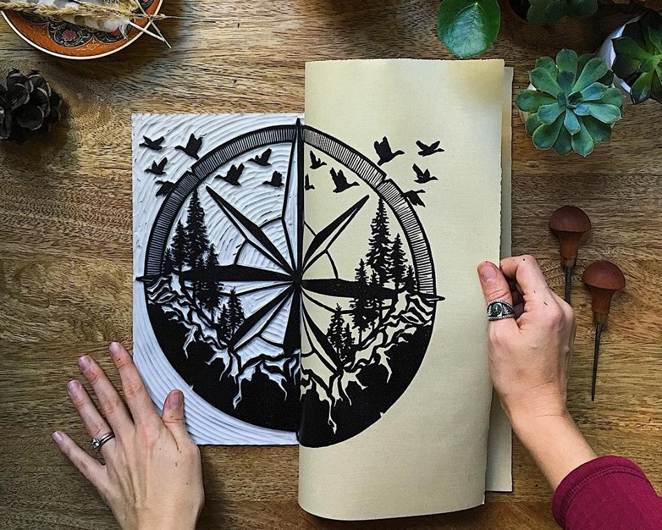
Aftyn Shah, founder of Rise + Wander, is a self-taught printmaker and painter with a mission to move others and inspire adventure. She discovered the importance and power of art during the healing process after a life-changing accident. Aftyn’s work involves nature and landscapes real and imagined, as the outdoors provide inspiration and soothing restoration.

Choosing a paper is large and important part of Aftyn’s art. Through experimenting with several papers, she discovered the papers best for her nature inspiring art.

The process requires a strong paper to withstand the rubbing/burnishing of the surface against the block, but also soft enough to absorb the ink within the grooves. However, as we often recommend, only by experimenting with different substrates will you find the best choice for your project.

More on Block Printing.

r+w.jpg

Aftyn Shah, Rise + Wander

“I think paper can be one of the biggest variations between artists.”

Paper is such a fun topic! The options are diverse and can add something special to a piece or go completely unnoticed while elevating it through simple quality. Whenever someone asks me for a paper recommendation, I always offer the caveat that testing for yourself is the best way to find your favorite, but I definitely have my preferences.

When I first started printmaking, to be perfectly honest, I used cheap cardstock. I had plenty of it from previous projects, in a whole range of colors, and it was durable. As I continued, though, I started to branch out and explore other options—many different options! I tried the dreamily airy papers like Unryu, pulpy ones like Chiri, decorative colorful papers a friend brought from traveling abroad, and a whole host of mould-made cotton papers (Rives BFK, Somerset, Stonehenge, Arches, and so on).

In the end, I fell in love with the Stonehenge line as my go-to option. It’s velvety, with a hint of soft texture, and takes prints smoothly. I still burnish each piece by hand, which means I love a paper that takes ink easily and I like seeing the slight indentation in the paper as I press onto the block. It’s light, but durable, and works equally well for a single-color print and multiple layers without warping or getting weighed down.

Similarly, when I work in mixed media, especially with watercolors or acrylics, the paper is still able to support the different paint and pen combinations. Having a large amount of versatile paper on hand is convenient.

Block Print on Stonehenge White

Block Print on Stonehenge White

Mixed Media with acrylic, pencil drawing and ink illustration on Stonehenge Paper.

Mixed Media with acrylic, pencil drawing and ink illustration on Stonehenge Paper.

When picking a paper, I consider aspects like how well it will print and of course cost, but I really like a bit of character. I decide if I want the paper to let the art stand on its own or add an additional element, either aesthetically or texturally. The latter is what draws me to bookmaking papers, like Nideggen and India Hemp. I love seeing hints of the fibers that make me think about the papermaking process, an artform in itself! Exploring other options, even if they’re not specifically made for my technique, is exciting. It also opens up options for my customers to become creative in how they display the artwork.

riseandwander3.jpg

Lately, I mostly work with black ink, which means I can go with a simple contrast in white or add some additional visual interest with a colored paper. For the most part, I like to stay neutral (Nideggen or Stonehenge’s Fawn or Natural), as it goes well with my outdoorsy work. Occasionally, though, I use the paper to insinuate the mood of a piece. For instance, I created The Northern Coastline with a moody rocky coast in mind, and a light grey color really seemed to suit that atmosphere. I wouldn’t choose it for every piece, but for this one it worked perfectly.

In the end, I think I’ll always recommend someone try several options before landing on a favorite. Everything from personal technique to weather conditions can affect how materials can work with paper!

Somerset Velvet Black is Back!

stcuthberts_somersetblack.jpg

The long awaited return of Somerset Velvet Black printmaking paper has finally happened. After a 5 year absence, St Cuthberts Mill have reformulated its famous Somerset Black and re-introduced it to the market.

Somerset Black still has a deep warm shade of black, with an even darker core, and its surface retains the beautiful mid-textured finish of the other ‘velvet’ finished in the Somerset range. The internal structure of the sheet exhibits even darker fibers, which gives some dramatic results when laser etched.

somerset_velvet_black.jpg

Somerset Black is an archival sheet made with 100% cotton, being both acid free and fade resistant. It has an alkaline pH, and reaches 6+ on the Blue Wool Scale for fade resistance.

Much work has gone into reformulating the Somerset paper, using new black pigments, to give a sheet worthy to have the Somerset name.

Somerset Black is now available in a 280gsm in 30” x 44” bearing the Somerset watermarks and 4 deckle edges, plus a 22” x 30” sheet with the Somerset watermark and 3 deckle edges.

Somerset Black is suitable for Block/Relief Printing, Embossing, Intaglio/Etching, Hand Lithography, Letterpress, Silkscreen/Serigraphy, Laser Cutting/Etching, and Pastel.

PLI.Ē Project

Paper: Mirri Rainbow

Paper: Mirri Rainbow

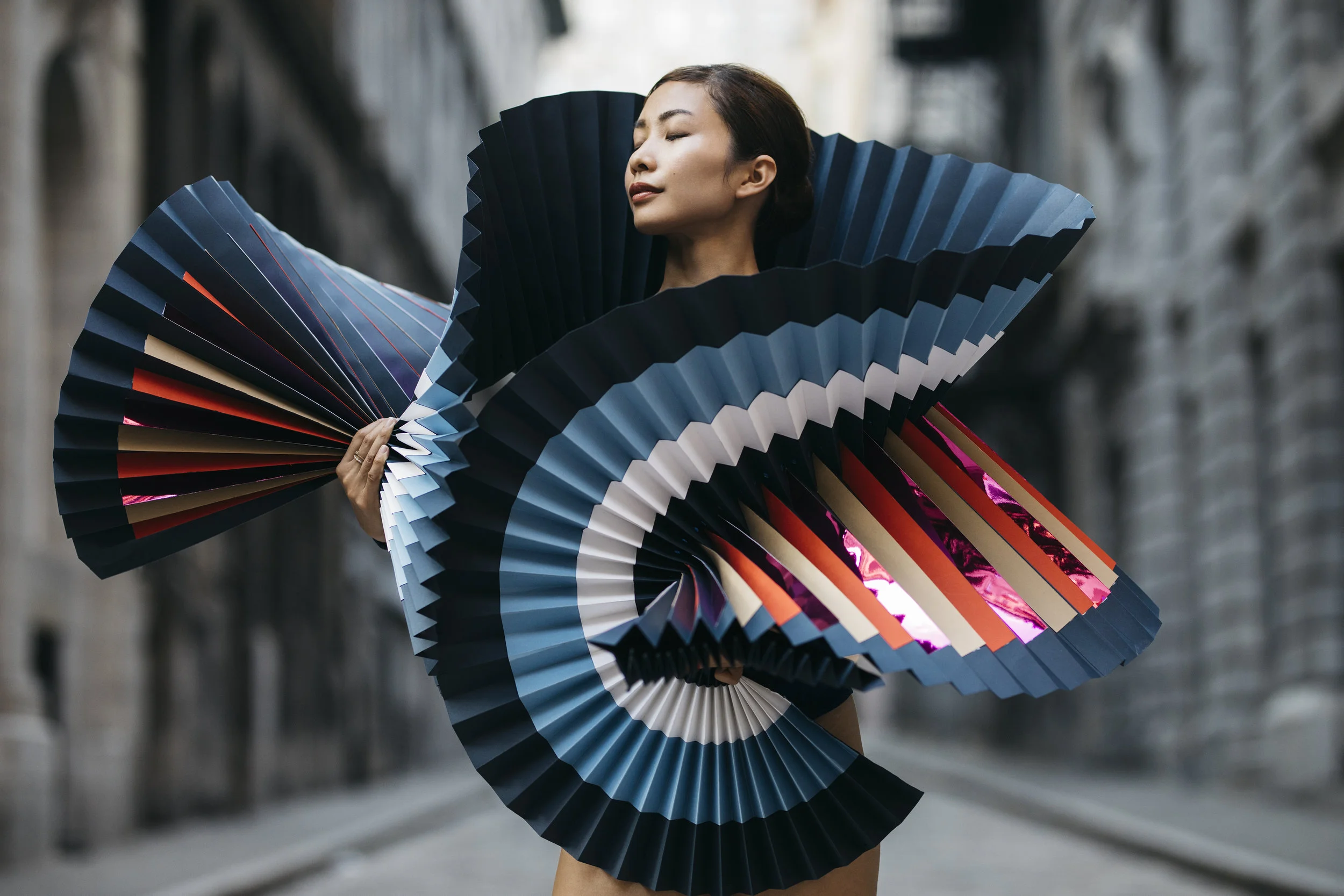
The PLI.Ē Project is a series of pop-up events featuring an exhibition of photographs and paper works by artist Pauline Loctin (aka Miss Cloudy) and motion photographer Melika Dez. But it’s more than that. It’s a combination of dance, architecture, movement, design, travel and, of course, paper.

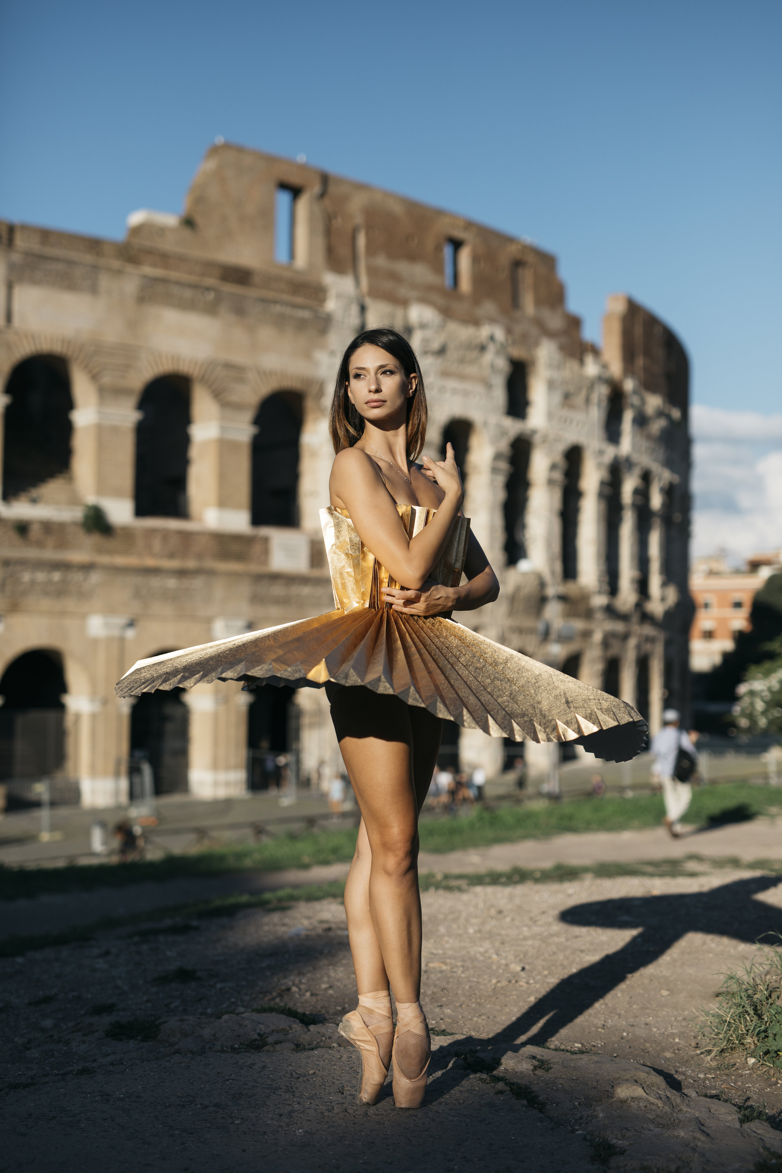
By matching the folds of ballet dancers with the art of folded paper, these two artists offer you a series of photographs taking place in some of the most beautiful cities in the world: Rome, Paris, New York and Montreal.

PLI.É is 14 dancers from 6 internationally renowned dance companies from 4 international cities and dressed in 16 folded and hand-made paper dresses. Each city, paper and dancer were specifically selected to create meaning within each photograph.

Paper: Colorplan (multiple colors)

Paper: Colorplan (multiple colors)

Paper: Colorplan Bright Red

Paper: Colorplan Bright Red

Where the project all began.

(Pauline [PL])

I met a photographer, Melika Dez, that specializes in movement photography, including all kinds of dancing: ballet, street dancing, aerial. After our meeting, Melika came across my installations and paper dresses and asked if I could create some dresses for some of the dancers she works with. I was excited because I’ve never created paper dresses for anyone to actually move in, let alone dance in. And the collaboration began.

We began with shooting two dancers from NYC, Michael Jackson and Akua Noni Parker, in a studio in Montreal. I created my first white tutu for the dancers and immediately noticed the potential. I wanted to create something even more different, something no one has ever seen before. I needed to steer away from white paper and get involved in more color. So I created colorful accessories, scarfs, hats and masks. I made a large red flower dress, and an African scarf consisting of so many different colors and detail, you could barely tell it was paper.

After a successful photoshoot in the studio, we decided to take it one step further. Melika shoots with a unique style, street dancing, so why not take it to the streets, our first challenge. The street photoshoot would begin in New York City, working with six different dancers. The more costumes I began making, the more I wanted to do. Every time I finished one, I had a new idea. Legion Paper came in just in time after noticing the very start of the project. This is where I was able to take my creativity further, with their endless selection of papers, papers I’ve never seen before. There were so many things to do with this new library of papers. 

The project began to grow, and new cities were added. The PLI.Ē Project traveled to Paris then Rome, and Montreal, but wasn’t going to stop there. More cities will be added, and the first exhibition is opening in Montreal. It’s just the beginning!

How did Cultural Diversity play a part in the PLI.É Project?

(Pauline [PL] and Melika [MD])

We wanted to highlight the beauty of bodily differences among dancers. Too often, dancers are judged for their body and movements: their color and curves. They spend days looking at themselves through mirrors. Throughout the PLI.É Project, the participating dancers saw themselves in a positive way. Some even say it was the first time they saw themselves in a photo and saw their beauty.

The fragility of the papers accentuates the incredible strength of the dancers. Strength that is also present in their own stories.

Paper: Mirri Gunmetal

Paper: Mirri Gunmetal

Paper: Mirri Gold

Paper: Mirri Gold

Which papers did you use for the project?

[PL]

I started with the papers I had locally. When Legion reached out with my many different papers, there was so much I wanted to do with all the different and beautiful options. It helps with creativity to see all the different paper options in front of you. I had no idea how much variety there is. “Paper” is a very broad term.

I fell in love immediately with all the Colorplan colors. We used so many of them. The blues, browns, reds. We even used several in one dress with imperial blue as the base and colored stripes on top. There are so many papers, but the quality of Colorplan is a step above.

We also used a variety of Mirri Papers. They were so different from anything I’ve seen before. The Mirri card colors used were copper, gun metal, purple, pink and blue. We also used Mirri Sparkle, and Mirri Rainbow. All in the 12pt weight, since it’s not too heavy to fold, or too light for the tutu to stay in place. Mirri reflects light creating a beautiful photograph and stunning tutu.

Papers: Colorplan Bitter Chocolate, Baghdad Brown, Nubuck Brown, Harvest, Stone

Papers: Colorplan Bitter Chocolate, Baghdad Brown, Nubuck Brown, Harvest, Stone

How did the locations and dancers’ personalities affect the papers you chose?

[PL and MD]

Both the place and paper choices strongly effected the effect we were looking for. All components were considered at each photoshoot. We actually chose different papers specifically for each dancer. We wanted to fit the dress to their personalities. Melika said, in her photography, she tends to find a location that suits the dancers and their movements. Each dancer moves differently.

One of the most meaningful photoshoots, was the group shot using flesh tone papers (Colorplan Harvest, Stone, Nubuck Brown). We wanted to steer away from the stereotypical pink tutu. We adapted the color of the paper to the dancers’ skin tone and want to emphasize the beauty of unconventional features as well as the importance of culture. This photoshoot was done in Brooklyn, with the Brooklyn Bridge in the background, surrounded by stone to match the colors of the papers.

We used Mirri Rainbow at key locations in Montreal with skylines and concrete. To us. Mirri Rainbow has a modern look that match the modern buildings of Montreal. We wouldn’t use this type of paper in a place like Rome, where the architecture is older and has an antique feel. In Rome, we used Colorplan Bright Red. We felt red matches the fiery personality of the Italian culture and was the Italian ballerinas favorite color. Lastly, Mirri Sparkle was used in Paris, to make a fashion statement, to symbolize the twinkling lights of the city at night.

Paper: Colorplan White Frost

Paper: Colorplan White Frost

Paper: Mirri Rainbow

Paper: Mirri Rainbow

What worked well with the papers? Any obstacles?

[PL]

Of course, creating dresses or any type of clothing with paper is a challenge… especially when dancers have to move in them!

It actually rained for some of the shots. I was surprised how well the papers help up, especially the Mirri. Colorplan still held together well, but rain was more visible on the paper. The rain did give it a different and interesting look we liked! Most papers wouldn’t have stood up to the rain.

Folding the paper was a lot of physical work, but it all folded very well. This was the way we chose the papers we did.

Sizing the models was another challenge. I used my own body for the fitting and since each model was different, we used Velcro and paper clips to enclose the back. We also added Velcro on the inside at the waist area to make it more comfortable, although there was no complaining of discomfort!

Paper: Colorplan (multiple colors)

Paper: Colorplan (multiple colors)

What’s next?

[PL]

We aren’t finished yet! We would love to add more cities. Possibly London and Tokyo. Also Rio because one of the dancers we worked with was from there. And Cuba, because they have some of the most amazing dancers in the world. We want to open more exhibitions after the first in Montreal in cities all around the world.

There’s more to come!

Mirri Copper

Mirri Copper

Colorplan Harvest and Ebony

Colorplan Harvest and Ebony

The Colorplan Difference

Colorplan - Studio - HR-3.jpg

81 Years in the Making

Since its launch in 1936, Colorplan has been continually refined , perfected, and pushed to its limits; the designers and craftspeople that continue to make it their first choice have played their part too. It performs exceptionally well - on every printing process from letterpress to digital. 

It's made to stand up to endless transformations - from business cards and boxes to paper bags and works of art. It's available all over the world - consistently beautiful on seven continents. And every one of its 50 colors and 8 weights is made, sustainability, in England. Colorplan represents an exceptional achievement in papermaking. 

Here are some of the qualities that making Colorplan the preferred choice.

cpdifference2.jpg

Intense Color Formulas

Colorplan's creation is an exacting art. The 50 colors are a unique blend, mixed from more than 50 high-intensity dyes and pigments supported by creativity, color science and generations of craft. Making each unique blend requires an absolute precision, where the color's formula is standardized within the strictest measures of optical tolerance. The outcome is that every Colorplan shade occupies its own dimension in color space defined by hue (tint), saturation (strength), and value (darkness or lightness).

Critically, the full color is added to the pulp before the papermaking process so that the pigments saturate deep inside the paper fibers helping them resist the effects of UV radiation, so that when the paper is folded, the color runs through the whole sheet. Colorplan's through-the-sheet deep-dyed vibrancy is demonstrated to most powerful effect in the high-octane shades of Fushia Pink, Purple, Mandarin, bringing impact to all applications. 

Purity Principle 

Colorplan White Frost is one of our most popular shades. it epitomizes the critical principle applied to all of our seven whites where every paper in Colorplan's exceptional white range is made acid-free, creating papers of exceptional longevity and opacity, idea when applications demand longer lasting purity and brilliance. These whites are made using pulp that is free of lignin. Present in wood cells, if lignin is not removed, it oxidizes (same chemical process that turns newspapers yellow.) The longevity makes it perfect for use in books, posters and for limited editions prints.

Innovative Chemistry 

Colorplan - Studio - HR-66.jpg

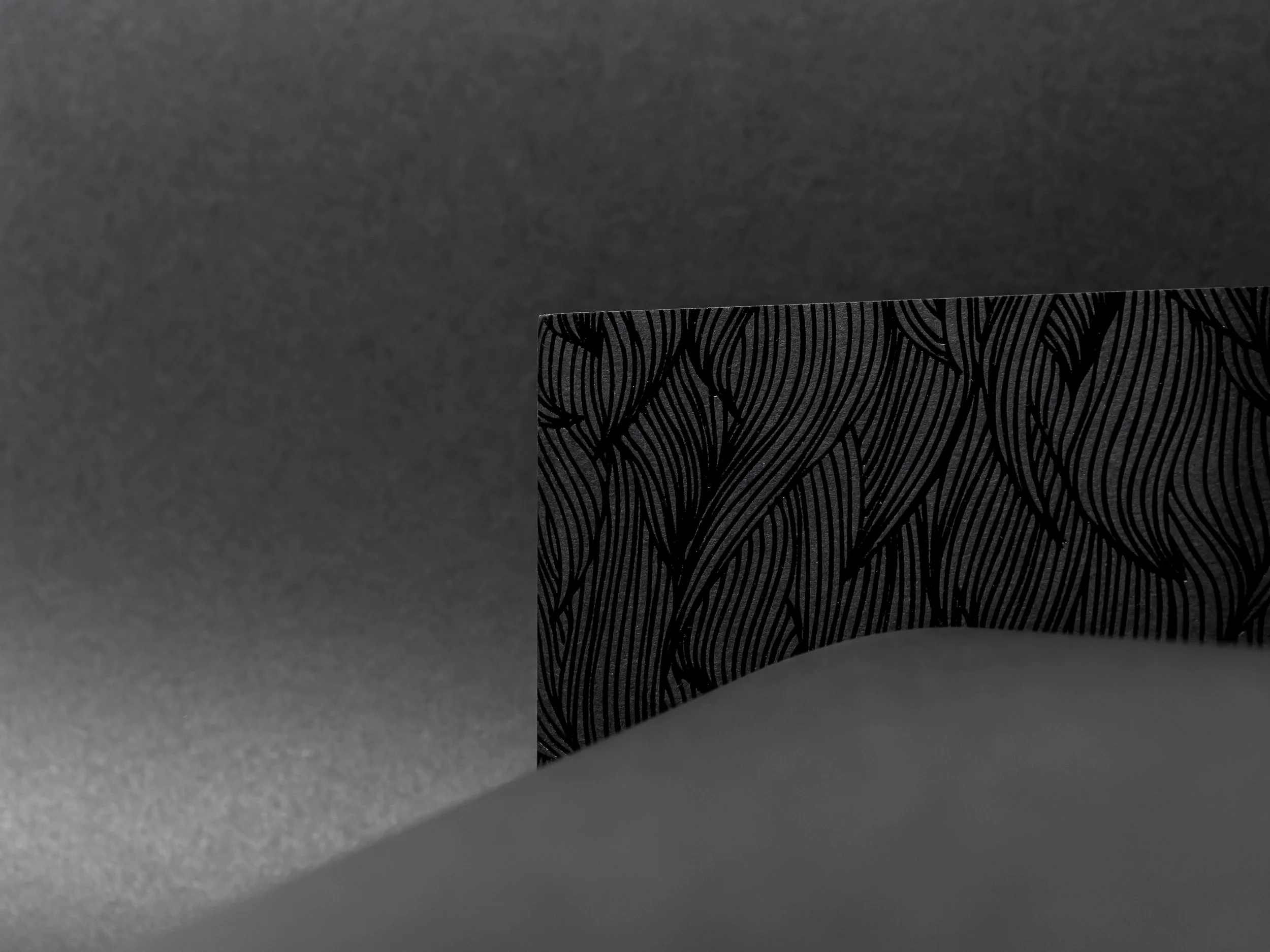
Unique Chemistry makes Colorplan. Its innovations in papermaking are exemplified in Ebony, an intense carbon-free black of such superior chemistry that it withstands rub against other surfaces and eliminates tarnish when foiled. This same laboratory expertise is key to every new color challenge tackled, with Ebony's 2011 launch in 2001 being a proud breakthrough in paper science.

It's also exceptionally lightfast and offers considerable resistance to fading, a quality of primary importance in luxury packaging applications. 

Pioneering Sustainability 

New standards are being set in papermaking process of Colorplan to make a positive contribution back to the environment. All the pulp is sourced from managed forests (for every tree felled, three are planted).

Pulp enters the process at 1% to 99% water, then becomes 93% solid material before the remaining extracted water is returned to the river in pristine condition. Bi-products from the production process are used in agriculture, and the chain of custody ensures that Colorplan is FSC certified. Colorplan strives to reduce the paper's environmental impact and are at ISO certification level in reducing energy consumption and waste generation without any compromise on quality. 

Bespoke Possibilities

Colorplan - Studio - HR-74.jpg

Colorplan has been tailored to match a specific creative requirement; if there's a color you need that isn't already one of the 50 shades in the range, our experts will create it. A bespoke color could be created from a paint chip, a sketchbook or a fabric swatch. 

Bespoke making of Colorplan can also be delivered in a custom sheet size and weight. Colorplan has mirrored color trends in popular culture, but when that's not quite enough, we're here to help create a unique color signature. 

Unsurpassed Testing 

Colorplan passes a series of 8 tests that confirm it superior quality and versatility including: eight, thickness, smoothness, surface integrity, absorption, moisture content. relative humidity and bursting strength. 

Papermaking with a twin wire creates the same surface on both sides of the paper, meaning the same results whichever side printed. A combination of fiber lengths is also critical. Long, flexible fibers give strength for creasing and folding; short fibers enhance formation, bulk, and surface for print. Supported by the remarkable internal structure, Colorplan's signature is a unique antique surface that in gently tactile but smartly uniform and which holds printed color exceptionally well. 

CPdifference.jpg

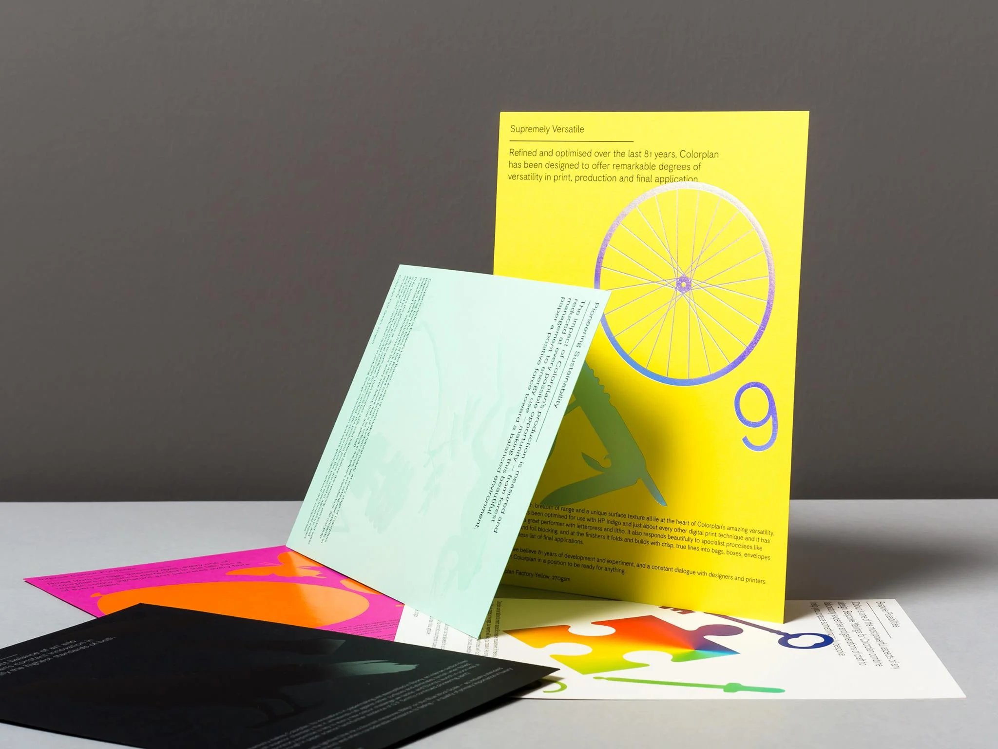
Supremely Versatile

Internal strength, breadth of range and a unique surface texture all lie at the heart of Colorplan's amazing versatility.  It has been a great performer with letterpress and litho, as well as a selection of colors coated for the digital press. It also responds beautifully to specialist processes like ebossing adn foil blocking, and at the finishers it folds and builds wit crisp, true lines into bags, boxes, envelopes and an endless list of final applications. 

Transforming Paper

The possibilities of Colorplan are endless. A range of services to customize, convert and transform Colorplan are offered from sheets cut to size, 25 embossing patterns, and a suite of envelopes available through converters. 

Worldwide Availability

Colorplan can be found and ordered in more than 65 countries. The global export builds on a dream that began with the founder, George Frederick Smith, a pioneer in paper who traveled the world by land and sea to forge international friendships, connections and partnerships, some of which continue to this day.

Whether you're printing in San Francisco or Sydney, or building a brand that reaches across every major marketplace, when you order Colorplan you can trust it will be consistent in every aspect, from continent to continent. 

Colorplan_book2.jpg