Greg Skol's Art on Stonehenge
Artist, Greg Skol, tells us about his connection with Stonehenge for his paintings.
Red Afternoon
Oil on Prepared Stonehenge Paper
"I was introduced to Stonehenge paper in the early 1980s, while a student at SVA (School of Visual Arts, NYC). An artist friend from the Bay Area was doing a semester residency at Parson’s School of Design. She was painting very large, neo-expressionist works on Stonehenge paper.. the large rolls which are about 50 inches wide. I was making mixed media works.... small but rigorous. We were both very aggressive with the media used. I don’t remember what paper I was using then (perhaps it was that unmemorable?)..... but the first work I did on the Stonehenge paper was the last time I wanted to use any of the other myriad choices of papers tried.
Some 35 years later, I still use Stonehenge paper exclusively. In all of that time I have never been disappointed or surprised by any deviation from the excellent quality. I also use the Rising Museum board exclusively for matting & framing the work..... again, consistent quality over a very long time!
Misty Lake, Oil on Stonehenge Paper, Framed with Rising Museum Board 8 Ply
I use oil paint on Stonehenge paper. I suppose I am a bit of an art materials “geek”. I like to know how the products are made, what goes into them, where they are made etc.... My personal opinion is that the cotton “rag” paper (actually made form linters, not rags, as the name suggests) is more archival than most canvas products produced today. Much of the canvas products are made under questionable “circumstances” (in my opinion and from what I could glean from information that is provided) and without any real specificity on the process, raw materials etc... Stonehenge paper information is readily available and accessible.
I spend a lot time creating my work and I ask my collectors to spend “good money” on the work. I begin with thin layers of semi-opaque acrylic primer..... as many as 15 layers. When I am done priming, the “feel” of the Stonehenge paper is still intact. The “feel” of the surface.... the ratio of tooth & smoothness & absorbency. I work many layers of both opaque and transparent oil. There is no “buckling” during any of the process. The paper absorbs the primer in a way that both seals, isolates the paper and yet allows the character of the paper itself to be “felt” beneath the brushes. I have used this same paper for works in acrylic & graphite (unprimed, of course).... straight graphite, intaglio printmaking, woodcuts, collage work and more. No matter what media or rigorous use of media..... I never second guess the archival & permanence quality. Works in perfect, conservation quality from 35 years ago speak to that."
View more of Greg Skol's work here on his website.
2017 Brand New Conference Program
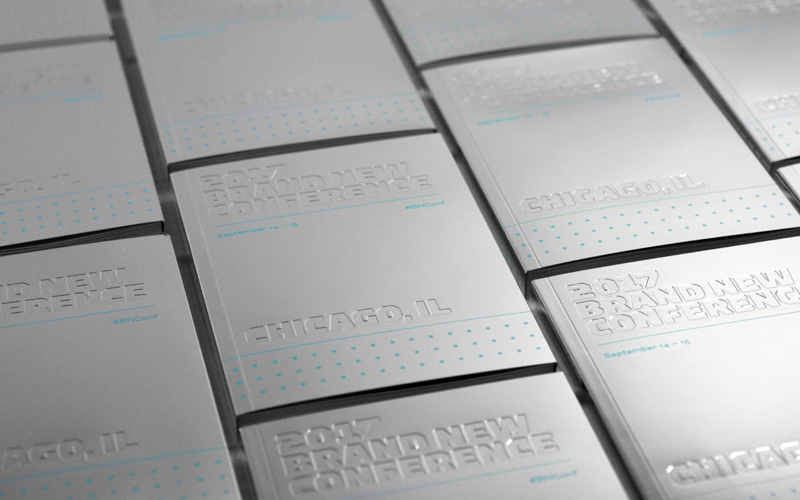
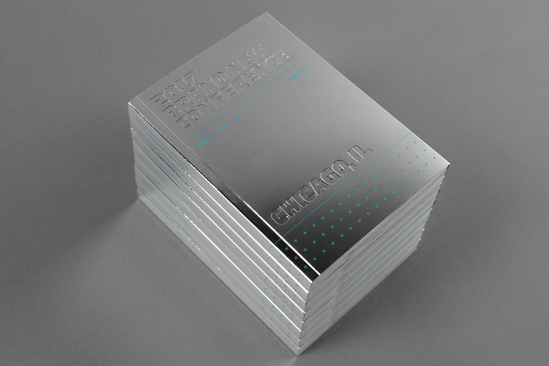
Mirri Paper was used for the Brand New Conference held in Chicago September 2017.
"The key concept behind it was replicating the distortion effect created by the Cloud Gate in Chicago’s Millennium Park, which happens to sit right behind the venue where we held the conference. " (Armin Vit, Underconsideration)
"We used Mirri, probably the best reflective paper I’ve seen and to highlight such lovely paper we did a straightforward deboss of the logo on the cover to further enhance the distortion effect. Additionally, we stretched the reflective concept into the pagination of the book by splitting day one’s speakers on the left side of the book and day two’s speakers on the right side. We emphasized this by splitting the book in half with the help of extended flaps that tucked into the center spread and directed readers to the appropriate side (a video at the end illustrates this as well as showing off the high degree of reflectiveness of the paper). The layouts are “mirrored” too, so day two speakers were flush-left/rag-right and day one speakers were flush-right/rag-left. A cool thing about the Mirri stock is that it has a white back, so we were able to flood the inside front and back covers/flaps with the key blue color from the identity and a great deal of color. In the body, there is a spare use of spot gloss varnish to highlight speaker pictures and names as well as some other small details." (Armin Vit, Underconsideration)
'Show Us the Money!' featured in PaperSpecs
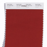
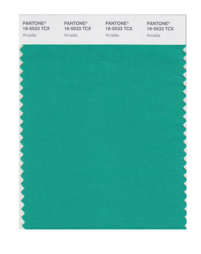
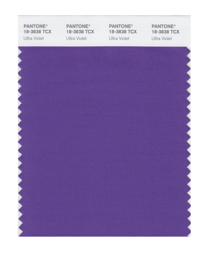
Pantone Lists Leading Spring Colors
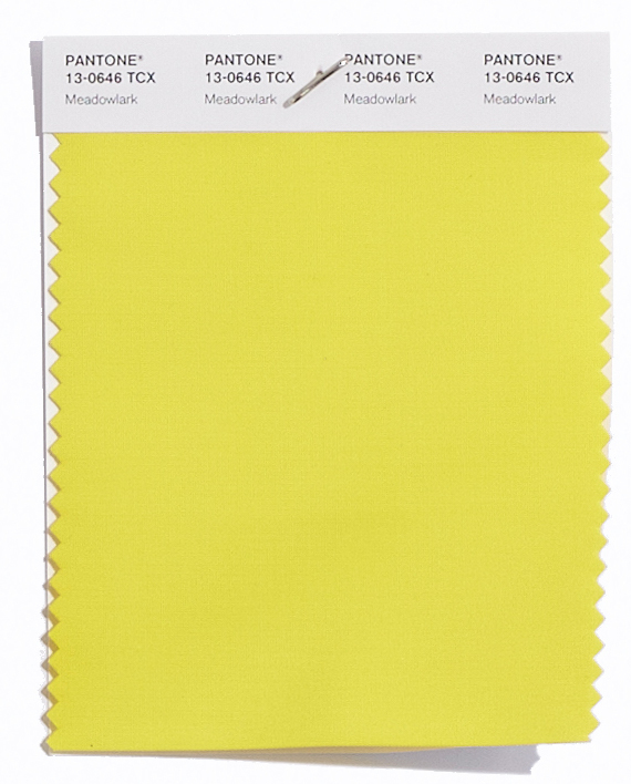
Pantone's 2018 Spring Colors are up and Legion has the paper to match them. We used our Ultimate Paper Selector to search by color through our thousands of papers for to find similar colors on our catalog.
Here are some papers that come close to the new trending colors for Spring 2018.
Meadowlark
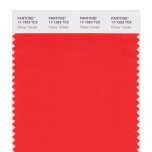
Cherry Tomato
Little Boy Blue
Chili Oil
Arcadia
Ultra Violet
Emperador
Find more on Pantone's leading Spring Colors for 2018: www.wwd.com


